In email marketing, one of the challenges is to make the user want to click. To do this, emails are always more beautiful, full of colors, images, etc..
But a very common mistake is to give too much space to images, to the point of forgetting that some email clients block images by default. As a result, the first thing that is visible when opening an email is the html text. This is why you should try as much as possible not to put text in the images when you do email marketing.
Here are some examples:
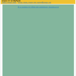
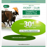
PMU offers you 30 euro, but no content in its email!
To start, here's what you absolutely should not do. An email with a single image that includes the entire content. Without an image displayed, it is impossible to understand the message (except for the subjectline). It's a shame because there are several sentences of text in the image that could have been written in html.
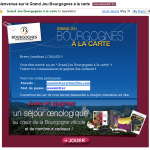
Win an oenological stay in Burgundy : white text on white background
Here, the problem is different. When creating the email, the designer/developer planned to put html text in his creation. Unfortunately, this was without counting on some technical details. Indeed, the color of the html text used in this email is white. But as some email clients suppress the background color of emails, this will give in some cases invisible text (here at Gmail). Also be careful, Outlook 2007 does not accept images in the background anymore.
Need help?
Reading content isn't everything. The best way is to talk to us.
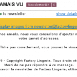
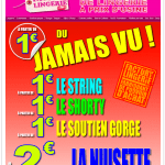
Factory Lingerie: An email with only text but integrated into an image
Okay, the text that is contained in the image of the Factory Lingerie newsletter is stylized, but it's still a shame that you can't see the content without loading the images. There would certainly have been a way to pass part of the text directly into the html code.
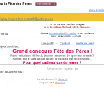
The good example, Father's Day at Just For You
After three examples of what to try to avoid, here is a realization to take as an example. The entire message is visible without having to display the images. Once displayed, they enrich the text without taking up any space. The only drawback is that the Call To Action is only visible when the images are displayed!
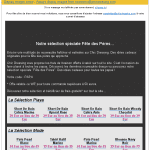
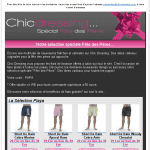
And finally, the Chic Dressing newsletter, an example to follow
In text version or with images, the Chic Dressing newsletter is an excellent example of emailing with a lot of content and which remains readable without images.
Conclusion
As we have seen, there are good and not so good in the use of images in emails. You should never lose sight of the fact that there are two main goals in email marketing, to get a message across or to make people click! If you are already losing some of your potential because the message or call to action is not visible without images, there is certainly room for improvement in your emails.

One Response
thank you for the site