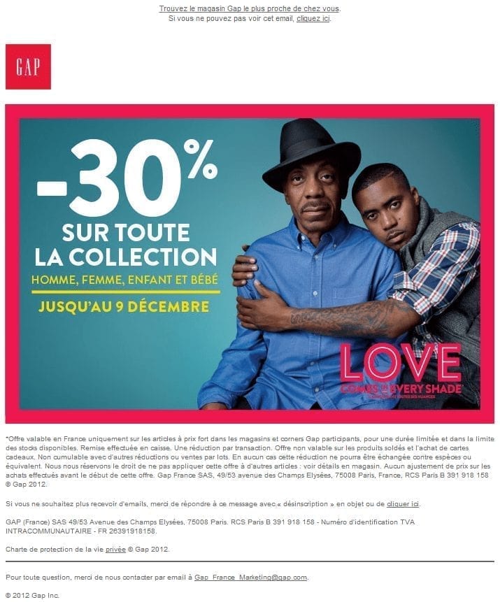
Let's be honest this email is graphically successful! And that alone is not always obvious. The design is simple and striking, the production time was certainly very good!
For example, if the email (or at least the main message) is exclusively made of images, the ALT Tags are present and the email remains perfectly readable.
But while this email is good, it still won't fit into the (rare) Goodsenders category. There are still a significant number of inaccuracies and details that could have improved the consumer experience.
Link between email subject, visual and message
The subject of the email talks about a discount on the Gap winter collection, but if you go and see the screenshot of the email (at the end of the article), you'll see that the picture used is not really related to winter. On the other hand, if you click on the image, the landing page shows us a clearly winter-oriented visual (the photo above) ... but no more information on the promised discount.
Call-to-action
On the main image of the emailing, a link was placed ... probably because it was necessary ... unfortunately, no incentive to action, and for good reason, the link leads to a page that has no relationship with the proposed promotion ... a missed act!
Text version
Need help?
Reading content isn't everything. The best way is to talk to us.
A good start, there is a text version to this email ... unfortunately, no relation to the message, it is a text version probably common to all Gap emailings.
And other things
You know the (at least temporary) obsession of Badsender with the No-Reply issue. And on this point, there are obviously practices to change. In the footer of the email, we invite users, in case of questions, to contact Gap at Gap_France_Marketing@gap.com ... but this is neither the address used by the From field, nor the address used by the Reply-to field.
Gap France doesn't seem to have a website, only a few pages in French on the European website (www.gapfrance.fr return an error). Difficult today, for a retailer to make a newsletter without having a drop point on the web (whether a site, a Facebook page ... or something else).
Note: With this week's Badsender, we are adding a point to the checklist that is "Mobile Ready". This point (OK, KO or Bof) indicates if the email was designed to bedisplay correctly on smartphone or tablet.
Identity card
Generic email information:
- Subject of the email Last days to benefit from -30% on the entire winter collection
- From : Gap
- Preheader :
Find the Gap store nearest you.
If you can't see this email, click here. - Platform of routing : Exacttarget
Checklist :
- Link to privacy : OK
- Link to unsubscribe : OK
- DKIM : OK
- Text version : Bof
- Text to Image Ratio : KO
- List-unsubscribe : OK
- Friendly reply : OK
- Mobile ready : KO
Screenshot of the email
