Like Frédéric Lefebvre, I have received threats... I have been ordered to write an article soon... Mr. Jonathan Loriaux has even warned you, faithful readers (I quote, from my list of serious prejudices, number 18.2017: " But don't worry, I know that Thomas is working on a new article ") Either way, manners will gain what friendship loses! I especially like to offer quality in my nightly essays, and I think this will be one of them!
I don't usually do this, because I'm not originally an Artistic Director. Am I artistic, by the way... I really think so, but purebred? What do I know and what do I care... But it's my choice, what shall I say? Of my duty... To inform you of an essential point (lived, otherwise it wouldn't make sense) on the design of your email templates and the choice of websafe typography. Let's play this back from the beginning (I did English LV2 in secondary school, that'll blow your mind!) :
You have integrated all the technical constraints of email marketingYou start to create designs that are self-evident when it comes to integration. You even manage, you rascals, to design fluid models that will fit on the Gmail App, and you can be proud of yourselves! You go from one mock-up to the next, just as others might go from one Fistiniere to the next (one joke too many)...
Of course, you have a clear conscience when you incorporate text in Arial, Times, Tahoma, etc. into your layouts... Because you've been told 100 times that these are "web safe" typefaces and that, without any problem, they will pass through HTML integration as plain HTML text in an email, so you can rest easy...
"Let us tell you that you are preparing yourself for sleepless nights, migraines, nervous breakdowns as they say nowadays..."
Paul Volfoni, "Les Tontons Flingueurs
Because once you've done the int tests, you may soon get feedback like this: "That's strange! The typeface doesn't seem to be the same as what you suggested on the mockup?" or "It looks like the typeface is vibrating and not readable". Often, it is on Friday at 4:07 pm this type of return, and the campaign must of course leave in 4 minutes...
So for the "vibrating" typeface (the expression is not banal but it is lived and describes rather well the concern which arises) This is often the anti-aliasing that you will have proposed (or not) on the model, which will, in reality, depend on the system and possibly on the end user's application. There is no (in my opinion) that what I will call "bastard" solutions to counter this which do not work everywhere. Simply explain to your end customer that antialiasing depends on the system and the application, and make a habit of laying out your raw text without antialiasing, to avoid any unpleasant surprises.
Now the question "That's strange! The typeface doesn't seem to be the same as what you suggested on the mockup?"
"My boy... I don't want you to think I'm old-fashioned or even rude... The man from the pampas is sometimes rough but always courteous... but the truth obliges me to tell you: your Antoine is starting to break my heart!"
Fernand Naudin, "Les Tontons Flingueurs" (The Gunslingers)
You test again and again, cursing the email rendering platforms, but you should know that they've got nothing to do with it: because what they've probably failed to tell you is that websafe typography in an email may be websafe on Windows... But not necessarily on the Mac. This misadventure happened to me recently, when, convinced of my skills (and especially Dreamweaver's automatic tips) I decided to introduce Comic Sans MS in my layouts (yes, yes, yes, yes) I know what you think of the Comic Sans MSbut when you work on newspapers and magazines for children, I think you can try it...)
"What happens next is incredible!"
Buzzfeed (don't pretend you don't know it, we all clicked on it at least once)
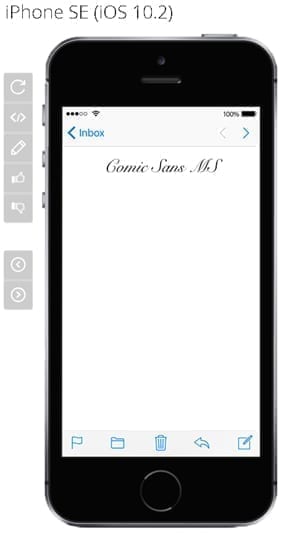
When testing email rendering: surprise! No Comic Sans MS on iPhone SE, 5S, 6, 6+, 7, 7.

So when I delivered it, I realized that while this typeface was well supported on Windows and Mac, it wasn't necessarily supported on iOS... You're beginning to know me: I had fun testing all the typefaces Dreamweaver automatically suggested when I assigned the CSS property font-family and ch'boum! The Lucida Console also poses quite a problem, even on Apple Mail 8, 9 or 10. After some quick research into the support of these fonts on the Mac, I found a site listing "websafe" typefaces and their percentage of support on Windows or Mac.
It all makes sense now. Be well aware of this before proposing a layout: always be sure that the proposed typeface won't cause any problems. This goes without saying when you start using websafe typography in an e-mail, but mistakes can still be made. And I'm proof of that! (yes, I'm a one-man mistake).
So, also take the time to check the support of your websafe email fonts on iOS for example. Don't make the same mistake as I did!
Strongly and warmly recommended :
https://www.ampsoft.net/webdesign-l/WindowsMacFonts.html
You will learn for example that MS Sans Serif or MS Serif is not a typeface made to be in other sizes than 8, 10, 12, 14, 18, and 24 point or that Comic Sans MS does not work on Safari other than in font-style:normal (even if I didn't encounter this problem, but well... Comic Sans MS and I are now ancient history... Comic, it's over... And to think that you were the typeface of my first amoooooour...).
Twenty or so film and music quotes are hidden in this article, will you be able to find them? And ho!!! heeeeeeeeeeeeeee !!!! Don't rush off like that! Share and spread the (I'll refrain from specifying "good") word around you!
Leave a Reply