Good morning, readers! Or according to Marion Duchatelet Bajeux, "ça farte" ? It's been a while, hasn't it? As someone wiser than me would say: you hit the bar, but sometimes it hits you... All this to say that I am inspired in this evening of April 18and especially since I consulted a specific guide #emaildesign written by Stack Overflow.
I immediately thought of sharing the content with you, while analyzing their recommendations, translating some of my favorite passages, but also comparing with our integration and design methods at Badsender. And this, while going three times around my underwear, towards Beijing!
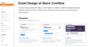
So this guide was designed for anyone working on emails at Stack Overflow. And I'm thinking this is finally the kind of documentation that should exist in any company working on email marketing. Let's not be afraid of the words.
There are many chapters, clear and concise, which allow to know what it is possible to do, which rules to respect, which good practices to know (both on the design and on the code)In short, it is a kind of little bedside book or reference manual. Because this not only ensures consistency in the multitude of emails producedbut this also accelerates and optimizes the production process. And we all know it: Time is money. Let's skip these philanthropic mundanities and get to the major chapters of this document:
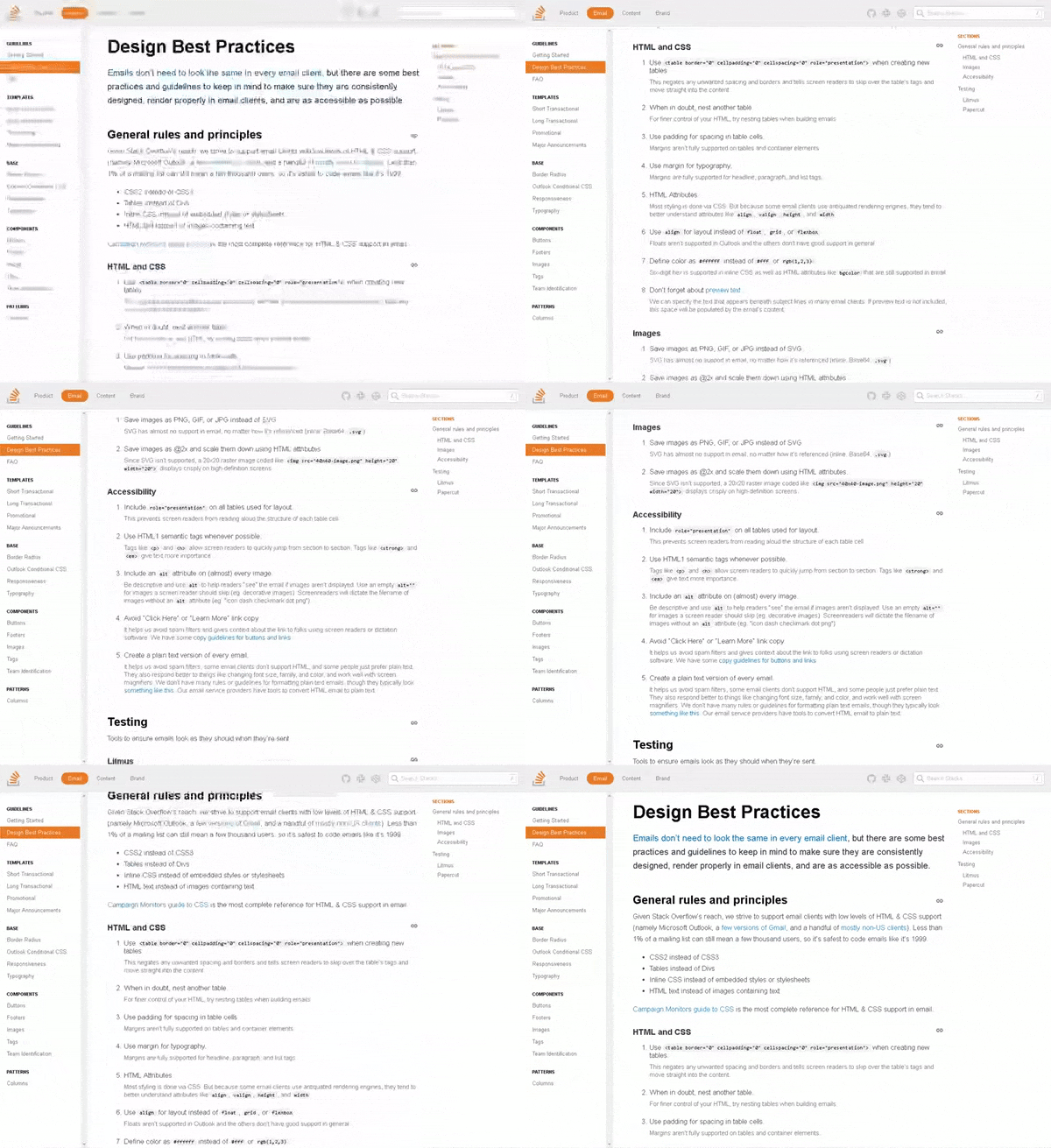
Design best practices
- Emails do not have to be absolutely pixel-perfect on all email clients. It can't be repeated often enough, but this is no longer the main objective of an e-mail campaign. There are many other areas to focus on: deliverability, accessibility, responsive... In short, make sure that your campaigns are correctly rendered on mail clients.
- Less than 1% of a mailing list can still represent a few thousand users (depending on the volume of your Base, of course). Therefore, you should not neglect all email clients. It is therefore "safer" to code emails the way we used to code a site in 1999 (I was 13 at the time, so I know what I'm talking about...) Either:
- CSS2 instead of CSS3.
- table instead of div.
- CSS instead of separate style sheets or styles in the <head>.
- HTML text instead of images containing text.
In HTML and CSS, you should remember:
- Use <table border=" »0″" cellpadding=" »0″" cellspacing=" »0″" role=" »presentation »"> when creating new tables. This removes unwanted spaces and borders, and allows screen readers, via the role= "presentation " to ignore the tags of the <table> and to be directly interested in the content.
- In case of doubt, nest another <table> .
- For internal margins in a cell, use the CSS property padding . The property margin is not well supported on the <table> or "container" elements.
- Define the colors in the form #FFFFFF instead of #FFF or rgb(1,2,3) . The 6-digit hexadecimal codes are interpreted both in the styles and in the bgcolor .
Not to be used:
- CSS properties float , grid , or flexbox . The first one is not supported in Outlook, and the other two generally suffer from poor support.
On accessibility:
- Include the attribute role= "presentation " on all <table> used for the layout.
- Use semantic tags whenever possible. In other words, the <p> , <h> , <strong> and . The first 2 allow to distinguish the hierarchy of informationwhile the last two give more importance to certain pieces of text.
- Add the attribute alt on each image, without exceptionand fill it in where possible, appropriate, and justified. If no alternative text is required, then leave the alt empty. This way, screen readers will know which images to ignore.
What if we have questions?
Stack Overflow pushes the professionalism to the point of thinking about a FAQexplaining in an educational way why it is necessary to write CSS styles inline, why there is however a <style> in the header, why it is not recommended to use an inliner, what about inheriting CSS properties in an email (a point I have never dwelt on until now, but on which I completely agree!)how the padding and margin in an email, what is the best doctype, what is a preheader/preview text, what width to use, when to leave these guidelines...
This FAQ is particularly usefuland sets the constraints with their explanations to any question a novice designer or integrator might have.
Need help?
Reading content isn't everything. The best way is to talk to us.
And more!
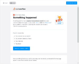
But the guide doesn't stop with these few chapters. It also takes the time to present the different "types" of email that could be handled: short transactional email, long transactional email, promotional email, announcement email. For each of these categories, a nomenclature to present the criteria of use, and a quick overview (mobile and desktop) rendering of the code with the possibility to copy directly the HTML code.
A BIBLE I TELL YOU!
And what I like most is the very clear and educational technical explanations. When it comes to explain the hybrid coding technique to clients, or the difference between Responsive and HybridIt's not always obvious. And yet, Stack Overflow does it I think in a very good way in their dedicated chapters to the Outlook conditional code and to Responsive. You will even find in the chapter dedicated to the "text very good little tips and advice, on how to interpret the tags , , or for example, or on the automatic formatting of dates, phone numbers, places or addresses, as well as on the automatic line breaks that you would like to prevent... There again, good little subjects that every emailing coding initiate has, one day, stumbled on.
As you can imagine, I fell in love with this document... Quite simply. I strongly encourage you to initiate this type of documentation for your company, or for your customers. (if you are an agency). Again, this is what will allow your campaigns (no matter what type of email you send) to have a certain coherence (and your recipients still like consistency, without falling into monotony of course! But it reassures them, and they will identify your communication more quickly). In addition, and this is probably the most important advantage, you will save a lot of production time (because you know where you are going) and you minimize (using templates) the risk of bugs or rendering problems. Finally, any new integrator or designer within the structure will know the rules to respect.
You'll tell me what you think, right? Tell me! SAY! YOU TELL ME! And if you need support for your emailing strategyor for HTML integration of your campaignsYou know we're here for that, we're here for that... But maybe you didn't know we had published a guide to HTML email integration on the other hand? Hm?


