Emailing designers, this message is addressed to you in particular (but don't take it the wrong way! Anyway I moved in a trunk ). In spite of our recommendations, I still see regularly passing, when HTML emailing integrations are ordered from Badsendermodels, models that do not "respect" the "visual/text" dissociation... I won't name names, even though my passion is denunciation. So maybe the term is not clear, it's true. Maybe I'm fuzzy, that's true too. The proof, you don't see me. So this is an opportunity to get the facts straight on the subject. Get out your Petit Robert (the dictionary)we're going to eat definition.
Dissociation Pronunciation and Orth. : (dis?sjasj??) Action of dissociating; separation of elements that were united.
Larousse.fr
I don't think it could be any clearer. Any questions? Our recommendation at Badsender in the field of emailing design is to separate as much as possible the "graphic or visual" elements from the "text" elements. And if a concrete case speaks to you more, so let's get down to the nitty-gritty, little rascals!
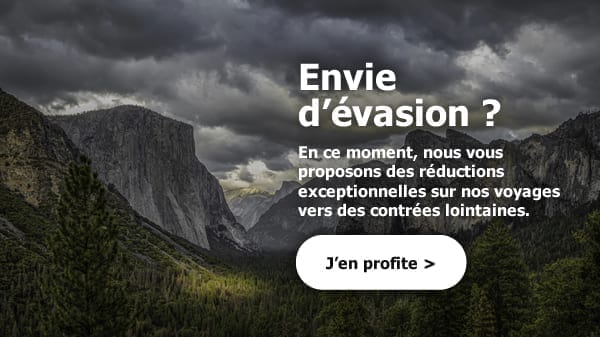
Well, we can imagine a bat This insert in an email... Nothing too fancy, I assure you, I created it on the fly for the needs of the article. A title, a text, and a Call to Action, all above a visual. This is the most common case. So, explain to me why we put the "text" content above the visual? Hm? Yes, ok, we gain height... But on the technical side, what's going on?
First scenario
In the first technical case, we decide to make the whole insert an image, so we don't have to worry about it, noon to 6 pm, pif paf pouf, and we add an alternative text with a clean graphic formatting. This would give us, in the best case, this in the end when the image is not displayed:
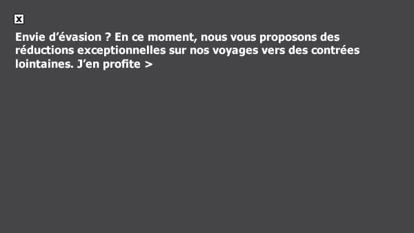
Which is good, but not great.
Second scenario
We take care of ourselves (calm down) and we consider the image as a background imagewith a title, text and a Call to Action designed in HTML and CSS on top. It's already much better, and there's no point in giving you a visual of what it could look like: basically, it should display correctly almost everywhere (well, that's if you manage the use of background images, VML, its support on Outlook and 120 DPI really well);
Small aside: To correctly generate your VML code to support your background image on Outlook, you can use the very good Campaign Monitor tool backgrounds.cm (even if it will remain some corrections to be made for the 120 DPI).
In short, it will not be a pleasure in terms of codeand your integrator may be in for a rough ride (let's be polite). This kind of integration method requires much more testing, and in terms of support, we have to forget about some specificities : background images on mail clients that don't support them, the shadow on the text that won't be correctly transcribed on most mail clients, or the rounded corners of the button, since VML can't be inserted in VML (and buttons like that are generated from buttons.cm). But then, what is the right solution?
Dissociate visuals and texts, again and again!
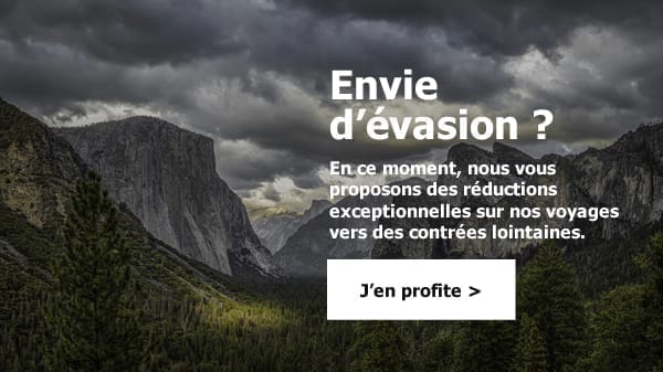
And I'll prove it to you with a concrete example: if I'm an emailing designer, I can design this insert in other ways.
We stay on the same format but we dissociate

This is one of the first possibilities. Ok, it's a little less sexy, but there are many advantages to this type of layout: I can finally design my texts and my Call to Action entirely in HTML and CSS, without complicating the code with background images, or incompatibility of background images and the button in VML. That's the first advantage, and not the least, my lady!
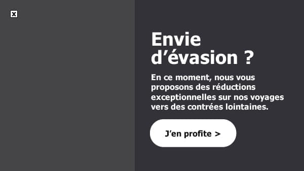
The 2nd is that on email clients that do not display images by default, or if the image link is broken, or if the images are not downloaded or displayed (depending on the user's configuration), I still have a good part of my formatting that will be kept! The proof:
The 3rd advantage will be the mobile version of the email. And we can't do without the mobile version, as you well know, especially when we see that Mobile browsing is starting to take over both desktop and webmail solutions. If I go back to my very 1st solution, which was to make the insert a big image, this is what I get on mobile:

Do you understand the message ? No, because I have 10/10 on each eye and I don't understand a thing... Well, I'm going to the extremes, since I considered that it was the rendering of an email on a mobile with a resolution of less than 320 pixels wide... But still, Anselm! WE CAN'T LET THIS GO! The user experience is rotten!
So the solution would be to design a version of this image specific to the mobile version, in this style:

Now it's still readable. But the thing is that you (Emailing designer)you'll be adding to your workload, becauseyou will have to prepare 2 versions of your insert. If there are several inserts of this kind in your email, well good luck, 20 out of 20, long live France...
And on top of that, the Integrator will also have to work a bit more on the code, so that the Desktop image does not display on the mobile version, and the mobile version does not display on the Desktop version. And it doesn't stop there, you unfortunate man! This also means that you will have to set up the same hyperlink twice (and if you ever have to change them and you forget to change one or the other, it's a disaster, it's a disaster... The disaster)
If we consider the second possibility, which was to design the image as a background image, you should know that you will probably have to design the background image on another format as well (square for example) for the mobile version and that it will also require a little more work from the integrator. So why not simplify your life?
Don't we look good? Are we? Peaceful, cool...
Because finally, the solution of dissociating the texts from the visuals will make it easier to obtain this type of result:

And this without touching almost anything (in any case at the design level, the integrator will just have to make the two cells pass under each other). Finally, we can get to the bottom of things (it is always better ) and imagine that the two elements, visual and text, are completely dissociated!
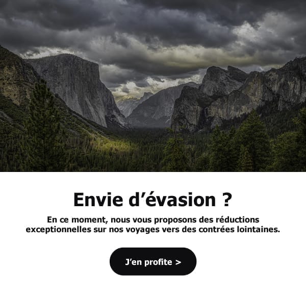
I admit, I'm getting carried away here because it totally changes the look of the email. However, the visual has much more space (and when a visual is beautiful, you might as well let your recipients enjoy it, it sometimes works better than a long speech), that it breathesand that the textual content and the Call to Action can, once again, be completely designed in HTML and CSS (and there for the blow, nothing to do for the responsive!)
That's it for me. I hope I've made myself clear. Don't come back Always remember to make it easy on yourselfIn any case, if you ever need help with email design, know that Badsender will always be there for you!
Leave a Reply