Table of contents
You wish to insert a Call to Action in raw HTML within your email campaign? What a great initiative! This will enable your button to be displayed more quickly, even if images are disabled, and will therefore probably improve your click-through rate! By the way, Jamy...
What is a Call to Action?
Call to Action (inciting to action in French) is a wording that encourages the advertising contact or the recipient of a direct marketing document to take an action sought by the advertiser more or less immediately.
definitions-marketing.com
The Call to Action is a sentence like "Click here" or "Buy now", often contained in a button. (but not always). A Call to Action can take many forms, but in this article we'll be focusing on "buttons".
Why is a Call to Action important?
Because it is the main marketing tool used to get a recipient to convert. End of story. Go home. And, once you've got that objective in mind, you can't ignore certain key criteria that contribute to the strength and power of this element.
One of the aims of email marketing is to get web users to click, to incite them to take action. Calls to Action are therefore an incentive to action, to click, especially in email. They are undoubtedly one of the most important elements in emailing content: they generate traffic to your site, sales of your products, and you are normally able to quantify the click rate on this type of element...
At present, many mailings don't have a Call to Action, even though their aim is to sell products online.
How do you create a graphical Call to Action?
- Place Call to Identifiable actions in your mailings.
- Place them so that they appear at first glance, without having to scroll! Don't wait until the end of the email to insert them! So that it's impossible not to know where to click.
- Repeat the CTA at the bottom of your e-mails if they are long.
- Create buttons that contrast sharply with the background color of the email: accessibility is also important in emailing friends! Is the contrast between the button background color and the text color sufficient? Is the typography used legible? If I use a background image, and my background image isn't displayed, will the text still be legible? If I design my button as an image, and the images aren't downloaded, what happens?
- If possible, reuse the main subject of your email in the Call to Action text. (as long as it stays short).
- Make sure of its size and therefore of its click zone Is the button easily clickable? Can I make it fully clickable? Is it as easy to click with a mouse as it is to "tap" on it with my finger on the mobile version?
- Check readability on mobile devices Shouldn't I increase the text size on the responsive version to make the button easier to understand on mobile devices?
- Take care of its appearance: our web habits sometimes lock us into "a priori" styles or layouts. A button is usually designed with rounded corners and sometimes a drop shadow, a button hover effect in the email or on click, with a pictogram in addition to the text... Can I, or do I have to, guarantee these graphic layouts when designing a button?

How do you write a Call to Action that converts?
I'm telling you right now, don't count on the "Learn more", or "Discover", or even "Buy". No. If you want to convert my darling, you have to innovate, surprise, arouse curiosity. Because "Discover" buttons are everywhere, and you want to stand out from the crowd, make your products exceptional and captivating.
It's all about sending out the heavy stuff. All the while remaining coherent with the topic/product being promoted. For example, for bedding products, you might consider Call to Action content such as "Sleep, child dooo", or "Sweet dreams", or "Rest, at last". And again, I'm moderating! According to editorial charter and the tone of your brand, you'll know which wording to adopt.
However, there is one point to bear in mind: accessibility. If you really want to comply with good accessibility practices, it's essential that the content of your Call to Action reflects the action the surfer is going to take. It's essential that the text of your Call to Action is meaningful and informative if possible. The content proposed just before is therefore a little too "mysterious"... But it does arouse an emotion! So you need to know how to strike the right balance between the two. Good luck with that!
How do you design a technical Call to Action?
1. Design buttons with images
I'm telling you right now, we're not going to be friends. Designing image buttons in an emailing allows you to obtain all the desired effects in terms of graphic layout: rounded corners, drop shadows, and so on... But by doing so, you forget the fact that (or you hide it, it depends on your mentality) that images will not always be downloaded on your recipient's email program. Worse, you think you're safe from a server problem, and that the images will always be returned. Or you think your hosted image paths are foolproof, and you're wrong.
In any case, I hope you've come up with a concrete alternative text and a graphic layout of your alternative textotherwise "Well done eh...". In any case, I position myself as a fervent supporter of this method.
I won't repeat the example of what happens when an image is not displayed in the inbox, I already mentioned this in a recent article on the dissociation of elements in the emailing design. However, I'm going to focus a bit more on how to design a button in HTML and CSS, while giving it some style. So we go to...
2. Design buttons in HTML and CSS
Now we'll get along. This is without a doubt the best solution to adopt. Why?
- Because when the images are not downloaded or displayed, there is a problem in the paths of your images, or the server hosting the images is out, your button will still be displayed. For that alone, it's worth it.
- Because via media queries you can easily change the width and/or height of your button, and thus improve the ergonomics and power of your button by offering a more comfortable click zone.
- Because you can easily enlarge the size of your text and therefore, make it more readable on mobile devices. And this, always thanks to media queries. Isn't that wonderful?
- Because you can bring animations to the hover, to the click and that, that's great (Don't tell me that it won't be supported everywhere, I'm not interested).
- Because then, you don't need to add a fucking image of your button for the desktop version, and another one for the mobile version, and therefore, you don't need to fill in the button link twice. No alternative text to add, and no graphic formatting for this alternative text. Sliiiiiiiip party!
How do you make a CTA clickable?
You want to make the whole button clickable in the email, not just the text, right? What's more, your Call to Action includes two lines of text. And some recalcitrant webmails still refuse to center this text vertically within the button...
Okay, so it's a bit more work in terms of code, but hey, that's what we like, isn't it? Let's start with a simple button.

Button with internal margins
If we want to code this button in HTML and CSS, we will insert a table <table> with a fixed width (or not) centered within a cell <td> (or not, it all depends on the final result). In this table, there will be (as logic would have it) a line <tr>inside which we will have a cell <td>. And on this cell, we can apply a black background color, with border-radius:5px for example. And now we just have to insert the text in a paragraph in the cell <p>and this text will be included in a link <a>. When you say it like that, it sounds fuzzy, but here is the final code:
Now you can go a step further, and have fun designing effects on these buttons in HTML and CSS. (which you couldn't necessarily do when it was an image). I'll give you an example of what it can look like on the fly:
See the Pen QWbyrOv by DEFOSSEZ (@Badsender) on CodePen.
I skip the email preview tests, everything is ok everywhere (well, rounded corners aren't displayed everywhere, especially on Outlook, but that's no big deal, it's called in email marketing the acceptable degradation…). This is probably one of the methods that has the best support. The advantage is that there is no need to specify a width or a height, since everything is managed with the internal margins: this leaves a lot of freedom on the content, and the button automatically adapts to its content. However, in this case, only the text is clickable, and not the whole button. This can be annoying... But there are solutions!
Need help?
Reading content isn't everything. The best way is to talk to us.
For example the technique developed by Mark RobbinsIt's all made up of a few conditional Outlook comments, but nothing really, I assure you. And if you're really not at ease with code, Matthieu Solente, a talented email developer, has put together a very good code generator for developing fully clickable buttons. All you have to do is fill in a few fields, and that's it!
Button with borders
It is a method developed by Litmus that I find relatively interesting, even if unfortunately, it suffers from a degraded rendering on Outlook tag: basically, the system consists in providing margins around the text as borders designed directly on the <a>. This same tag will be designed as a display:inline-block. But Outlook reduces the size of the borders, so... Here's the code for this method :
See the Pen Button HTML CSS email borders by DEFOSSEZ (@Badsender) on CodePen.
Button with internal margins + borders
Well, simply put, if both methods have their advantages, then we'll compile them. Again, on the support, it's not the best, but it works quite well anyway. So here is the code adapted to this method:
See the Pen ZEGQopa by DEFOSSEZ (@Badsender) on CodePen.
As the support of the internal margins on the left and on the right is not necessarily optimal on Outlook, Litmus recommends to set up a small hack with conditional comments for Outlook to insert unbreakable spaces on the left and on the right of the text... Mouairf...
And if you absolutely want to have the button fully clickable and guarantee the rounded corners: There is the VML.
I won't go into detail, I don't understand this system at all and I'm not a fan of 100%. I'll tell you why:
- This solution does not allow to have a text that can evolvesince the button must be given a fixed width and height.
- Forget also the possibility to have a button with two lines of text for example (even if it is quite rare).
- A VML code cannot be nested in another VML code so, if you manage an insert with a background image via VML, you won't be able to have a VML button inside this same insert... CQFD.
On the other hand, the big advantage of the VML is to have a background image inside the button. That's interesting. If you want to use VML, you can go directly to the button generator, developed by Campaign Monitor. Don't forget to don't put your fingers in the door, you risk getting pinched very hard fill in a target="_blank" in the VML code.
Here too, I can only recommend another Call to Action generator with internal margins, VML and border produced by Matthieu Solente! There's a second, also based on internal margins, which generates the properties mso-text-raise, letter-spacing, mso-font-width. I'd like to say "Thanks who?" : "Thank you Matthieu!"
And what about the mobile then, do we do nothing?
Well, yes, we are doing something! As difficult as it is to make a button fully clickable on the desktop because the CSS property display attribute with the value presentation to all block is not supported everywhere (mainly Outlook)on mobile, the Outlook software is not really the priority! We can therefore pass our link <a> in behavior block and why not give this link internal vertical and horizontal margins, to make the whole button clickable!
<style type="text/css">
.hover01:hover {
  background-color:#000000 !important;
  transition:all 1s ease;
  box-shadow:0px 5px 0px #202021 !important;
}
@media only screen and (max-width:600px) {
.displayblock {display:block !important;}
.paddingt0px {padding-top:0px !important;}
.paddingb0px {padding-bottom:0px !important;}
.paddingt15px {padding-top:15px !important;}
.paddingb15px {padding-bottom:15px !important;}
}
</style>
<table width="100%" border="0" cellspacing="0" cellpadding="0">
  <tr>
    <td align="center"><table border="0" cellspacing="0" cellpadding="0" style="margin:0px auto;" align="center" role="presentation">
        <tr>
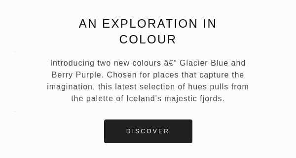
          <td class="hover01" bgcolor="#202021" style="border-radius:5px; -moz-border-radius:5px; -webkit-border-radius:5px; padding:15px 40px; background-color:#202021; background:#202021;"><p style="padding:0px; margin:0px; font-family:'Trebuchet MS', Arial, Helvetica, sans-serif; font-size:12px; text-align:center; color:#FFFFFF; letter-spacing:4px; mso-line-height-rule:exactly; line-height:16px;"><a href="#toreplace" target="_blank" style="color:#FFFFFF; text-decoration:none;" class="displayblock width100pc paddingt15px paddingb15px">DISCOVER</a></p></td>
        </tr>
      </table></td>
  </tr>
</table>
That's it! Same thing, don't talk to me about support, that's not the idea : we're here to S'A-MU-SER ! Too much effect kills the effect, my friend, use it with moderation... Do you have any particular method to code a button in HTML ? How do you do it ? Tell me everything, I'm curious...
In any case, there's no shortage of solutions! A lid for every pot (nothing to see, single thread). In any case, now you've got some ideas about how to get rid of the image of your button, and that's already a good thing.
Some examples of Call to Action in an email.

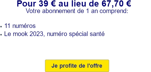
Here's a Call to Action that couldn't be more explicit. An email from 60 Millions de Consommateurs features a special subscription offer. The Call to Action is clearly explicit, involving an action verb and a subject. The contrast between text and background color is sufficient. It works!

Avast sends an email to inform you that payment has failed when automatically renewing a subscription, and states that all you usually need to do is update your payment details... Never mind, let's click on the aptly named Call to Action "Update 🙂

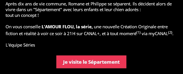
Now that's interesting... Canal+ informs me that a new series is coming out, with a story about a divided apartment, a "Department. And to invite me to discover the series, Canal+ is not content with a simple "Discover the seriesbut innovates and includes me in the series by writing the content "I visit the Department. I'm intrigued, they've won.

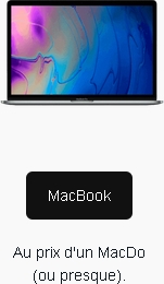
What I love about this Call to Action made in Back Market is the "caption" or clarification BELOW the Call to Action. The content of the button is very informative, very concise and concrete, while the caption adds a touch of humor and an offbeat tone. And I appreciate that.
Note: This is a curiosity worth talking about; Terra, ISP in the United States, Spain and 16 other Latin American countries, not only adds a target="_blank to any link code that you might put in your presentation (as in this example), but keeps the formatting of your HTML code for display. In concrete terms, if your HTML editor proposes an indentation of your code, Terra will transcribe it in the same way. This explains many of the questions you might have about the strange email rendering in this webmail!