On April 28th (in full confinement, yes), I bought a tablet on the FNAC website. I've been wanting to do a little analysis of transactional emails received after a purchase for a long time, and then with Marion's article the other day on the use of theemailing in retailI thought it was a good time!
We are not going to talk about the act of purchase itself, but rather the email that follows this purchase.
Disclaimer: This article is written in "survey" mode, so it is less structured than a emailing audit since I report my discoveries... in order of discovery 😉
Identification of the sender
The first email arrives a few seconds after the purchase, it's great. However, the first surprise is that it comes from "customer service". You have to look at the subject line to understand that it's an email from FNAC.

We recall that an Internet user who reads his emails first scans the list of senders. His eyes will stop on those he knows personally and then on the brands he has a relationship with. Only then will he read the subject line to decide whether or not the email is worth opening.
Unfortunately, transactional emails receive too little attention and are not always sent from platforms that are designed to send mass transactivity.
So, let's take a look at where the email comes from and why it's not there. sender name in email. To do this, we'll take a look at the message header.
Small excerpt from the header:
From: service-clientele@fnac.com
To: xxx@gmail.com
Date: 28 Apr 2020 20:09:54 +0200
Subject: Your Fnac.com order of Tuesday 28 April 2020
Content-Type: text/html; charset=utf-8
Content-Transfer-Encoding: base64
Message-Id:
Looking at the "From:" field, we can see directly why the brand name is not displayed. There is no alias, the customer service email address is present in "raw" in the message. We should/could have had something like :
From: Fnac - Purchase <service-clientele@fnac.com)
In this case, in the list of senders we would have had 'Fnac - Purchase', which would have allowed us to have the brand AND to differentiate from the other emails sent by this one (yes, because a purchase, we must be able to detect it right away).
Other interesting information in the header
(We reassure you, further on there are ergonomics, design, content. If the technique gives you buttons, do not hesitate to jump)
Since we are in themessage headingWe might as well go on and look at some interesting elements.
Sending solution
We had talked about the sending platform, so let's look at how to find out where or what the email came from. For that, several solutions. Either, an "x-header" can enlighten us by giving us a clue, or we will have to look at the sending IPs.
Nothing interesting on the x-header side (there is not a single one coming from the sending server), so we will look at the IPs side. To do this, you have to look for the part in the header dedicated to authentication and "bounces" of the email:
Authentication-Results: mx.google.com;
       dkim=pass header.i=@fnac.com header.s=dkimmtp header.b=vfe348+4;
       spf=pass (google.com: domain of service-clientele@fnac.com designates 193.108.68.2 as permitted sender) smtp.mailfrom=service-clientele@fnac.com;
       dmarc=pass (p=NONE sp=NONE dis=NONE) header.from=fnac.com
Received: from FCS1WPWEBFR2 (unknown [10.178.39.87]) by mta12-fnacdarty.fnac.com (Postfix) with ESMTP id 1F1C5AD877 for ; Tue, 28 Apr 2020 20:09:54 +0200 (CEST)
We can deduce that the IP is 193.108.68.2 since it is validated by the SPF test (if you want to know more about theemail authenticationWe have an article about it).
Interestingly, in the line "Received:" we see a "Postfix" in parenthesis. We could stop here, the sending server is therefore Postfix (an opensource solution) installed on the servers of Fnac Darty which sent this purchase confirmation email.
We will still see who owns this IP address via a WHOIS query. 2 times out of 3, the IP address belongs to a router, here it is not the case, it belongs to FNAC Darty en direct.
Email authentication
Authentication in emailing is the possibility to guarantee that the sender of the message is who he claims to be (well, it's a shortcut, but that's about it).
Here, everything is fine, as we have seen above, in the header extract, the three main standards (SPF, DKIM and DMARC) have a "Pass" status.
We only regret that the policy DMARC of fnac.com or none. This excludes de facto an effective protection against phishing and no preparation for the arrival of BIMI. However, it seems that there is some DMARC monitoring (to be confirmed).
The object
In this purchase confirmation email, the subject line is :
" Your Fnac.com order of Tuesday 28 April 2020 "
First remark, if we had the brand name in the sender name, the Fnac.com would have been superfluous (but hey, it only saves 8 characters). On the other hand, good point for the personalization with the date that allows the recipient to validate that it is indeed his transaction that we are talking about and that there is no usurpation.
On the other hand, it seems that other writing axes could have been chosen, like thanking the buyer, proposing directly the order number in the object, reassuring, ...
Small proposal without much thought:
Thank you! Your XYZAZERTY order is in good hands
Pre-header
I voluntarily put the part dedicated to the pre-header under the title dedicated to the object, since it will reinforce the latter (you follow me?). If you have never read it, I recommend our article on the value chain in an email.
Anyway, this is what the pre-header looks like in the email list:

If you zoom in a bit, it looks like this:
Need help?
Reading content isn't everything. The best way is to talk to us.

So we find ourselves again with the name of the brand (already present in the object), and with the beginning of important information, which is the order number.
As a reminder, the pre-header automatically takes the first words present in an email and puts them next to the subject if there is enough space left. It allows to have additional arguments to encourage the opening or to communicate additional information. There are now techniques to display a pre-header next to the object... which is not visible in the content of the message. This is an element that is very well controlled.
In an ideal world, we should have :
- Sender: Fnac - Purchase
- Subject: Thank you! Your XYZAZERTY order is in good hands
- Pre-header: Track your order on our site.
I like pre-headers that contain a call to action. And in general, when you've just bought something, you need to feel that the order is under control, nothing like an incentive to "Follow" the order.
We open the email!
The first thing that jumps out at you when you open the email is that Fnac displays a summary of the order directly in the Gmail interface (without any trace of the specific markups in the email source).
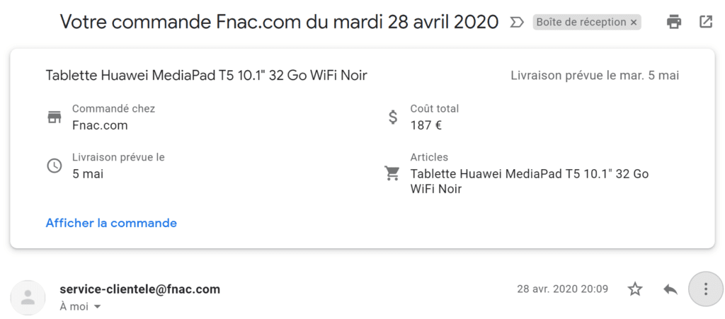
The advantage is obvious, we are immediately reassured about the content of the order and we find ourselves with a summary of the essential information that we must find in an email of this type.
We go down a little in the message
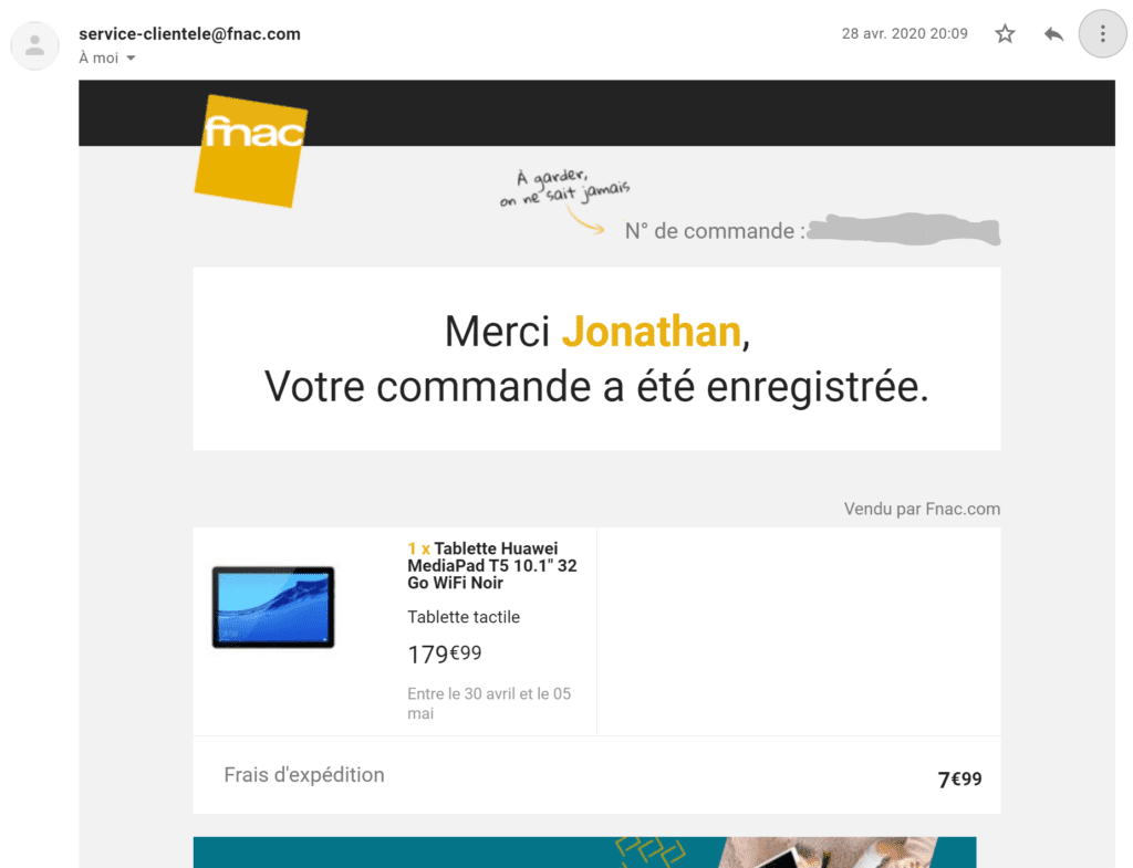
Ok, so here we are again confronted with our value chain. In the upper part of the email, there are three main messages: the order number, a thank you, and a validation of the order.
A quick recap of the original email value chain:
- Sender: service-clientele@fnac.com
- Subject: Your Fnac.com order of Tuesday 28 April 2020
- Pre-header : Fnac Order number xxx
- Over-title: Order number xxx
- Main Title: Thank you Jonathan, Your order has been registered.
We can clearly see that the space is largely wasted. Out of the 5 elements, we keep only 3 messages: Validation of the order, thank you and number.
By having a better distribution of information, we can get much more information across:
- Sender: Fnac - Purchase
- Subject: Thank you! Your XYZAZERTY order is in good hands
- Pre-header: Track your order on our site.
- Main Title: (Follow) your order n°XYAZERTY
- Subtitle: We will send you your tracking number by email as soon as your package is ready!
There, we multiply the messages that are passed: Validation, thank you, number, follow-up, delivery. Without significantly increasing the space taken by the text.
And the ergonomics in all this?

Calls to Action
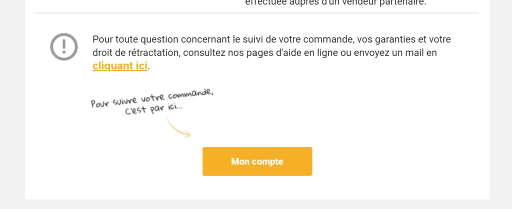
First, you have to go very low to get a first identifiable link or call to action. And again, the main call to action of the email that should have been "Track my order" turns out to be a banal "My account". Not so great!
Information hierarchy
There are headings. A main title (Thank you Jonathan, Your order has been registered.), at the top, and two intermediate titles, namely "Payment" and "Delivery". When you put it that way, on paper it doesn't look so bad. In reality, the two intermediate headings are in gray on a gray background, and you can't really say that they give the email any rhythm.


Moreover, in the part that we think is dedicated to payment... we find information dedicated to the order tracking (and the famous call to action).
Also in the delivery part... we talk about billing address... It's a little hard to follow the logic.
Missing elements
The first is not really a missing element, but a missed opportunity. In the email, there is a block promoting a "Serenity Pack".
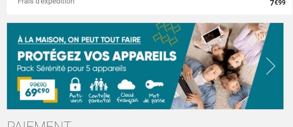
The objective for Fnac is to sell in cross-sell a security software for household appliances. We can guess that the block is automatically personalized according to the type of purchase (or at least the most expensive product). Unfortunately, we have here a simple image banner. Probably simpler to maintain, but not really in line with the design of the email, without call to action...
Then, even if I know that I will make people cringe, I will continue against all odds to militate for the smoothest possible customer experience... even if it's to make it easier for them to cancel their order. In this email, there is no trace of a button like: Cancel my order, modify my order, modify my delivery address, ...
Moreover, the cross-sell effort, if it exists, seems very light. When buying a tablet, it can be very powerful to offer me, at the last second (a little countdown?) to add an accessory in my order. From a logistical point of view, it is undoubtedly a challenge. From a ROI point of view... an experiment to try.
Finally, what's under the hood of our email?
130ko ! Caramba, just above the Gmail limit. The code is very very very full... even though the email is not that complex. It is probably important to review theHTML integration of this email to aim for a little more lightness.
We were not able to do a very thorough analysis, but here are some observations on the quality of the integration.
There are traces of really dodgy code (like we did copy/paste with our eyes closed):
  /* Copyright 2014 Evernote Corporation. All rights reserved. */
    .en-markup-crop-options {
No links are tracked. Neither click tracking, nor even tags for web analytics. In the same way, it seems that there is no tracking of openings. This means that the Fnac teams are totally blind to the performance of the email.
    <a href="https://telecharger-logiciel.fnac.com/lp/serenite-fnac" target="_blank">
      <img border="0" src="https://static.fnac-static.com/multimedia/fnacdirect/publi/mail/banners/Protegez-0320-640x200.png" alt="" style="-ms-interpolation-mode: bicubic; border: none; display: block; max-width: 100%; outline: none; text-decoration: none; width: 640px;" />
    </a>
There are some display bugs:
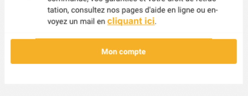
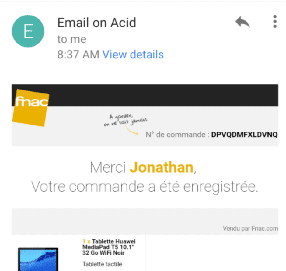
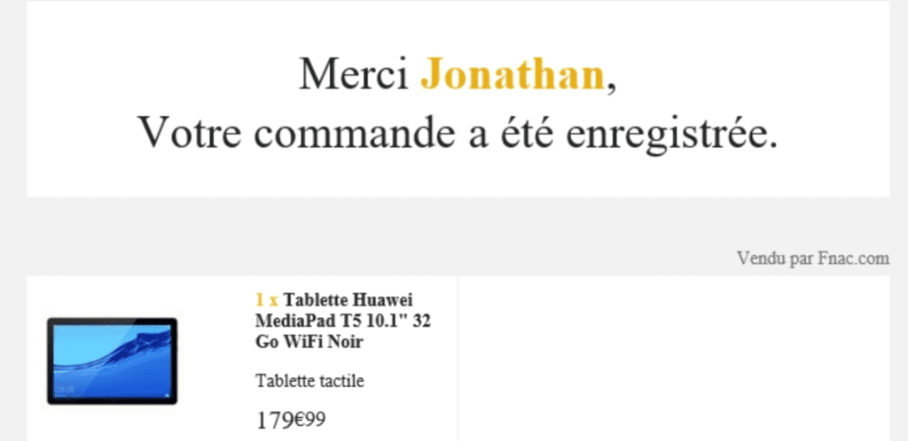
And again I haven't done a very complete tour of the issue 😉
In conclusion
Purchase confirmation emails are unfortunately often the poor relation of email MARKETING (and I stress marketing, yes, this email should be part of your strategy). We see it here with an email that looks like it was created a long time ago and is probably off the radar. There are some good ideas... and work to do 😉
In summary
Positive points to keep
- Deliverability: Speed of reception of the confirmation email that arrived a few seconds after the purchase.
- Deliverability: Authentication validity (SPF, DKIM, DMARC)
- Writing: The object is personalized with the date of purchase
- Gmail: Display the order summary directly in the Gmail interface above the email itself.
Points to optimize
- Sender identification = KO : The email is not identifiable as coming from FNAC,
- Authentication: the DMARC policy is at none which is a problem in the fight against phishing and does not allow to implement BIMI.
- Pre-header: The pre-header should contain information that reinforces the object, which is not the case here.
- Information hierarchy: the organization of the email needs to be reviewed from top to bottom so that the different information can be found in a logical place.
- ROI: more integrated cross-sell and up-sell offers would probably increase the ROI of this confirmation email (which usually have a "crazy" ROI even though they are not optimized for).
- Tracking : No tracking, neither on the links, nor on the opening. Impossible to follow the performance of the message.
- Rendering: Many display bugs in email clients. It seems necessary to start the integration from scratch.
Badsender, emailing expertise agitator!
Badsender is a team of craftsmen specialized in the various disciplines surrounding email marketing! Our emailing agency intervenes on questions of strategy, design, orchestration and deliverability. We offer this expertise in the form of coachingWe can also provide services such as audits, or act as an outsourced production force.
4 réponses
Speaking of FNAC there would also be a lot to say about the marketing pressure. 15 emails in April, sometimes two in the same day... 🙂
@François It will be for another time 😀
Thanks for the analysis. I had the same funny experience a few days ago: totally "irresponsive" email in Gmail app (the words are cut, letter by letter, on the line which gives an endless and unreadable email) and there is no online version (nor unsubscribe)! Clicking on View full message, we have the desktop version that appears, and going back a semi-responsive email that would have made a much better impression when opened 😉
@Benoit We are not at the end of our surprises 😉