Did we ever tell you that we love our readers very much? Well, with Benoît, we have known each other for a long time, we have crossed each other many times! And this weekend, he's taking the liberty of giving us some advice. To us. About our own newsletters. About our Dark Mode management! But what a nerve!
About Benoît Duchesne Benoît has spent his entire career in various agencies in Brussels. He started 15 years ago at Tagora, then Redleg, before moving to Beejee and now Serviceplan Group. He has worked on emails for advertisers such as the Fiat Group and Bouygues Telecom among others.
Come on, we pass the sponge for this time. On the other hand, we are not going to keep these good recos only for us! We copy/paste you the email of Benoît almost literally.
Benoît makes his Dark Mode
As you know, I've been following you closely for many years... actually even more so after being the anti-hero of a memorable article on the CNG, hey yes it came from Beejee, what memories!
Since then, time has passed and I have perfected my emailing skills, especially thanks to your help in launching the Bouygues Telecom project when I first joined Plan.Net.
Anyway, I continue to follow you and I must say that your " lives emailing" , the 24 days of email among others and especially your white paper on HTML best practices are real nuggets!
So I wanted to give something back to you too!
Need help?
Reading content isn't everything. The best way is to talk to us.
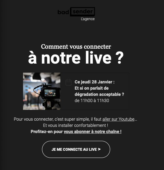
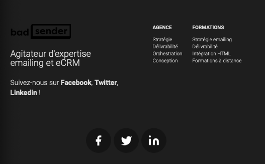
Having followed the Halloween webinar organized by Email on Acid on the dark mode, I started to optimize the emails of all my clients, and taking advantage (finally) of this lousy weekend to investigate in depth on the subject, I wondered how you did it... and that's when I noticed that your newsletter was globally well in dark mode, except for the logos and pictos (mainly in the header and footer) :
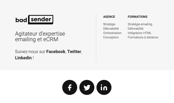
It seems possible tooptimize email rendering and target dark mode via @media (prefers-color-scheme: dark), but that's a lot of extra work and not the best solution.
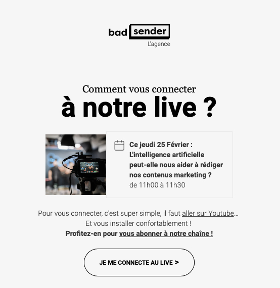
On the other hand, by adding a background color behind or around the images, we quickly obtain a much more telling result like this (and this has no impact on the "normal" version since the outlines and backgrounds are the #F6F6 or #FFFFFF that you use) :
In his generosity... Benoît even sent us the optimized images and pictos in a small zip file. Bless you Benoît!

One Response
Thanks for all the tips, it's a real gold mine.