Dear readers... HELLO BONSOIR!!! My dear Boss (for real, I don't mean the wonderful email Builder developed by Badsender)Mr. Jonathan Loriaux recently told me : "We should do some R&D on inserting a form in an email for a prospect". So why not take the opportunity to share with you, faithful readers, the content of this note of intent? Hm? I ask you? It's a rhetorical question.
I had been fascinated by the demonstration of a form for a large Swedish furniture brand (which I will not quote) by Cyril Gross at the 2018 Litmus Live. Now that's how it sounded. And then a Litmus newsletter with an interactive form in the spring of 2020 also blew me away. It is therefore time to make it a separate article, because finally, there is very little French content on the subject.
Note: Here we will focus on a form in an email in HTML and CSS exclusively, without using AMP4email. Forms with AMP4email are probably easier to set up, but it's not pure HTML code, and the evolution of AMP still leaves something to be desired in the emailing world.
How does a form work?
A form in a website requires several types of language (HTML, CSS, PHP, Javascript...). One of them, the javascript, causes deliverability problems in an email and directs your emails directly to the "Junk" folder. Ch'bim. It has often been said, rightly, that it was impossible to put forms in an email...
Advantages of a form directly in an email.
Forms can be a powerful tool to make emails more engaging and increase conversion rates. And yes! They save a step by offering recipients to answer questions without going through a landing page. Fewer steps means a shorter path to conversion. Shortening the path to conversion" means "increasing conversion". Who says "No palace" says... "No palace"... With a form, you can for example:
- Collect product reviews, or gather feedback.
- Conduct surveys.
- Allow your recipients to update their subscriber profile directly in the email (this would save the Preference Center step).
- Integrate lead generation forms.
- Personally, I met my wife through a form...
- And much more...
Support.
Because that's what we're really interested in! The support of this technique on the multiple email clients, webmails, email software and applications present on the market! The fear of using a form in an email lies in the support of this technique on email clients, let's face it. However, 4 of the 5 main email clients support forms in emails: Gmail, iOS Mail, Apple Mail and Yahoo! According to the site emailclientmarketshare.comThese alone account for more than 80% of openings. But it depends on your target, and their habits.
For example, Outlook's Windows desktop software uses Word as its rendering engine: it goes without saying that forms will not work or display correctly in Word. But then again, I guess that's to be expected.
Mail client | Support for the form | Notes |
Apple Mail | Yes | The method GET works as expected. The method POST opens a landing page with a form instead of submitting it from the email. |
iPhone Mail App | Mitigated | The method GET works as expected. The method POST does not submit. |
Gmail Desktop Webmail | Yes | Submits the form with a contextual alert. |
Gmail (iOS) | Mitigated | Does not submit in iOS GANGA. The entry POST is also disabled. |
Gmail Android | Mitigated | Only the method GET works, but opens a landing page with a form instead of submitting it from the email. With POST The form appears visually, but does not allow for user input. |
Gmail Mobile Webmail | Yes | |
Outlook on Windows | No | On some versions of Outlook, the fields are transformed into text. |
Windows 10 Mail | No | |
Outlook Mac OS | No | The form appears visually and allows the user to enter Microsoft email addresses, but does not allow submission. |
Outlook.com | No | Only submits when an email is opened in its own window, rather than submitting from the inbox. When submitting, the input attributes are prefixed with x_ This can lead to problems with data collection. |
Outlook iOS | Yes | |
Outlook Android | Mitigated | The form displays visually, but the keyboard does not appear to allow users to enter information. Users must therefore copy and paste text to be entered. |
Yahoo! Desktop Webmail | Yes | Submits with a pop-up alert. |
Yahoo! iOS | No | The form appears visually and allows user input, but does not allow submission. |
Yahoo! Android | Mitigated | The form displays visually, but the keyboard does not seem to allow users to enter any data. |
AOL Desktop Webmail | Yes | |
AOL iOS | Mitigated | The form appears visually and allows user input, but submission is not allowed. |
AOL Android | Yes | |
Samsung Mail App | Mitigated | The form displays visually, but the keyboard does not seem to allow users to enter information. |
Thunderbird | Yes | The form is displayed correctly but a warning message is displayed. |
Orange (webmail) | No | |
Free (webmail) | Mitigated | The form is displayed, but is not functional. |
SFR (webmail) | Yes |
As mentioned above, the technique can also induce warning messages within the email, questioning the reliability of the message or the sender. It's hot! Let's go, we'll cover all this in a few paragraphs quickly.
Dangers.
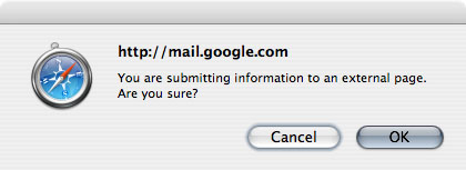
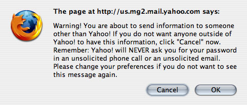
Some email clients consider forms in an email as a security risk. Some simply warn you of a potential danger, others disable them completely. Many clients (especially webmails) display a javascript warning message when submitting the form. Users always have the option to cancel the form submission. This is not a bad thing from a UX point of view, right?
- Gmail Web alert: "You are submitting information to an external page. Are you sure?"
- "The page at url says: Warning! You are about to send information to someone other than Yahoo! If you do not want anyone outside of Yahoo! to have this information, click "Cancel" now. Remember: Yahoo! will NEVER ask you for your password in an unsolicited phone call or an unsolicited email. Please change your preferences if you do not want to see this message again."
- Alert posted by Thunderbird, which acknowledges that the form may be malicious but does not remove its functionality: "Thunderbird thinks this message might be an email scam."
- Windows Live Hotmail displays the form, but when it is "submitted", the page is refreshed but no data is sent...
- It is also possible that your email solution does not accept forms in HTML code, and simply deletes it. Mailchimp, at the last news, proceeds to this type of method for example (and I'm not trying to discredit any particular brand by mentioning this, I totally understand their state of mind too). Find out more before you start a project!
Technical.
Ok. Now that we know all that, the support, the dangers, the points of attention, the heart of the matter: How to set up a form in an email?
1. Set up the basics.
We will start on the simple. We will create a tag with two HTML attributes:
action
and method
.
- In the attribute
action
We define the destination page to which the form data is sent. - For a form, two methods are possible to "send" information:
GET
andPOST
. As seen above in the chapter on support, theGET
seems to be the best supported. Be careful, however, the methodGET
implies to attach the data sent in the url defined in the attributeaction
. In other words, the data will be visible directly in the url. For example, the following form will lead to a url of the type " https://www.monurlperso.fr/?nom=votrenom " or " https://www.monurlperso.fr/?nom=votrenom&prenom=votreprenom ". (in the first case, only one data is sent, the name data, introduced at the end of the url by a " ? ", and in the second case, one data is sent in addition, the first name data, separated from the name data by a " & ")).
2. Configure the form fields.
Text fields.
Now you need to think about what information you want to collect, and how you are going to translate it into form fields. Each field needs a label, a . This information tells the recipient what the field is for. For a field asking for the first name, for example, we will fill in the form in this way:
Some email clients will not take into account this "linkage" between the label
and theinput
. Even worse, some add prefixes to the identifier. In this case, the label
does not match the field anymore... Annoying isn't it? To counter this problem, insert theinput
style tag in the head label
like this:
Concerning the text entry fields, you will have different types of attributes type
possible, depending on what information you want to obtain: ,
,
<I'm not sure what to do about it.
, <I'm not sure how to do that.
, ... I don't think it's necessary to specify the usefulness of each type attribute, their value speaks for itself, right? You can also use larger text fields, for example to leave a comment, with a
.
Choosing the right type of field allows you to validate the format of the text entered when possible, but also to allow you to modify the layout of the keyboard on your cell phone to match the required input (numbers for example for the phone number). Where the field type is supported, a basic validation is performed (usually possible via javascript. But javascript in an email is to be avoided since it involves deliverability and security problems).
On the other hand, if the validation of the format entered in each field is not possible, this can be problematic (an email field filled in with a wrong email address, for example). Okay, that's for text fields. But let's say you want checkboxes or "radio buttons", how do you do that?
Check boxes and radio buttons.
Values are optional for checkboxes. If you do not set any values, the checkbox will be submitted as "on" or "off". However, you can set a very specific value if the recipient clicks on the checkbox.
Need help?
Reading content isn't everything. The best way is to talk to us.
The destination url will then look like this if the box is checked : https://www.monurlperso.fr/?accord=ok. For radio buttons on the other hand, values are required. The attribute name
The radio buttons specific to your question are grouped together. Think of it as a multiple choice questionnaire. In the example below, your recipient will only be able to choose one of the two choices.
And you'd also like to improve rendering radio buttons or checkboxes, and customize their appearance? Indeed, they often appear quite small, and are inaccessible to the readers. In this case, we can add a div
following theinput
which will allow to replace the style of the button radio
by the style of our choice.
<form action="/en/exemple_url/" method="GET" data-trp-original-action="exemple_url">
<fieldset>
<legend>What is the best email marketing blog in the world in your opinion?</legend>
<label for="blogemailmarketing01">Badsender <input type="radio" name="blogemailmarketing01" value="badsender"> <div class="bouton rouge"></div></label>
<label for="blogemailmarketing02">Error404 <input type="radio" name="blogemailmarketing02" value="erreur404"> <div class="bouton rouge"></div></label>
</fieldset>
<input type="hidden" name="trp-form-language" value="en"/></form>
Replace the default style of the radio button.
To change the style of the radio buttons in a form in an email, there are a few steps to follow. First, we will need to hide the default radio button using these styles:
.radio_cache_button{
display:inline-block;
opacity:0;
width:0;
height:0;
margin:0 -9999px 0 0;
float:right;
position:absolute;
}
You have applied the class
to your radio input? Perfect. Now let's replace the focus with our own styles, adding highlights or an outline to the element the recipient is focusing on:
input:focus + .button{
outline: Highlight auto 2px;
outline: -webkit-focus-ring-color auto 5px;
}
Finally, we will style our buttons, and change their style according to their state:
.button{
/* style */
}
.button:hover,
input:focus + .button{
/* style */
}
input:checked + .button{
/* style */
}
Make fields mandatory.
The attribute required
to make a field mandatory is completely ignored in almost all email clients, with two exceptions: Thunderbird highlights empty required fields but the form can still be submitted. Opera Mail, on the other hand, behaves like a browser and displays an error message, preventing the form from being submitted. Finally, you can also find support for different types of fields on the caniemail.com.
3. Convey hidden information.
We were saying that we wanted to send some extra data that the recipient wouldn't need to fill out, okay? For example, a name, or a user ID. You can send hidden information by using the type="hidden"
. For example, the following piece of code will transmit a user ID without the recipient having to fill it in (he will not even see it on the screen).
4. Submit the form.
Ok, now we come to the end. And so we will propose to our recipient to submit the form directly in the email. To do this, you can use a input
type submit
or to a button
type submit
. Both work very similarly, but the difference is where you put your text. For the input, you will have to fill in its text in the attribute value
. For the button on the other hand, the button text will go between the opening and closing of the tag.
Backup solution.
What to do if your form does not work in some mail clients? Anticipate! For every interactive email, it is essential to have backups. They ensure that where the forms do not work, they will be hidden and a fallback solution will be displayed instead. For example, it is possible to display the interactive form in Apple Mail, Gmail (desktop web), Yahoo (desktop web) and display the fallback solution on Outlook and Windows Mail, and all mobile devices. Here is what the code will look like to display or not the interactive form or the backup solution in this case:
.interactive_form {
display: block !important;
max-height: inherit !important;
overflow: visible !important;
}
.solution_of_rescue {
display: none;
}
body[data-outlook-cycle] .montresuroutlook{ display:block !important; width: auto !important; overflow: visible !important; float: none !important; max-height:inherit !important; max-width:inherit !important; line-height: auto !important; margin-top:0px !important; visibility:inherit !important;}
body[data-outlook-cycle] .cachesuroutlook{ display:none !important; display:none; overflow:hidden; float:left; width:0px; max-height:0px; max-width:0px; line-height:0px; visibility:hidden; }
class~="x_montresuroutlook" { display:block !important; width: auto !important; overflow: visible !important; float: none !important; max-height:inherit !important; max-width:inherit !important; line-height: auto !important; margin-top:0px !important; visibility:inherit !important;}
class~="x_cachesuroutlook" { display:none !important; display:none; overflow:hidden; float:left; width:0px; max-height:0px; max-width:0px; line-height:0px; visibility:hidden; }
@media only screen and (max-width: 640px) {
.solution_of_rescue {
display:block !important;
width: auto !important;
overflow: visible !important;
float: none !important;
max-height:inherit !important;
max-width:inherit !important;
line-height: auto !important;
margin-top: 0px !important;
visibility:inherit !important;
}
.formulaire_interactif,
.formulaire_interactif p,
.formulaire_interactif label,
.formulaire_interactif input {
display:none !important;
overflow:hidden !important;
max-height: 0px !important;
max-width: 0px !important;
line-height: 0px !important;
visibility:hidden !important;
}
}
And here is the HTML code:
<!--[if mso | ie]>
<style>
.solution_de_secours {
display: block !important;
max-height: inherit !important;
overflow: visible !important;
}
</style>
<![endif]-->
<!-- debut FORMULAIRE_INTERACTIF -->
<!--[if (!mso)&(gte IE 10)]> <! -- -->
<div class="formulaire_interactif cachesuroutlook" style="display:none; max-height:0; line-height:0; font-size:0; mso-hide:all;">
[Insert Interactive Form code here]
</div>
<!--<![endif]-->
<!-- fin FORMULAIRE_INTERACTIF -->
<!-- debut SOLUTION_DE_SECOURS -->
<div class="solution_de_secours montresuroutlook">
[Insert fallback for form section here]
</div>
<!-- fin SOLUTION_DE_SECOURS -->
The other solutions.
If you are not sure about the support of the form in an email (and this is understandable, as you have no way of checking the reliability of the information sent, nor its format)There are many other methods to "simulate" the presence of a form:
- Insert an image from a form (or ideally develop a fake form in HTML) with links to direct, on click, to a landing page where a real form will be available. You can even be vicious and design a
text
in gif format, with a blinking cursor... If you don't want to go that far, you can also simply set up a Call to action that will direct to an online form. - Use multiple choice forms and insert different tracking links depending on the answers clicked. You will be able to retrieve data on the number of recipients who clicked on a particular answer.
An example of a form in an email?
No worries, that's what we're here for folks! In the email below, from my article on Litmus certification for Email designer/developerIn the Deezer email, I have inserted a simple form with a search bar for a Deezer email. So, from the email, the recipient can type the artist he wants to listen to, and will be automatically directed to the search page with the corresponding results. Go ahead, test it!
See the Pen Litmus Certification - Email 2 - en by DEFOSSEZ (@Badsender) on CodePen.
Conclusion.
For any form in an email, it is IM-PE-RA-TIVE to set up a backup solution in case the form does not work properly. We agree, setting up a form can be quite complex and the time/support ratio is not necessarily convincing... But if a client asks you to set one up, at least you will now know how to do it and you will know in detail the support of this technique.
The sites listed below offer several test results for the main mail clients on the market. If, in most cases, the form is correctly displayed, it is not necessarily functional... Finally, apart from the support, it is also necessary to ensure that the routing platform used does not remove all the tags specific to a form before sending...
Want to try interactive forms in your emails?
Badsender is here for that, baby! We have a design studiowe have a HTML/CSS integration studioWe do R&D, we do innovation... Just give us a call! You won't be disappointed!
Sources
- https://www.litmus.com/blog/the-ultimate-guide-to-interactive-forms-in-email/
- https://www.campaignmonitor.com/blog/email-marketing/how-forms-perform-in-html-emai/
- https://www.sitepoint.com/forms-in-email/
- https://css-tricks.com/html-forms-in-html-emails/
- https://www.caniemail.com/search/?s=form
- http://emailclientmarketshare.com/
- https://www.emailing.biz/gerer-ses-destinataires/integrer-formulaire-emailing
- https://happy-academy.plezi.co/fr/articles/2008147-pourquoi-inserer-un-formulaire-dans-un-email-est-une-tres-mauvaise-idee
- https://agencepenrose.com/peut-on-inserer-un-formulaire-dans-un-email-marketing/
4 réponses
Hello,
I just tested your tips and scripts in outlook.
Despite the "workaround" not everything is functional. The checkboxes in particular.
In any case, thank you for this article which is already a great lead.
Sincerely,
Eric
Hello Eric! Concerning the forms in an email on Outlook (Office software for Windows), clearly, there is little chance that the form will be displayed correctly and work. Hence the importance of having a backup solution. But this backup solution must logically contain something other than a form (or a multiple choice questionnaire for example). The checkboxes will not be displayed correctly in Outlook because they are an element specific to forms.