Hi!
I hope your summer and vacation went well.
And what do we do at the beginning of the school year after having gleaned on his towel and chained a cocktail barbec rosé combo ... ?
Let's go back to sports 😉
I decided to get back to it too. But email version ^^
Through the analysis of a newsletter, we can see or review some good practices.
So this will be a sports email my friends!

Prejudices and brands
On a more serious note, I subscribed to the Adidas newsletter after an online purchase. Even though I like this brand, I don't advertise it either! And you'll soon see that.
After several NLs without asking me any questions, the pro side takes over and then I click on "display in a browser" then "page source code".
We have the other side of the story (after going through an online code-indentor). I fall from my chair...
I'm not new to email but I'm always surprised when I see the prestige of a brand and the quality of their communication, in this case email campaigns.
In short, Adidas is one of the most famous brands of sportswear in France and beyond. So if it is known, there are ways.
If there are means, there is a way to make beautiful, clean and efficient things. But that remains to be demonstrated, doesn't it?
The email in question
So I get back in my chair and dive into my email.
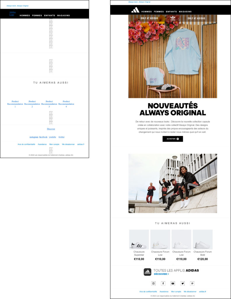
To begin with I see little text in real text, we are on almost full images. Here is what it looks like without images and also with :

First of all, what can be said:
1- it's unreadable without images
2- attention weight
3- but most of all I wonder: "why did we come to this???"

Let's go and have a quick look around. Some things will be a bit technical but nothing too bad. And if you have a question don't hesitate.
Design side:
Yes, this is a commercial email. The products must be highlighted, which is done. But if the images do not pass we can not even know what type of email it is. Of course we have a clue or two but for those who have no time to lose ...
Afterwards, design-wise, everyone has their own thing. We have something simple, readable on a white background. Personally I find it sober and effective. The mobile version is also worked, it is a good point. Of course we could have improved the sizes of social networks and enlarge the CTA, but let's pass.
Big problem of design: the typos in pictures! Well, with the white background, you can see the small pixelation that prevents the sharpness of the characters. One can recognize by force very quickly text in image or text in text.
Code side:
1- the css :
With the indented code I arrive at 1920 lines for a total weight of 114kb just on the html file'. The email will be truncated under gmail because it exceeds 102kb. But above all how to justify so many lines of code with the 'normal size' of this email.
Between the email header and the css, I have almost 1100 lines!!!
One small thing that jumps out at first glance is that we use hosted typography. No worries on this practice of course. But considering the amount of text, what's the point?
Reflex: we are going to pass by an analyzer of css in line. It will sort it out in a few seconds.
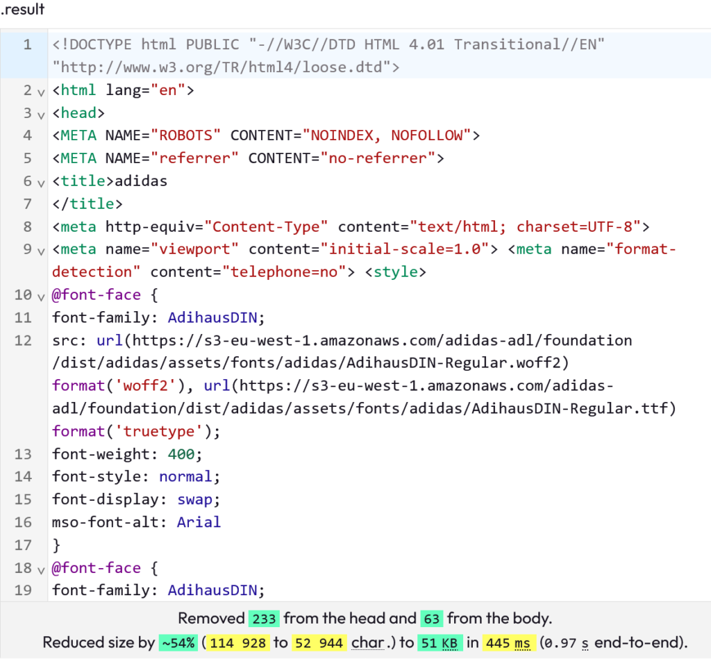
Result:
233 classes to be removed in the css, that's a lot of people who are useless !!!
Ok here we have a generic template or an email builder that does not optimize anything. We also have 'id' and 'name' for each image, 63 in all. I'm not convinced of their usefulness, but it could be useful to analyze clicks on certain platforms...
We also have 4 media queries that manage 3 break points: two at 639 pixels, one at 480 pixels and one at 320 pixels. We could have done without this by managing it with %. On the other hand, there is no management of 120 dpi.
Conclusion:
Just by cleaning up the css with an online tool you gain a pharaonic weight.
2- html:
Let's not fool ourselves, it's full images so there should be little code. While we could have the title, the text, the CTA, the products and their prices, the application insert in text.
So basically I shouldn't have masses of code. There are more than 800 lines of html though.
In several places I find 1 by 1 pixels with links identical to the CTA. There are 14 in all. Yet I even have the opening tracking pixel at the end of the email. So what are these 14 pixels for? I don't know how to answer clearly but maybe they are generated by the builder used.
At 7 lines of code per pixel we save almost 100 lines. And then good morning to the person who has to make the stats on the clicks of this email.
Otherwise, apart from the cumbersome encapsulation of <table>the code passes. We could still have gained a lot of lines.
Need help?
Reading content isn't everything. The best way is to talk to us.
3- accessibility:
Is the basis of the filled 'alts' there? Ok on the logo and social networks. But nothing on the main image and for the products we have this declined: 'Product Recommendation 1'.
And the "role='presentation'" are not present on the <table> (if needed refer here : https://www.badsender.com/2019/01/23/accessibilite-emails/)
So it's very average to pass in a screen reader.
On the image hosting side :
3 different domain names for hosting... This is not a deliverability model. It reinforces that complete 'mess'.
Darkmode side:
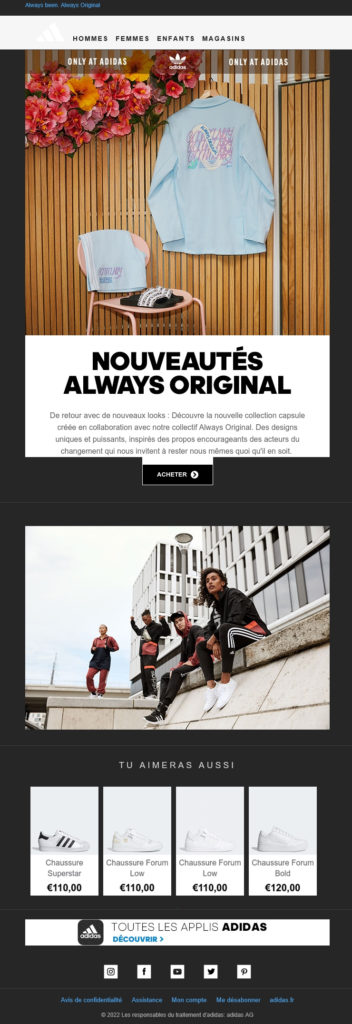
Once again we are in full images and as they are in white background, the darkmode is correct. Except for the Call To Action which is in image on black background. We could also have put more white margin on the last banner. It's a pity because if we had real text and some transparency on the images, we would have just had a white/black inversion of the backgrounds and texts, which would have made the email just as aesthetic as the 'Whitemode' version.
Ecology:
A parameter to be taken into account now in marketing!
Big carbon footprint for a small email. We have images for nothing and an aberrant html weight. We will not lie, this email campaign is not in a good ecological approach.
It's a pity because here nothing was complex to achieve something correct.
Conclusion:
Not surprisingly it's a big flop for this email from a big brand.
Flop because the email is far from being up to the reputation of Adidas. That's the problem: when you're a heavyweight you have to have the image to match. We think that this is true in all areas. Including marketing and advertising.
Can you imagine a TV commercial for this brand with as many flaws as in the analyzed email...
What to remember about this article:
If you use an email builder or generic tools, you may find that it can make your email very heavy. Unnecessary code is embedded almost systematically. So either you can use custom tools like The Boss or you can at least clean the parasitic css.
Don't forget the basics of an email: put everything in text that can be put in text. It helps the customer and their experience on your newsletter. And again we lower the weight of the message. Bet on a beautiful design certainly! But it should not be transformed into images only.
Of course, it's all about cost too. We know that by using certain tools it is not the same price at the end. But is it worth selling off your brand and your image?
If you are not sure about the quality of what comes out of your builder or what is delivered by your agency, everything is easily verifiable by the way. This will be the subject of a future topic with the tools used here for this analysis 😉
And don't forget that we do marketing, but we can also do it in the cleanest way possible.
I'm going back to practice ! Kisses and don't forget to eat, move and everything !


