Çhe summer sales season is here. As you know, at Badsender we're campaigning for responsible communication and marketing. More storytelling and brand positioning with editorial newsletters.
But you can't escape it. Your mailbox is bound to be flooded with promotional campaigns at this time of year. We might as well give you our help and expertise in this area too, especially when it comes to design and integration.
Sample promo newsletter for sales
The aim is not to lay blame, but to suggest areas for improvement. So for this example we're talking about an email from TEAMAXE, a specialist in motorcycle and scooter equipment.
It doesn't matter who the advertiser is or what the product is. In this case, I'm a Teamaxe customer and subscriber because I'm a motorcyclist, but that's not the point. We'll be focusing on the newsletter's conception, design and integration choices.. TEAMAXE was the first advertiser to refresh my memory and remind me that the sales were starting, so GO!
Sales newsletter campaign, strategy and context
If we take a quick look at the elements of context in terms of campaign strategy, we're on the right track for the motorcycle equipment brand:

- Sender: TEAMAXE joffrey@teamaxe.fr good point for the personalized address which is not in noreply!
- Subject: ?? SALES | Start of the bargain hunt!
- Preheader: and -20% in store on non-sale items until 02/07
On the face of it, with this information in our mailbox, we know pretty much what to expect in terms of offers and content. So let's turn our attention to the design itself.
A design that announces an all-image template model

Even if the structure of the main blocks seems classic: promo banner, cover, multi-column promo, multi-column category, social networks... A quick scan of the email reveals, sadly, that it's all been done in images..
Background images, text with effects (outlines, transparencies, gradients...) and overlay products with prices and action buttons (the famous CTAs).
Okay, we still have some text content:
- link to mirror page
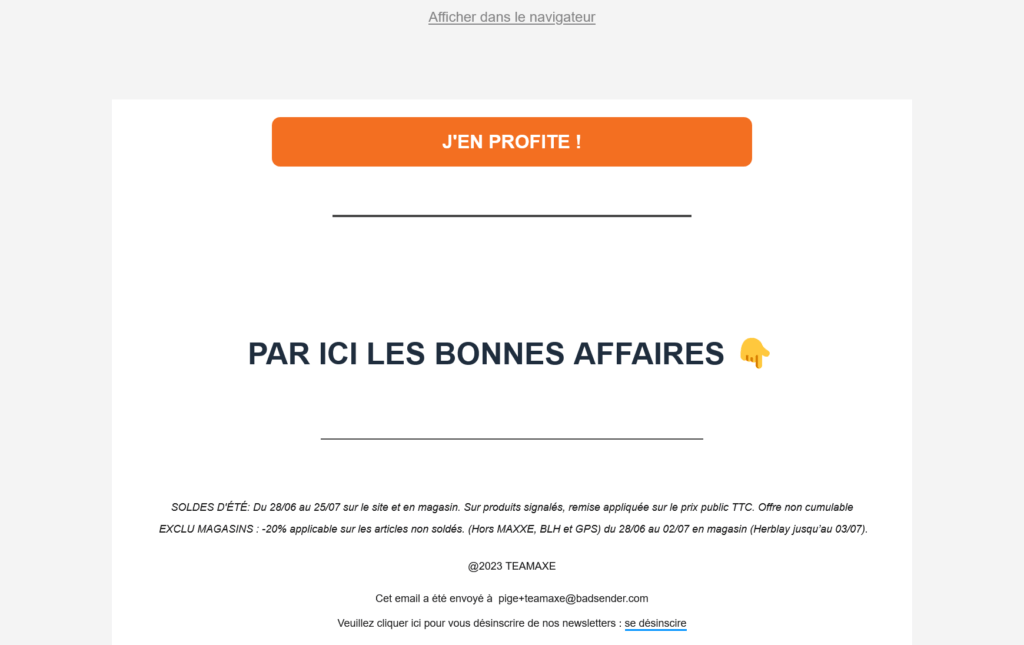
- the " buttonI'M ENJOYING IT!"but of what?
- the title "THIS WAY TO BARGAINS?"But which ones?
- legal notice and unsubscribe link in 9px. You couldn't do worse if you wanted to make these elements unusable.
Oh yes, because I forgot to tell you... on all these images (yes, all 16 of them!), well... none with an alternative text attribute (alt). Not that it's left empty, it's just not there. So in addition to not making the content accessible, the HTML won't pass W3C validation.
The message is then much less clear without the images.

And the results are clear. The content hierarchy could have been reversed: title followed by action button.
A mail template and responsive design?
If you've ever created emails with mixed content (images and text), you'll know that the image format can raise a few questions for responsive design.
Landscape (horizontal) images on the desktop aren't very suitable for mobile. If you can provide a portrait (vertical) version, it will be more legible and adapted to the medium. And if you really don't want to bother with several formats depending on the context, then you should opt for something close to square (1:1).
Here, the ratio is already more portrait-oriented, and the move to mobile should roll (moto, rouler, humour).
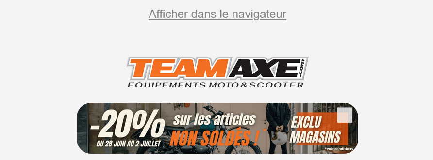
Except for the unreadable banner announcing the main promo and dates.

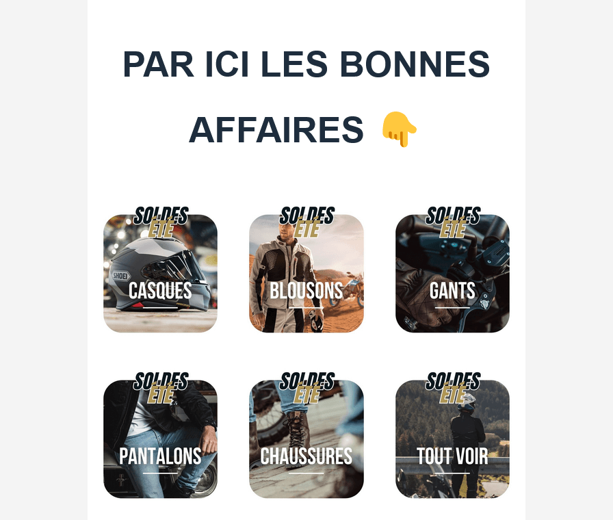
And the category section remains in 3 columns on mobile. As we often say in briefings, 2 columns on mobile can quickly become unbalanced depending on the text content, and difficult to manage (content overflow and/or inconsistent vertical rhythm). TEAMAXE chose to superimpose text over images. The result? Titles become very difficult to read, and in any case, the category illustration image is of little interest as it is also difficult to read.

The shock of sales, the weight... of images!!!!
Yes, the weight in bytes, not the visual impact they generate. We can't stress this enough: remember to optimize your image files.
Let's say you're using Photoshop, exporting for the Web isn't enough. The file will contain software-specific metadata that take up unnecessary space. For example, the logo in transparent png once passed through TinyPNG :

It's clear: 69% reduction! The file size shrinks from 121.8 KB to 37.5 KB. Imagine the result for our 16 images. As it is, we have 16 requests to download 1.09 MB!!!! For a simple email, ouch! Discounts aren't just for special offers.
Text-free newsletters and eco-design
We could think of it this way: if the content isn't in the HTML of the email, then we have less CSS styles, less typeface, so less code and no need for resources other than images. In short, a lighter, even "eco-designed" HTML email.
Even so, that would be reductive. And On closer inspection, there's no doubt that the template has been reused. It doesn't include the bare minimum dedicated to this campaign.
And that's what gives us our first clue: a resource that's strictly useless here. We have a call to an external resource directly from our friends in the valley (a Google font) for a custom typeface: "Montserrat". But it's not used anywhere.
This makes it hard not to suspect that many of the CSS declarations we present are not useful and equally used.
So yes, the HTML file doesn't exceed 102kb and won't be truncated in gmail. That said 56.63 kb in total and 7 nested tables to center only the logo, for sure there are savings to be made..
Promo email but quality template
I like them TEAMAXE so it's a bit of a helping hand or a biker's V?? and by no means a stick.
Their business is selling motorcycle (and scooter, because yes, it's different from a motorcycle, but that's another subject) equipment, and they do it very well. Our business at Badsender is largely the newsletter template design. So when I see a personal e-mail like this one, there's bound to be a professional distortion.
There's a lot of room for improvement, but not a lot of effort. What's more, it's easy to industrialize. And obviously there's a bit of Brevo (formerly SendInBlue) and here too we have mastered the art and even have connectors with ThePatron.
Leave a Reply