Alright, I've decided to talk to you about Stripo, the email template builder! I've been meaning to write this article for weeks (under the pressure of Marion Duchatelet: admit it, peasant!) but I couldn't find the time or inspiration. But today is the day ..
Among the vast choice of email creation tools and other email buildersStripo defines itself as a "drag-and-drop HTML e-mail template builder". That's precisely the goal of an email builder: to be able to design emails by selecting blocks, changing their order and content, or adding custom HTML.
Live demo on Stripo email builder
Stripo boasts email production speed and over 950,000 users: you'll soon see why. Please allow 20 minutes for your reading time, as this article is particularly loooonnng. (but probably not completely exhaustive). Hence the table of contents, the connections are forming. Let's begin.
Table of contents
Nomenclature
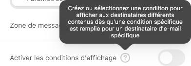
Before rushing headlong, you need to understand Stripo's nomenclature. Four terms come back reccurently as soon as you hover over the elements of your email: Band, Structure, Container and Block. Explanation: Stripo relies on bands, one under the other. These bands can be tagged as "Header, "Content", "Footer or "Info Zone" areas. You have the opportunity to set up conditioning on these bands (conditioning specific to your routing platform, of course) to make them appear. Or not. It's a handy feature that we don't necessarily find on all email builders, especially when they're not attached to an eCRM solution.
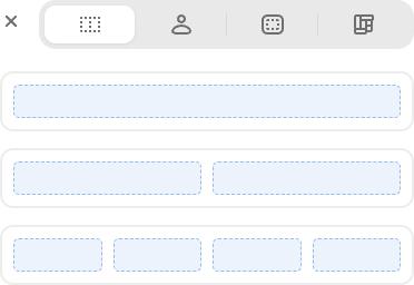
These bands consist of one or more rows ("Structures"). Each of these rows includes one or more cells ("Containers"). There might be only one cell, or two side-by-side cells of the same width, or three side-by-side cells of the same width, or four, or two side-by-side cells with the first making up 1/3 of the overall width, and the second 2/3... The combinations are quite numerous.
In these cells, you can insert "Blocks". As many blocks as you wish. In essence, remember that the hierarchy of elements is as follows: Band > Structure > Container > Block. Stripo provides you with "Template Modules", with pre-built examples of bands, structures and containers. That's already a nice gift.
Alright. Let's move on to the blocks. Stay motivated, only an hour and a half of reading left.
Standard blocks
Image, Text, Button, Spacer, Social Media... I'd say that's the basics of any email Builder. But just listing these few blocks would be way too easy. And above all, it would omit to specify the particularities of each. Because it's not just about a "base". Let's take the time to detail these little extras from the Stripo house.
Images
It's not Figma, I'll grant you that, but still: Stripo gives you the opportunity to resize, crop, rotate your images, or even add filters, text, shapes, "stickers", frames... And all of this without leaving your project! Personally, I like it.

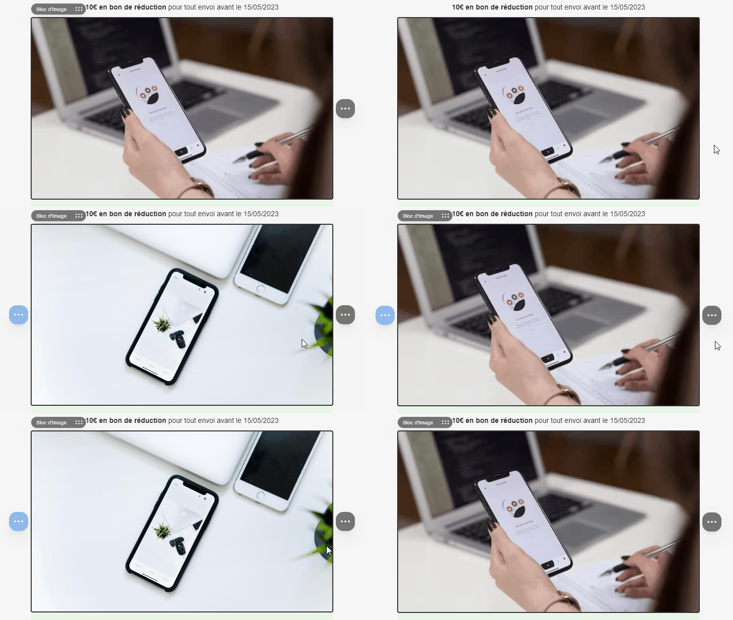
You can also browse a visual library made available, or directly pick from your "common" library. I also note that you can have a free Stripo account and easily host all your visuals on their servers. It's always good to have! Moreover, a small feature/innovation that I appreciate is the opportunity to change the image on hover : it's off to a strong start!
Texts
Text alignment options, text color, background color, line-height... So far, nothing very new. However, the tags used for texts respect accessibility principles, as they are semantic tags (<h1>, <h2>, <p>…) : not everyone does it, so it's worth pointing out!
You'll find a choice of classic standard fonts (Arial, Georgia, Tahoma, and so on) but also a short selection of Google Font (Lato, Roboto, Open Sans, etc.) on the Free plan with a fallback to a similar standard font. On the paid plans, it is possible to have your own font.
Note that the tool offers AI-powered writing assistance directly integrated into the "Text" module: the result of a relatively basic prompt seems convincing. I also take this opportunity to point out that, on the new version of the platform, it is now possible to save a color palette: handy when you want to easily find the shades of a design system!
Finally, I want to emphasize that it's possible to set a fixed height for a text content: this addresses the eternal issue of "How do I align my call to action buttons in two cells side by side when the texts above don't have the same number of lines?" Don't pretend, you know exactly what I mean.
Buttons
Rounded buttons with support on Outlook (automatic addition of VML) or not, with or without borders, with the possibility to add an icon/image in the button, to play with the internal or external margins, on the rounding itself, on the alignment of the button, on its height... In short, so many possibilities, it's crazy! And on top of that, I can even add a hover effect on the button by changing its background color... Magnificent, in a word.
Spacing
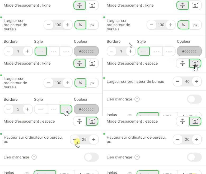
It might not seem like much, but to me, it means a lot: you can use an "Spacer" block that acts both as a separator and as spacing... Hence its name, QED. This means that within this block, you can define if it acts as a separator (continuous or dotted horizontal line of color) or if it acts as spacing between two blocks for example, with the possibility of course to choose the height of this spacing in the block options. Veeeeery useful, even if personally I prefer to manage spacings through margins (margin or padding).
I'll skip over the "HTML" block (even though the ability to see a code editor appear at the bottom of the tool is particularly appreciated), "Menu" (even though it's very practical since you can add endless tabs) and "Social Media", even though I'm thrilled that the latter allows you to add as many of UPDATED icons (hello Twitter/X) as desired, with very easy to insert links.
Innovative blocks
Now let's discuss some slightly more special blocks that personally excited me.
Banner
The "Banner" block is quite exceptional since it allows you to do visual creation DIRECTLY in Stripo. Let me explain: you can choose an image (of a product, for example) and add elements on top of it: text, additional images... Stripo will then design a hosted image for you. You can even, afterwards, change the image ratio or add filters (blur, noise, saturation...). Handy! (though, let's be clear, the separation of text and graphic content isn't really respected).
Video
Let's be clear, the folks at Stripo are well aware of the limited support for the <video> tag in email clients. They're not born yesterday. So this is a module that allows you to add the link to your Youtube, Vimeo, or Tiktok video, then specify an alternative text, a custom thumbnail (if you don't want to use Youtube's default one), and choose a style from several "Play" button styles that will overlay on your thumbnail.
In my opinion, this is the best choice to make when offering a video in an email: insert a player with a link to the video ((and, by the way, this player can be composed of an animated gif to simulate a video).
Timer
I love this block. In just a few clicks, you can easily create a countdown timer, perfect for inducing a sense of urgency or time-sensitive offers in a promotional email. Specify the end date and time, choose your timezone, the font, the size, the color of the numbers, the background color of the countdown, among other options... And voilà, you have a neat and beautiful countdown timer!
I'm just surprised not to see a warning about using this block since the release of iOS 15 and its image caching feature, but oh well. And I don't understand why it's only available on the older version of the editor, but again, oh well.
AMP4email
I'm not a big fan of AMP4email: even if the technology seems to introduce innovative features for email marketing, I feel like the idea is dying on the vine. However, just because I don't like something doesn't mean others should be discouraged from it, right?
I therefore want to point out that Stripo offers the insertion of "Carousel", "Accordion" and "Form" blocks through AMP4email. The carousel offers several options (Autoplay, loop...) and it's easy to add new slides. The accordion is also very user-friendly, as you can add as many sections as desired, and insert into those sections any of the modules present on Stripo (text, image, button, etc... Wow!). The same goes for the form, in which you can insert text fields, email, phone, or even hidden fields!
Stripo also claims on its homepage the ability to insert real-time data (updating product quantity, a price for example) via AMP4email. The content would automatically be updated upon opening the email. I'm curious about how this works (this feature doesn't seem to be part of the Free plan, so I didn't get a chance to test it).
Need help?
Reading content isn't everything. The best way is to talk to us.
All that's left for you is to find a platform that accepts the AMP4email format, and recipients to match... 😀
Styling and Appearance in Stripo's Email Template Builder
The customization options for different elements in Stripo are abundant. Let's take a tour of the shop.
General email settings
Being able to change the width of the email (with a width still limited to 1200px, let's not go crazy), the alignment of the email (After all, why not! Why would we always have centered emails, hm?), the background color of the email body (<body>), the text orientation, the background image of the email body, its position, its repetition... The general options are very broad and varied, and in principle, they meet all needs. Not all email builders necessarily do this, it must be acknowledged!
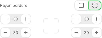
Rounded corners and radius per corner
This is the kind of detail that gets me: the platform, in its new version, goes as far as to offer to specify different values for the rounding of each corner of a buttonYou might tell me it's intellectual overthinking, but not at all: When I have a design guideline to follow, I follow it to the letter!
Internal and external margins
This is a huge advantage in using Stripo: you can manage (again, separately) the margins of your elements. In other words, spacings inside or around them. The only downside: the free version only allows multiples of 5 (with a limit of 40px).
Mobile
The possibilities offered on the mobile version are numerous! The first and most important, you can choose to hide a block, WHATEVER IT IS, on the desktop version OR on the mobile version.
Imagine a visual that would be specific to the Desktop version (due to a landscape format, for instance): hence, you can hide this element on the Mobile version and display another more suitable visual (with a portrait format, for example).. Pair this with cropping and resizing of the image directly in the interface, and you're set.
You can also define internal margins specific to the mobile version, change the text size (titles h1, h2, h3... paragraphs) on the mobile version, and so on and so forth... YOU HAVE NO MORE EXCUSES NOT TO PLAN A MOBILE VERSION OF YOUR CAMPAIGN!
Save as Module
Now there's a handy feature: saving an element as a module. The concerned elements are: Bands, Structures, and Containers. The blocks themselves cannot be saved. But hey, just insert a block into a container, and voila! Magic of the show!
So, what's saving as a module? It's the act of designing content modules (comprising one or more blocks) just once, and then reusing them in multiple emails. That alone is huge.
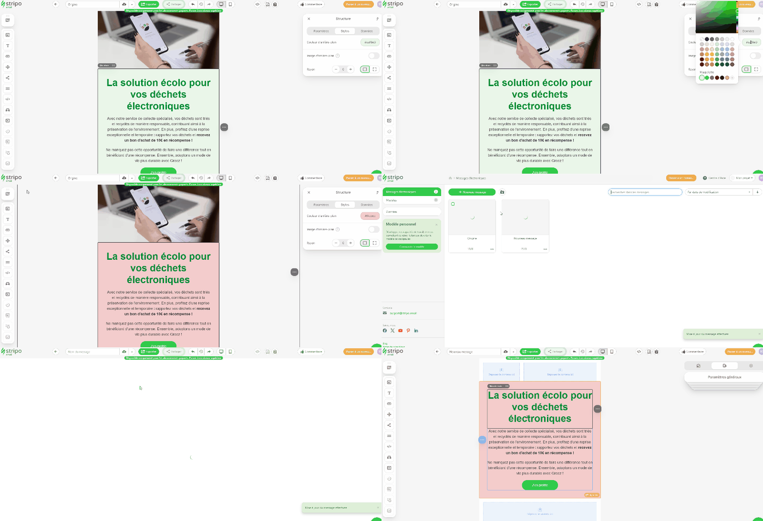
But I'll add the following: it's also possible to "synchronize" a module. In other words, if you use an instance of this saved module in another campaign and make modifications to the initially saved module, those changes will reflect on the module instances present in other campaigns. It's somewhat like the component and instance system on Figma after all. A little illustration speaks louder than words.
And I find it brilliant. Because this way, you can envision a general template, listing all of your saved modules, and use instances of these modules in your future campaigns. And if one day, a design element were to change (text color, background color, font, whatever) it will be reflected in your ongoing campaigns. Magical, isn't it?
Export
HTML file
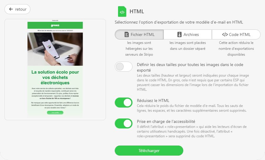
From Stripo, you can export your email in HTML format (with inline CSS, of course). During the "Settings" phase of the file export, you can specify whether the images should be hosted on Stripo's servers, whether they should be placed in a separate folder, or if you only want to retrieve the HTML code.
I note that a few additional options are available here:
- "Reduce HTML code": to remove line breaks, spaces, indentation in the code, thus saving a few extra kilobytes and potentially avoiding truncation in Gmail with its famous 102kb limit.
- "Accessibility support": to add a
roleattribute with the value presentation to allpresentationto all<table>tags in the HTML code that aren't data tables. This particular point makes me think that Stripo is ahead since it offers its clients some technical conditions to improve email accessibility. Kudos!
To a file or application
Gmail, Outlook App, Outlook Web, Webhook, Zapier , or even PDF or image format... Stripo stops at nothing! So, you have a plethora of choices regarding the format or destination of your email creation export.
To an ESP
Unfortunately inaccessible from the Free plan, Stripo still offers you more than 80 connections to the most famous and widely-used Email Service Providers. And there's a good chance that your favorite ESP is on this list! With one click (I assume), import the HTML code and images of your campaign directly into your preferred ESP.
Note: On its free version, Stripo only allows 4 exports per month. I'm quite surprised by this choice, given how often one needs to revisit an HTML code in an email campaign. But it's a marketing strategy to push for a paid plan. At some point, not everything can be free either, folks!
Innovations
Image change on hover
I already mention this above, but I wanted to note it again here. It's my article; I do what I want.
Anchor links
An anchor in an email, which allows, when clicked on an element, to go directly to the associated content in the email, is great. But it doesn't work everywhere. Stripo strives to explain these constraints (and I can only admire their technical knowledge) , yet they don't hesitate to offer what I see as an "innovation" in emailing.
Gmail Annotations
With switches to turn on or off, optimize the information provided to your recipients upon receipt of the email (and not upon opening). I won't rehash Gmail annotations; Grégory has already extensively discussed it. But with Stripo, it's very intuitive to add them to your campaign and your HTML code.
Image compression
You might ask: "How is compressing images innovative?". Well, it's because very few do it, that it's innovative, you smart cookies! On top of that, Stripo offers to choose a percentage of compression. I love it.
Options
You're almost at the end of the article, fear not. I feel like I almost lost you. Maybe these additional options will wake you up!
Free
- You can use the template generator, which analyzes your website's charter to offer you a relevant email design. Boom!
- You can send up to 5 test emails per day to the email address you registered with.
- In your campaign settings, you can add a subject, a preheader (both can be generated by artificial intelligence), and automatic addition of UTM parameters for campaign tracking.
- You can access the generated HTML code at any time from the "Code editor" icon available at the top of the interface.
- A "History" feature allows you to backtrack in your design.
- Merge tags (or variables) from ESPs like Hubspot, GetResponse, MailChimp, Campaign Monitor... can be activated to directly insert them into your emails.
Paid
- The platform offers, in its paid version, tests via the EmailOnAcid API. Email rendering tests that you can view WITHOUT LEAVING the email builder.
- You can import translations of elements from XLS and Json files.
- Automatic translation of content via Google Translate is included in the Basic plan.
- In its Basic plan, you can also import and use custom fonts (other than web-safe and Google Font).
- You can ask Stripo's design team to create your own custom email design. But then, you might as well go through Badsender's email design team. Be fair at some point.
Both free and paid
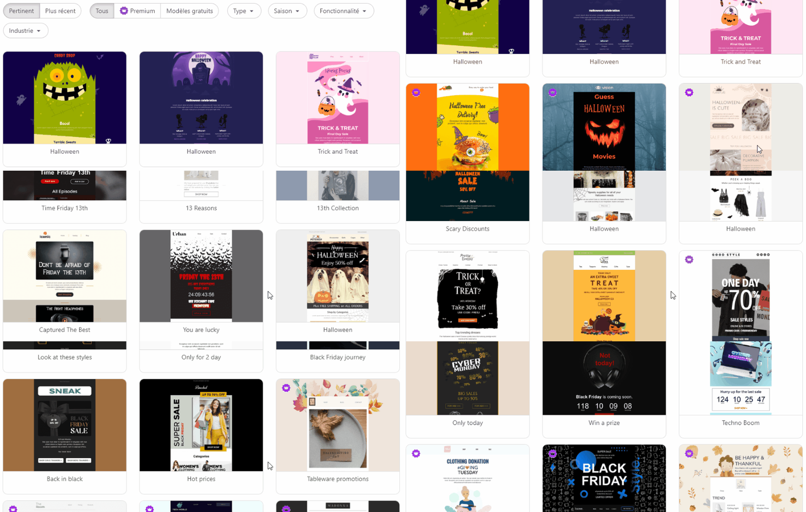
- You'll have access to an impressive number of "basic" templates (promotional emails, triggers, transactional emails, etc.) and "prepared" templates with regular themes (Black Friday, Cyber Monday, Halloween, Christmas, etc.) easily viewable with a filter system. And honestly, Stripo's creative team has nothing to be ashamed of. I even think these templates can serve as an inspiration bank! Usually, the proposed templates are quite basic, even "outdated." That's far from the case here.
My opinion on Stripo's email template builder
Stripo is the quintessential email Builder (or email constructor, I should say) Stripo is the quintessential email Builder (or email constructor, I should say). I even sent a comment to their team expressing this. With it, you can almost do everything, which is fantastic, I admit. But the moment nothing is structured, you also risk producing less qualitative emails... Being an email integrator or designer is clearly an advantage to understand its operation. The breakdown of components is really the result of a developer's approach. Therefore, it may not be wise to put it in everyone's hands, risking not adhering to the email design system or your email guidelines (if prior training on the tool has not been followed). You can do almost anything with itWhich is fantastic, I admit. But as long as nothing is framed, you also run the risk of producing less qualitative emails... Being an integrator or email designer is clearly a plus for understanding how it works. The breakdown of components is really the fruit of a developer's approach. It's therefore perhaps not a good idea to put it in everyone's hands, at the risk of not respecting the rules. (if no prior tool training has been given) email system design or email guidelines.
I'd also like to point out a small downside in using Stripo: with so many options, I sometimes have trouble remembering "where" a particular feature can be set. Right now, for example, I've been looking for the "Image Compression" option for five minutes... But I'm sure I'll remember soon, I'm not worried. On the other hand, the platform's execution speed truly amazes me: no waiting or latency, a real pleasure!
Postscript: I'm slightly less fond of the new version of Stripo's email template builder than the old one. Perhaps I preferred the somewhat outdated look of the old interface, or maybe I found it more practical and functional... But no matter! I also want to highlight that switching between the new and old versions is particularly easy and quick!
