If there's one thing that makes emailing design a unique discipline, is the management of HTML and CSS by the various opening environments. And among e-mail programs, Outlook is the winner! If you work in the world of email marketing, you're probably aware thatOutlook is THE email client of choice for all email integrators Poor HTML and CSS support, breakage, animated gifs that don't animate, rendering problems... He's done it all to us! In this article, we explore email display problems on Outlook and share our recommendations.
Table of contents
- The importance of Outlook
- Understanding Outlook
- Common Outlook e-mail display problems
- Rounded corners
- Outlook background images
- Fully clickable buttons
- Widths and heights in percent for 120DPI
- Image dimensions to be entered
- Blocked images
- div
- Non-websafe typefaces
- Animated gifs
- Max-width
- Hover and other CSS pseudo-selectors
- Animation and keyframes
- Box-shadow and text-shadow
- Opacity and rgba
- Visibility
- Video
- Margins
- Horizontal and vertical lines
- Minimum cell height
- Protocols
- Interline display problem in Outlook email
- Page height
- Our philosophy: acceptable degradation
- Sources
The importance of Outlook
If Outlook is so complicated to manage when it comes to supporting and interpreting HTML and CSS code, why keep sending it? Simply because it's one of the most popular opening environments most widely used in the professional world. Its market dominance means that many emails will be read and interpreted by its rendering engine. Understanding how Outlook displays emails enables marketers to ensure that their messages are well received, readable and attractive to a large segment of their target audience.This reduces compatibility problems and improves the effectiveness of email campaigns.
Understanding Outlook
Special features of Outlook's email rendering engine
Outlook 2007, 2010, 2013, 2016 and 2019 on Windows use the software Microsoft Word as a rendering engine for HTML and CSS emails. However, this software is clearly not suited to interpreting this type of code, as it is a word processor. It would be like using a radiator to make toast. True, you could do it too, but that's not really the idea...
As a result, support for modern web standards is clearly limited. By the way a non-exhaustive overview of the HTML elements and attributes, CSS properties and pseudo-selectors that are totally, partially or not at all suppressed by this messaging software..
Please note that the issues discussed in this article concern versions 2007, 2010, 2013, 2016 and 2019 of the messaging software. Outlook on Windows. These same Mac versions are not affected by the same problems.
The VML
Have you always wanted to be able to put background images in your emails? Or beautiful buttons that aren't images? Have you always hated certain e-mail clients Outlook for the difficulties it can cause you? Well, those days are over (well, almost). Not that the different versions of Outlook are updated. (haha that's a good one...)But now there's an "easy" way to make your dream come true.
The problem so far is that, with HTML/CSS techniques, you can render the same button in most email clients, but different Outlooks have their own way of displaying your code, or simply not displaying your background images. And since Outlook is such a widespread e-mail client, it's hard to ignore it.
Most of the "fix" that integrators have put in place to overcome the problems of interpreting HTML and CSS code on Outlook is via the VML languagea language specific to Word. This language allows you to do certain things, but unfortunately not everything, and it also brings its share of bugs...
The VML (Vector Markup Language) is a proprietary XML-based language for vector graphics in Outlook. This language is also used to insert background images into Outlook. Draw a vector shape containing an image (which can be repeated)and that's it.
The bad news is that this language is considered obsolete (svg having taken its place). The good news is that you don't have to learn it. Our friends at CampaignMonitor have created a generator to generate the button code or background image without having to go through a VML tutorial.
Pros and Cons
Concerning the background images, don't be fooled. It is a workaround that is not an ideal solution (the attentive reader will have noticed an alignment problem in some versions of Outlook). The generated code is heavy and not very reusable.
For buttons, the biggest advantage is that they will play correctly in most email clients. The generated code also makes the button clickable as a whole, and not just on the text contained in the button (which can save your customers, and therefore you, a lot of frustration). On the other hand, once again, the generated code is rather heavy and not very reusable. What's more, the button is coded twice (once in HTML and once in VML), which means that if you modify the button, you'll have to remember to make the changes in both pieces of code. But all in all, the solution remains relatively robust.
So, I'm going to like VML?
If you absolutely must have background images, even in Outlook, you now have the option. Bear in mind, however, that a significant number of users see their emails without images, whether because of their email client or by choice. This underlines the importance of having calls to action that are not dependent on the display of images, which you can now do!
VML + VML = ...
If VML can be used to create rounded or fully clickable buttons, or to insert background images into HTML elements, VML cannot be included in... VML. In other words, it's impossible to have an element with a background image inside another element with a background image, and for this to work on Outlook. Failure to do so will result in a broken rendering of the e-mail.
It is therefore important, in view of this specificity :
- definitively separate textual content from visuals
- accept the harmonious degradation of rounded corners
- think upstream in terms of design
Outlook-specific styles prefixed with -mso
mso for "Microsoft Office". If you're not new to the small world of emailing, you'll probably be familiar with it. If you're a novice, on the other hand, it may seem more obscure. In truth, CSS properties preceded by a mso- will apply to Outlook. And in the microcosm of #emailgeeks, it's customary to know how to target Outlook, isn't it? You'll find a brief list of these prefixed styles, with a few more explanations, in the article dedicated to this subject on the site goodemailcode.
Common Outlook e-mail display problems
Rounded corners
The CSS property used to create rounded edges on HTML elements is the CSS property border-radius. This graphic formatting is generally found on calls to action, for example. It will therefore be present when a call to action is designed in HTML and CSS, and the corners of this call to action are rounded.
<table cellpadding="0" cellspacing="0" border="0" role="presentation">
    <tr>
        <td style="border:1px solid #000000; border-radius:100%; padding:15px 30px;">
            <p style="margin:0; font-family;Arial, Helvetica, sans-serif; font-size:14px; line-height:20px; mso-line-height-rule:exactly; color:#000000;">
                <a href="https://www.badsender.com/en/" style="color:#000000;">
                    Read more
                </a>
            </p>
        </td>
    </tr>
</table>
However, this property is not at all supported on Outlook.
Solutions:
- Or accept a degradation in the rendering of the call to action: the corners will not be rounded on Outlook, but square (right-angled), while continuing to design your calls to action in HTML and CSS. This is the method we recommendto ensure immediate display and better maintainability of these calls to action.

- Plan calls to action with square corners from the outset, to avoid rendering disappointment.

- Adding VML code (Vector Markup Language) and use the
RoundRectin the HTML code to guarantee the display of rounded corners on Outlook. However, this requires the button to be given a fixed width and height, and adds to the final weight of the email's HTML code. We advise against this practice.
Outlook background images
In HTML, a background image is an image that appears in the background of an element. Other elements can be inserted on top of this image. Text, for example. This feature makes it possible to continue offering text in HTML (not included in the image). It therefore promotes content accessibility and maintainability/updating.

Several CSS properties and HTML attributes can be used to assign an image to the background of an HTML element. CSS properties background, or background-image for example. Or the HTML attribute background. However, all these possibilities suffer from a real lack of Outlook support. Several options are available:
- Separate visuals from textual content. So you can continue to design your texts in HTML and CSS, without using background images. This is the method we recommend. However, it needs to be worked on right from the design stage.

- Continue to use background images, knowing that the support on Outlook will be degraded (in other words, the image will not be displayed). In this case, it's a good idea to set an "emergency" background color for the cell containing your text.

- Design your block as a single image, including both your background image and your text, to ensure identical rendering on all opening environments. We STRONGLY advise against this procedurewhich penalizes the accessibility and maintainability of content.
- Add VML code to your HTML code to ensure that your background image is displayed in Outlook. Although this practice works, it is much more complex to set upIt requires additional VML skills, adds to the final weight of the HTML file, and requires you to assign a fixed width and height to your block...
Fully clickable buttons
If a call to action, or button, is designed using the HTML and CSS development languages, it will be summarized in the following table <table> (with or without fixed width) including a <tr>comprising a cell <td> (with or without internal margins)with text embedded in a link.
<table cellpadding="0" cellspacing="0" border="0" role="presentation">
    <tr>
        <td style="border:1px solid #000000; border-radius:100%; padding:15px 30px;">
            <p style="margin:0; font-family;Arial, Helvetica, sans-serif; font-size:14px; line-height:20px; mso-line-height-rule:exactly; color:#000000;">
                <a href="https://www.badsender.com/en/" style="color:#000000;">
                    Read more
                </a>
            </p>
        </td>
    </tr>
</table>
Internal margins padding entered here are applied to the <td> and not on the hyperlink <a>. This means that only the text itself is clickable. When hovering over the area around the text, nothing will happen, and clicking will not be possible.
To make a button fully clickable, you would need to be able to apply the internal margins to the hypertext link. <a>. However, the HTML element <a> has a default behavior in inline. In other words, online element. And not block (block). Internal margins applied to a native inline behavior element cannot work.
It would then be possible to specify the CSS property display attribute with the value presentation to all block to the <a>this way:
<a style="display:block; padding:15px 30px">Join the movement!</a>Unfortunately, CSS property display supports only the value none on Outlook. It is therefore impossible to make calls to action "fully" clickable on Outlook, except by means of complex HTML and CSS hacks or... VML.
Widths and heights in percent for 120DPI
PGD (for Dots Per Inch) is a measure of display resolution, used to quantify the clarity and detail of an image on a screen. In other words, DPI measures how many dots can be placed in a line one inch long. The higher the DPI, the sharper and more detailed the image displayed.
A screen with a density of 120DPI has 120 pixels in each inch of its display. This is higher than the standard density of 96 DPI on conventional screens. When a machine is set to 120DPI and an e-mail is opened in Outlook :
- Outlook, using Word's rendering engine, can automatically resize emails to fit the user's DPI configuration.
- Resizing can distort images and text.
- Tables, cells and spacing, used for email layout, can be affected, leading to alignment and layout consistency problems.

It is important for the display to be correct, make several modifications to the HTML code of the email :
Add the xmlns attribute to the <html> :
<html xmlns="<http://www.w3.org/1999/xhtml>" xmlns:o="urn:schemas-microsoft-com:office:office">Correct DPI for images
96Replace all widths or heights defined via attributes width or height by CSS properties width and height.
Pixel conversion can then be carried out correctly on Outlook. This is a user-modified setting over which you have no control: it's a user choice in the display or accessibility settings. The best you can do is "adapt" your coding method accordingly.
Image dimensions to be entered
When an image is "called" in the code of an email, we use the HTML tag <img>.
<img src="chemindelimage" style="display:block;" alt="Alternative text" border="0">In Outlook, image dimensions MUST be entered using the attributes width and height within the image. Both widthwise and heightwise (if possible). When images are not displayed or downloaded, you run the risk of obtaining large square inserts asking you to download the images in order to display them (Outlook relies on width and considers, by default, that the image is square).
<img src="chemindelimage" alt="Alternative text" border="0" width="240" height="60" style="display:block; font-family:Arial, Helvetica, sans-serif; font-size:18px; color:#000000">Blocked images
Microsoft Outlook is configured by default to block automatic downloading of images from the Internet. And the images in your e-mail are hosted on a server. So they're on the Web. So they're blocked by default.

Anticipate this problem and provide your recipients with as much content as possible, without downloading images, thus optimizing the user experience. Once again, try to separate visuals from textual content.
Headings, subheadings, bulleted lists and calls to action should therefore be designed as far as possible, so that they can be created in full HTML and CSS in the email.
div
If the element <div> is correctly supported on OutlookThe problem lies in supporting the CSS properties attributed to this element. This is the case, CSS property widthelement, for example, is not supported on the <div> on Outlook.
In fact, it is strongly recommended to use <table> (nested or not) to ensure that element widths are respected in this opening environment.
Non-websafe typefaces
websafe typefaces are typefaces installed by default on your recipients' machines. They are based on a few main font families: serif fonts (serif)sans serif fonts (sans-serif)handwriting fonts (script)monospace fonts (monospaced)...
Depending on the machine used by the user, it may therefore be necessary to enter several values when a typography is applied to a text, to guarantee a similar rendering.
<p style="font-family:Arial, Helvetica, sans-serif;">My text</p>Here, we indicate that our first choice of typeface is Arial. On Windows, Arial will be applied to the text. On the Mac, Helvetica has better support than Arial. (and strongly resembles it) Helvetica will then be applied to the text on the Mac. If neither typeface is found, the machine will opt for a typeface from the "sans-serif" font family.
The list of websafe typefaces is relatively short. Also, many designers opt for other typefaces to give a brand its own unique graphic identity. For example, by using typeface libraries, such as the Google Font.
To call up an "external" typeface in an email, you need to use the HTML element <link> or by requesting @font. Then enter the name of the non-websafe typeface called first in the CSS property font-family.
<p style="font-family:'Inter', Arial, Helvetica, sans-serif;">My text</p>Now, these methods are not properly supported by Outlook. We might then think that Outlook will use the "emergency" fonts, as in the previous diagram, i.e. Arial, then Helvetica, then a font from the sans-serif family. Unfortunately, Outlook replaces this with "Times New Roman": a typeface WITH serif.. This considerably changes the rendering of the texts concerned, and creates a real problem when displaying the email in Outlook.

There are several possible solutions to this problem:
- As early as the Design System Emailing, specify that the typography used in emails will be websafe typography. Although complex to get designers to accept, this methodology is undoubtedly the safest.
- Designing texts with images to ensure that the selected typography is respected: we strongly advise against this method, for the same reasons of accessibility and maintainability as mentioned above.
- Use non-websafe fonts, call them up via the query
@fontbut add Outlook-specific conditional comments to display sans-serif typography as a backup. This is the most commonly adopted method, but requires additional coding work.
Note that Outlook is not the only one not to display non-websafe fonts. On the other hand, it is the only one to replace this typeface with the "Times New Roman" font.
Animated gifs
The animated gif is an image format that lets you create short, looping (or non-looping) animations from a series of images displayed at a certain time interval. Animated gifs can display up to 256 colors, and do not contain an audio track.

This format is generally used in email marketing in the face of video's lack of support. However, it is this format is not supported on Outlook. Outlook will then simply display the first image, the first state of the animated gif: a still image, without any animation.

Here's what we recommend:
- If your target is mainly BtoB (in other words, with a high opening rate on Outlook desktop software on Windows), avoid using animated gifs.
- If you still need to call an animated gif, be sure to prepare a first image for your animated gif, displayed at an interval of 0 milliseconds (invisible to the naked eye) and including the most important content information of your animation.
Max-width
This CSS property allows an HTML element to stretch to a defined maximum width. Combined with the CSS property width attribute with the value presentation to all 100% and the use of <table> or <div>In principle, it could allow elements to be adapted to the viewing media.
Now, it is not properly supported on Outlook. When used, as in the Hybrid Fluid coding methodThis means that you need to create fixed-width phantom tables within Outlook-specific conditional comments to ensure that the width is respected on Outlook.
<!--[if mso]>
<table cellpadding="0" cellspacing="0" border="0" role="presentation" style="width:600px;">
    <tr>
        <td>
<![endif]-->
<div style="width:100%; max-width:600px;">
</div>
<!--[if mso]>
        </td>
    </tr>
</table>
<![endif]-->
Unfortunately, this overloads the HTML code of the email. However, the Hybrid Fluid coding technique allows us to offer a mobile version of the email. even on opening environments that don't support media queries. Weigh up the pros and cons of choosing this coding method.
Hover and other CSS pseudo-selectors
A CSS pseudo-selector is a keyword added to a selector that specifies a special state of the selected element. Pseudo-selectors allow you to style an HTML element in a specific way, according to certain conditions. They are preceded by a : for pseudo-classes or :: for pseudo-elements.
Thus, the pseudo-class :hover applies a specific style to the targeted element when the mouse cursor hovers over it. In both web and emailing applications, for example, this allows you to change the style of a call to action when the mouse hovers over it.
<style>
#bouton:hover {background-color:#000000 !important;}
#bouton:hover * {color:#FFFFFF !important;}
</style>

<table cellpadding="0" cellspacing="0" border="0" role="presentation">
	<tr>
		<td id="bouton" style="border:1px solid #000000; border-radius:100%; padding:15px 30px;">
			<p style="margin:0; font-family;Arial, Helvetica, sans-serif; font-size:14px; line-height:20px; mso-line-height-rule:exactly; color:#000000;">
				<a href="/en/<https://www.badsender.com>/" style="color:#000000;">
					Join the movement!
				</a>
			</p>
		</td>
	</tr>
</table>
In this example, the pseudo-class :hover allows you to change the background color of the hover button, as well as the text color.
But on Outlook, this pseudo-class is not supported. Fortunately, the final degradation is largely acceptable: the button remains in its initial state on hovering.
Animation and keyframes
Need help?
Reading content isn't everything. The best way is to talk to us.
CSS animations are powerful because they add interactivity to web pages, enhancing the user experience without the extra weight of JavaScript. CSS properties animation and @keyframes in CSS are used to create animations of HTML elements. They allow you to progressively modify the styles of an element over a given period.
But, like many other CSS properties, they are not supported by Outlook. So don't use CSS to animate or transform elements in Outlook, and consider designing "fixed" elements.
Box-shadow and text-shadow
These CSS properties can be used to apply a drop shadow to a block element and text respectively. This is a useful feature when trying to reproduce graphic effects via a development language, are not supported on Outlook.
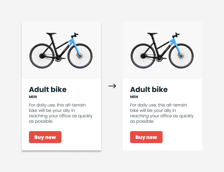
We recommend :
- Anticipate this breach right from the design phase: avoid inserting drop shadows into your graphic designs.
- If their use is essential, be aware that shadows will not be displayed for Outlook. In this case, you'll need to add an extra border to your block element, to make sure it stands out visually.
- For texts, make sure there is sufficient contrast between the text color and the background color to ensure legibility.
<img src="chemindelimage" style="box-shadow:0px 0px 5px rgb(0,0,0);">Opacity and rgba
The CSS property opacity is useful for changing the opacity of an HTML element. This means you can set a certain transparency on an image, title, text... any HTML element.
<img src="monchemindimage.jpg" style="opacity:0.4">But not on Outlook, which doesn't support it at all.
Similarly, the definition of an element's color via the declaration in rgba (for Red Green Blue Alpha) is based on an additional value to the declaration in rgb the afor Alpha, i.e. Alpha transparency. Alpha therefore represents the transparency level of the color.
<p style="font-family:Arial; font-size:16px; color:rgba(0,0,0,0.8);">My text</p>In the example above, my text is therefore in black (0 for red, green and blue values) and alpha to 0.8 (i.e. 80% of opacity). . yet, on Outlookthe text will be displayed in black, without reduced opacity. Enter the color of your texts using a definitive hexadecimal code.according to the code provided by the pipette on the graphic model.
Visibility
The CSS property visibility coupled with the value hidden should be used to hide an element in an HTML page. This can be especially useful in an e-mail, when you're looking to hide an element specific to the mobile version, for example. However, as it is not well supported by Outlook, it will need to be supplemented by the CSS property mso-hide attribute with the value presentation to all all for Outlook, always adding to the weight of the final HTML file.
Video
Video is engaging and entertaining. Including video in an email can lead to an increase in open rate of 19% and click-through rate would increase by more than 50%. However, this format will not be displayed in the inboxUnless your subscriber's e-mail client supports HTML5 format and tags. Since only one popular e-mail client, Apple Mail, supports these tags, it's best to avoid embedded media and consider an alternative.

Using a play button above a static image is undoubtedly the easiest way to link to video content hosted on your site.
Margins
In CSS, when you want to apply margins EXTERNAL property to an element, the margin is just the thing. When you want to apply margins INTERNES property to an element, the padding is just right.
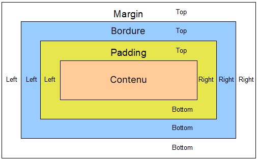
But on Outlook, you need to be aware of certain subtleties:
- if a background color is specified for an HTML element with the CSS property
marginthen the background color will be included IN the outer margins. - Negative values are not allowed on external margins.
- The internal margins
paddingare only supported on table cells (<td>).
Also note: internal margins will be the same for all cells. <td> on the same line <tr> picture <table>.
<table cellpadding="0" cellspacing="0" border="0" role="presentation">
    <tr>
        <td>
            <p>My text 01</p>
        </td>
        <td>
            <p style="padding-top:20px;">My text 02</p>
        </td>
    </tr>
</table>
So, in the code example above, the vertical internal margin at the top assigned to the second cell of my table will also be present on my first cell in Outlook. Then think about nesting other tables when necessary:
<table cellpadding="0" cellspacing="0" border="0" role="presentation">
    <tr>
        <td>
            <p>My text 01</p>
        </td>
        <td>
            <table cellpadding="0" cellspacing="0" border="0" role="presentation">
                <tr>
                    <td>
                        <p style="padding-top:20px;">My text 02</p>
                    </td>
                </tr>
            </table>
        </td>
    </tr>
</table>
Padding-left internal margin
In some cases, the padding-leftput on the tag <td> a <table> in Outlook will be placed on the right, in addition to the padding-rightinstead of on the left, as would be expected.
This padding bug on Outlook was found in the following case:
- When a
<table>is embedded in VML code, that this<table>itself has nested tables, and that the<td>of this<table>have apadding-left. No matter how it's written:padding-left: 10pxorpadding: 10pxwill have the same concern.
That's a lot of things, and that's what makes this bug all the more difficult to pin down. There are undoubtedly other obscure conditions for encountering this bug.
As is often the case with e-mail, you can get around the Outlook problem by playing with variable-width tables centered in other tables. This will make the code more complex, depending on the desired result, but it's possible to find a way to get around it.
Horizontal and vertical lines

Very fine horizontal white lines (or verticals) may appear on Outlook versions during email rendering tests. This is a genuine problem with the display™ of emails on Microsoft Outlook 2016. This bug has been around for several years now and, although it has apparently evolved with software updates, it has never gone away. Numerous solutions have been proposed; among them are:
- The separation of a large
<table>in several<table>lower height - The application of
mso-to set certain values (mso-table-lspace, ...) - Adding tags
<div>of 1px in height in a<td>vacuum - The addition of
in a<td>vacuum - etc.
For English speakers, this topic and a range of proposed solutions are discussed in a post on the Litmus forum. There is also a post on the Microsoft TechCenter. Inside, a "TechNet Community Support"Very kindly explains that this is a known issue that is being investigated, that a timeframe for resolution cannot be given at this time and that the issue will continue to be tracked and the post will be updated when a solution is found." This message is dated July 11, 2016...
Needless to say, subsequent messages asking for news dried up in 2018 in the face of no response from the "TechNet Community Support .
My hypothesis is as follows: Outlook 2016 resizes theview email depending on screen size and resolution. And I think Outlook 2016 gets its feet stuck in the carpet when resizing in some cases, causing those white lines to appear.
This would explain why these lines appear in different places in our tests, and why the solutions proposed by the community work for some and not for others. If this hypothesis is indeed true, it would mean that solving the problem on some BATs would not necessarily solve the problem on other screens, or might even cause it. In short, to the best of our knowledge, there is no no final solution to the problem. If this happens to you, the best advice I can give you is to play lightly with certain pitches and pray.
According to Jay Oram, it could also be due to the conversion of pixels to dots in Microsoft Word. In fact, 1 pixel is equal to 0.75 points. The main solution is therefore, right from the design stage, to favor even values for the sizes of text, images, internal and external margins, etc. And, if possible, to divide them by 4.
Minimum cell height
In Outlook, table cells that are empty or contain a have a minimum height of approximately 15 pixels, regardless of the CSS property height defined.
This can be a problem when using empty cells to create margins between paragraphs, internal cell margins or, why not, horizontal lines. But there is a solution. If you have an empty cell like this :
<td style="height:5px">Outlook will therefore give this cell a minimum size of 15 pixels high, unless you add a style="line-height:5px; font-size:5px" where 5px would be the height of the cell you're looking for. This gives us :
<td style="height:5px; font-size:5px; line-height:5px">Protocols
The href can only contain links respecting a certain type of protocol. These protocols are : http:// or https://, tel:and mailto:. Respectively, these protocols can be used to direct to a url (secured or not)predial a phone number, or prewrite an email to a recipient's address.
Unfortunately, links are sometimes populated by dynamic variables or temporary links. (example: #toreplace). In these cases, the content of the href will appear directly in the email on Outlook.com. It is therefore imperative to check the format and protocols of your links before sending a campaign!
Interline display problem in Outlook email
The CSS property line-height is used, as its name suggests, to manage the height of the line spacing in a text (i.e. the spacing between each line of text). Good web development practice would lead us to define them in relative units, such as percent (%).
<p style="font-size:16px; line-height:140%;">
    Text text text text text text text text text text
</p>
However, the CSS property line-height presents some interpretation quirks on Outlook.
- Enter fixed, non-relative values in the CSS property
line-heightlike the pixel. - Add the CSS property
mso-line-height-rulefor Microsoft Office with the valueexactly.
<p style="font-size:16px; line-height:22px; mso-line-height-rule:exactly;">
    Text text text text text text
</p>
Line spacing smaller than font-size
If you've ever had the experience of trying to set a line spacing lower than the size of your text, you may have noticed that on Outlook (and not just Outlook 2007-2010-2013-2016-2019, but also Outlook Office 365 on Windows) your text is displayed as "cut". Take the following code:
<p style="margin:0px; font-size:64px; line-height:52px; mso-line-height-rule:exactly; font-family:Georgia, 'Times New Roman', Times, serif; color:#000000; text-align:left;">
    First words
    <br>
    following words
</p>
So if we define a text with a type size of 64px and a line-height from 52px (lower than the font-size defined, since 52 is smaller than 64 until proven otherwise), we get the following result on Outlook 2007-2010-2013-2016-2019 and Outlook Office 365 on Windows 10:

Do you see the problem? Do you see it there? We have the top of the "P" and "t" letters (as well as the "i" dots) cut.
To solve this problem on Outlook, use the CSS property mso-text-raise (preceded by a mso- because this property is specific to Microsoft Office). CSS properties preceded by a mso- will apply to Outlook.
Subtract the line spacing value from the type size value, and divide the remainder by 2 to obtain the value to be applied. Square the hypotenuse on Pythagoras. In concrete terms: In my example, the value of font-size is 64. The line spacing value is 52. So I calculate 64-52 and get 12. I then divide 12 by 2, and get 6. All that's left is to add the property mso-text-raise with, for value, -6px.
<p style="margin:0px; font-size:64px; line-height:52px; mso-line-height-rule:exactly; font-family:Georgia, 'Times New Roman', Times, serif; color:#000000; text-align:left; mso-text-raise:-6px;">
    First words
    <br>
    Last words
</p>
Small clarification : this works well when the "top" of the letters is cut. If it's the bottom jamb (consider that there is a "g" or a "p" in the sentence)But that wouldn't necessarily solve the problem.... But then, it's better than nothing, and already allows you to use line spacing that's less than the size of a typeface, with words in uppercase, for example! So you've got less and less excuse not to pass your textual content in raw HTML and not via images, you little rascals...
Page height
As a reminder (because I think it's not a luxury)Outlook uses the Microsoft Word rendering engine to display an email. Microsoft Word offers different display modes: Mode Reading, Page and Web. Outlook uses the "Web" view: a kind of WYSIWYG editor that outputs its own HTML code. Within this Web view there are "text limits"..
In concrete terms, if you have a <table> height above a certain value (text limit)a <br> will be inserted and your <table> will break into several tables, creating breaks in your content. Let's be clear: we haven't specified a fixed height for our <table>. It is the height that its content imposes.
If the limit is exceeded, a line break is automatically inserted. The last value reported for this limit was 23.7 inches, or approximately 1790 pixels.
To avoid this problem, split your HTML integration into separate tables. Create a new table in which to place the rest of your email. This way, the height of the table no longer exceeds 1790 pixels, and breaks no longer appear on Outlook 2007 or 2010. There's always a way!
Our philosophy: acceptable degradation
In email designthere is an important principle to keep in mind which is that of the acceptable degradation. It's very complicated to get a similar rendering on all email environmentsSo we're forced to make concessions. There's an old article on our blog that's still relevant today about acceptable (or gracious, as you like) degradation. You might want to read it before continuing your journey here. We even did a live on the subject, the replay is here.
The thing we want to do for our super customer who sends lots of transac emails: rounded corners, even on Outlook.
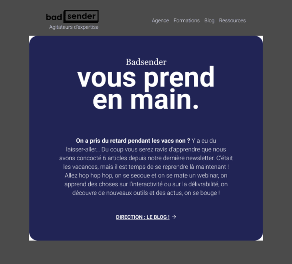
What we want to create for our client is a large block with rounded corners that displays correctly in Outlook. So here's a simulation of what we want to do:

Sounds simple, doesn't it? Well, it could be, but not this time. Because, given the constraints, we take the liberty of thinking in terms of time, brand image and user experience. And the truth... is inevitably somewhere in between!
What are our choices for rounded corners on Outlook?
Option 01: simpler, more efficient
In general, on the web and in emails, rounded corners are handled directly in HTML.
- Impact Outlook Outlook doesn't handle "standard" rounded corners; it transforms them into right angles.
- Solution in general in Outlook To overcome this defect, we use Outlook-specific "VML" code which allows you to apply rounding to it.
- The problem here The "VML" solution works well for buttons, because it requires you to precisely define the size of the block to which you want to apply rounding. Unfortunately, on large blocks (as in these e-mails) and even more so when the content is editable in a email builderThe size cannot be defined in hard terms.
Here is what it looks like in Outlook without VML:
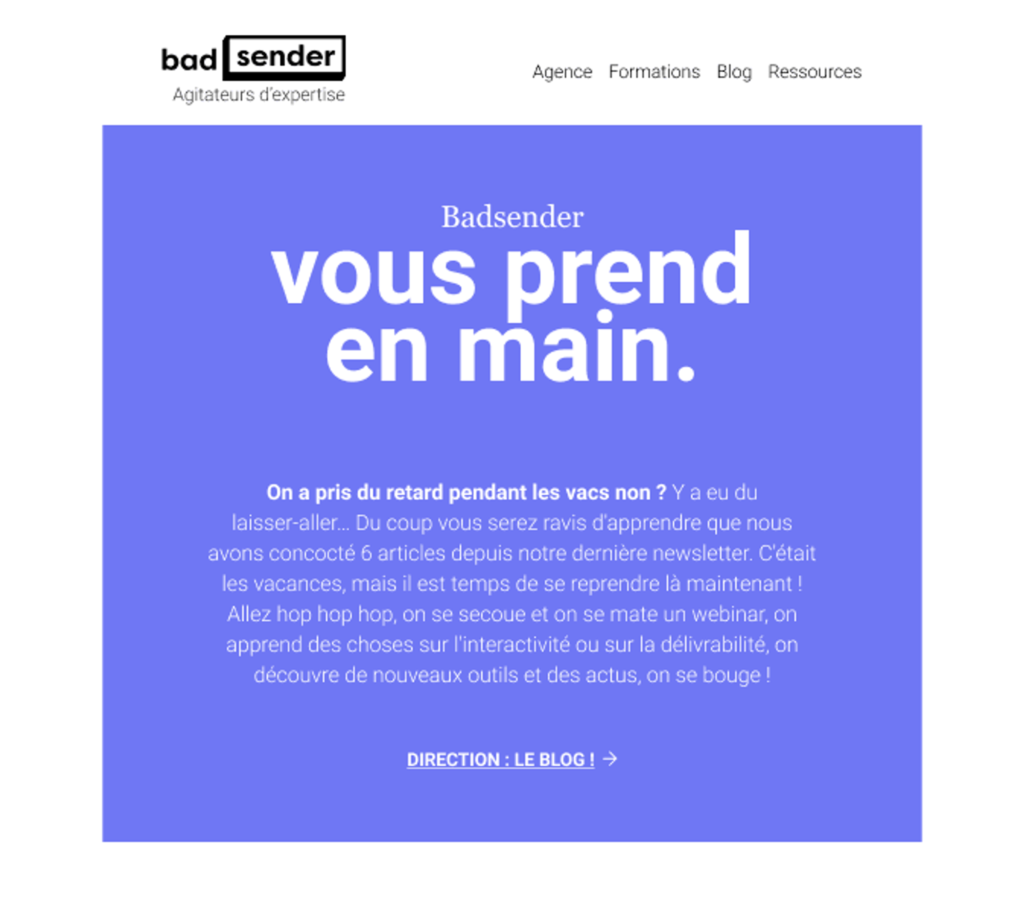
And for consistency's sake, that's not what the customer wants. Just like everyone else, he would like a similar design in all email clients.
Option 02: Back to the old techniques and make rounded corners with images
To get around this problem, we apply an old technique which consists in using small rounded images at each corner of the block. This works very well with Outlook (and others). The problem? The Dark Mode!
Unfortunately, the behavior of Dark Mode is not uniform for background colors and image colors. In Dark Mode, HTML colors are darkened... but images are not. So our little round images stand out.
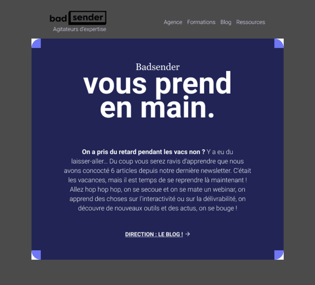
The solution to limit the damage Use partially transparent images so that only the hard color is a problem... but it's still not very graceful.
Now what?
A choice is made, and that choice must be between:
- X % of Outlook users who will see right-angled corners... OR...
- X % Dark Mode users will see unsightly corners
For us, the most acceptable degradation is clearly at right angles in OutlookThis is because users of this email client probably won't even notice that they don't have exactly the same display as others. Whereas Dark Mode users will clearly see that there's a problem.
On the other hand, the 2nd solution makes the code more complex to maintain.
Finally, there is undoubtedly a 3rd way, which is to use Dark Mode bypass techniques by forcing normal display. But we have little experience with these techniquesThis is a risk that bugs will appear in a few months' time when email clients are updated.
Sources
- https://www.emailonacid.com/blog/article/email-development/how-to-code-emails-for-outlook-2016/
- https://www.litmus.com/blog/a-guide-to-rendering-differences-in-microsoft-outlook-clients
- https://www.contactmonkey.com/blog/outlook-rendering-issues
- https://www.badsender.com/ressources-email-marketing/
- https://backgrounds.cm/
- https://buttons.cm/
- https://www.goodemailcode.com/email-enhancements/mso-styles.html
- https://www.badsender.com/ressources-email-marketing/
Leave a Reply