It's a fact: by focusing our skills on editorial content, requests for services are logically increasingly directed towards newsletter writing. This type of email often has a lot of content, with an abundance of news to share.
Our darling customers would like to insert "summaries" into these newsletters: a way of browsing content at a glance. It's legitimate ! These summaries are intended to be positioned at the top of the email, with internal links, known as "anchors", allowing direct access to the desired content WITHIN the newsletter. Yes, but unfortunately, support for internal anchors in an email is clearly not ideal. So what are the alternatives? An editorial ? A table of contents, with or without external links ? A mix of both ? A separate table of contents ? Or perhaps we simply have to accept thata newsletter is not intended to do the work of a blog or website... (see how brilliantly I use internal anchors? with whom?*) Come on, I'll unroll...
The advantages of internal anchors in a newsletter.
- They allow users to "jump" directly to the relevant section without having to scroll through all the content. This makes navigation easier and reduces search time, as users find the information they're looking for more quickly.
- They make it easier to organize information in the email.
- They improve the readability of long-form content, and optimize the user experience.
- People using assistive technologies can more easily navigate a page structured with internal anchors. The same applies to keyboard users: they can access important sections more easily.
Finally, using internal anchors is a bit like creating a clickable table of contents. At least in theory. Let me tell you, it's not quite that simple in practice.
Technique
To talk about a subject, you need to understand its technique.
HTML anchors, also known as HTML tag <a> for anchor (are used to create hypertext links within an HTML document. They can be used to link web pages to each other, to different parts of the same page, or to external resources.
<a href="/en/URL/">Link text</a>Hypertext links point to a different page from the one currently being viewed. An anchor creates a link to a specific location on the current page (or another page). In concrete terms, to create an anchor, all you need to do is assign the targeted element an identifier with the HTML attribute id and associate a link beginning with the character #followed by the identifier's name.
In this way, I can create a paragraph with a unique identifier:
<p id="myparagraphe">My paragraph</p>And then link to this anchor:
<a href="#myparagraphe">Go to my paragraph</a>That's easily done on a website or web page. But can you use internal anchors in a newsletter?
Support for internal anchors in email
The support of internal anchors in an email is clearly not ideal. You can see the estimated support rate of 56% in the support table for caniemail functionality. Let's take a look at the main problems encountered :
- On SFR Desktop webmail, internal links take you back to the webmail homepage, since webmail also uses anchors for navigation.
- On Samsung Email, Yahoo! Mail for Android, Apple Mail on iOS, Gmail on iOS, Outlook on iOS and Android, Orange on iOS, SRF on Android, nothing happens when you click on an anchor.
- On SFR iOS, clicking on the anchor opens a new browser window with the anchor as the url.
- etc...
And what about opening environments that accept it? When it comes to links in an e-mail, ESPs themselves, but also opening environments, tend to add attribute target attribute with the value presentation to all _blankThis has the effect of opening the link path in a new tab. And yet, the very opposite is what is normally sought with internal anchors: to facilitate navigation within the newsletter. In terms of user experience, we've seen better.
In conclusion, anchors and internal links are not particularly recommended in email marketing (although, as I'm wont to say, it all depends on your target and your recipients' opening environments!) On the other hand, I'd like to point out that, while we don't recommend using internal anchors in an email, it's perfectly possible to insert external links that include an anchor: so, when we click on a link in the email, we can arrive at a specific insert on a landing page. No technical problems at all!
What are the alternatives to internal links?
If internal anchors don't work properly on all opening environments, but the customer still insists on having a "menu" or "summary" in his newsletter, then what can you do?
An editorial
This is one solution: write a tailor-made text, specific to each issue of the newsletter, which not only introduces a certain relationship with subscribers, but also allows, within the editorial, links to all or part of the content mentioned in the newsletter. Personally, I love reading the editorials of print magazines! So I'm no exception to the rule when it comes to newsletters.
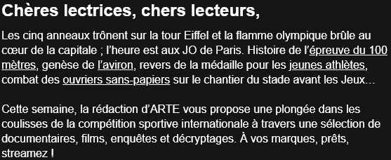
A table of contents, with external links
It's very simple: we're going to create a table of contents of the various newsletter contents, but on each text, we're going to put an external hypertext link to the article in question: people wishing to access the content quickly can click on the link and go to the web article. Others can, if they wish, scroll through the newsletter and gradually discover the content.
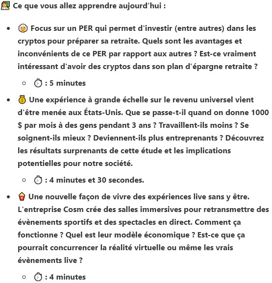
A table of contents, without links.
It's quite rare, but it does exist: a table of contents in the form of a bulleted list, but without links! In just a few lines of text, the articles are summarized to give an introduction and enable the subscriber to quickly grasp the subject and content of the articles to follow. A great way to summarize a very long newsletter!
A mix of editorial and table of contents.
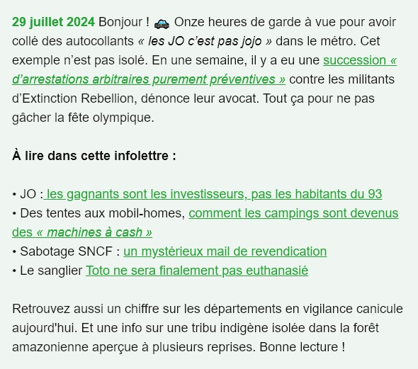
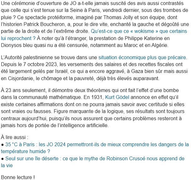
Taking a little of the advantages of each solution is also a possibility!
You could then consider an editorial written for the occasion to introduce and, why not, give context to the main content. Then insert a summary leading to the secondary articles. And, as in the example above in Reporterre's "La Quotidienne", end the editorial with a sentence without a link, to encourage the recipient to read the entire newsletter and give a taste of the newsletter's full content.
A journey through the newsletter.
While the content of a newsletter can be very long, it's a good idea to take your recipient by the hand and guide them through the reading process. And this requires real editorial work to take them with you, to tell them a story, to find a common thread between each piece of content.
After all, a newsletter doesn't have to be just a never-ending series of articles one below the other. Your newsletter must provide your subscribers with relevant and interesting information, of course, but it must also reinforce a sense of community and build loyalty, maintaining your brand's reputation by sharing quality content.
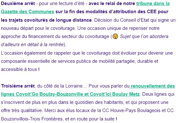
This task will undoubtedly be reserved for those who are willing to take the time to work on the copywriting! Of course, it will be much more complex to set up, or even unsuitable, if your newsletter is sent out too frequently.
How about a separate table of contents?
The problem common to all these solutions lies in the graphic layout of this table of contents: how to make it "attractive", "sexy", while at the same time designing it cleanly with HTML and CSS, and trying as far as possible to reduce its height so as to lift the newsletter content as much as possible. Creativity is born of constraint.
What if one of the solutions to this question lay in designing a summary / table of contents outside the email content? Design it as a separate element, so that you can leave the newsletter content high enough in the email all the same.
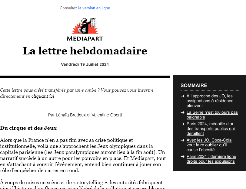
On mobile, it would be entirely possible to either remove this summary and, why not, add another specific to the mobile version, although in the example below, the desktop HTML structure would mean that the summary would be moved to the end of the email on the mobile version if no changes were made.
Conclusion
We have to listen to the recurring and changing needs of our customers and their subscribers: if internal anchors are not recommended in an email due to disparities in support for the functionality on opening environments, it's perfectly possible to envisage editorials, summaries, with or without external links, inside the newsletter or, why not, "outside".
However, good graphic design, a pertinent layout and short, precise, concise information normally enable the newsletter to do its job as... a newsletter! The newsletter is not there to replace the website or blog. It's not there for ALL the content to be present, but as a conversion vector towards a site/blog consultation.
* "Not with anyone with brio it's an expression we use if you like... "
"This is a striking example... I tried to be funny, but... it fell completely flat..."
"Ahhhh with brio... Ahhh ah yes! It's... It's very good, it's very good!"
"No, it's too late."
Leave a Reply