The length of emails is a recurring issue in the email design. A widely held belief suggests that the shorter an email is, the more it gets clicked. In this article, we'll explore this idea: should you keep your emails short?
Note: This article is the fruit of in-depth reflection, fueled by the reading of this article (in English) which brings together numerous resources (notably from Norman Nielsen - User Experience Research Group) on scrolling, attention, and the importance of the top part of interactive content: https://uxmyths.com/post/654047943/myth-people-dont-scroll
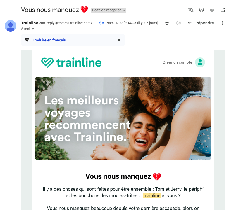
Email consultation context
When talking about the length of an email, it's essential to put the debate in context. The total length of an email is not immediately perceptible on opening. Whether on a cell phone or on a computer, the email is often viewed in a small window, especially on a cell phone. The reader never sees the whole email at a glance. They scroll instinctively through the content, stopping at a given point depending on their interest.
Changing user behavior
In the 90s, scrolling down a page was not a common practice among Internet users. However, habits have largely evolved. With the advent of social networking and the (unfortunate) "infinite scrolling", it's now perfectly natural to scroll through content to access information. Think of your behavior on social networks: you scroll through your news feed as long as what you see grabs your attention.
The risks of a shortened email
Reducing the length of an email at all costs can lead to too dense a renderingand poorly structured. This often happens when font sizes, line spacing, margins, spaces or separators are reduced to save height. An overly compact, unventilated email can lead to :
- Reading and comprehension difficulties
- A low click-through rate
- A risk of premature abandonment
The marketer's reflex
Faced with disappointing click-through rates, marketers often tend to question the length of their emails, rather than questioning the clarity of the message and visual structure. Yet these elements are far more decisive than mere length.
If readers don't click on your campaigns, it's not because they're reluctant to scroll through the content, but rather because the poorly designed email doesn't make them want to continue browsing.
The famous "waterline
Need help?
Reading content isn't everything. The best way is to talk to us.
The "waterline" is often invoked to justify design choices aimed at condensing information in the upper part of the email. But, with the diversity of screen sizes and email opening environmentsThis line is becoming increasingly blurred.
If the information placed above this "waterline effectively capture initial attentionBut that doesn't mean you have to concentrate all your content there. The key is to include a relevant message with the right angle of attack to capture the reader's interest. If the tagline is convincing, readers will flock to the site, and it will be crucial to maintain their interest with a clear hierarchy messages and visual cues efficient.
Warning: the main teaser must not be a simple repetition of the subject line, a mistake often observed when analyzing emails.
Encouraging email scrolling: design principles
Users have no trouble scrolling through content, provided it's optimally designed. Here are a few key principles:
- Work on writing your main title : a clear message with the right angle of attack.
- Sequence information logically A logical order makes it easier to understand.
- Place the main CTA high up in the emailwithout forcing it to the waterline.
- If you need to include 2 CTAs Make sure they are clearly distinguished by different background colors.
- Large font sizes for titles, weight, line spacing, adapted to the importance of the message to be conveyed.
- Optimize text legibility line spacing, left-aligned, not centered.
- Ventilate! white space, margins and separators
- Avoid distracting decorative elements They can distract attention from key information.
- Formulating simple texts clear, concise sentences improve readability.
- Group related elements For example, an image and its associated text must be close together and have the same background color.
- Limit the number of colors Use a consistent palette: color should guide attention, signal importance, or indicate interactivity.
Note: We're taking advantage of this article to kill another misconception: just because an email is long doesn't necessarily mean it's heavy. By applying the eco-design principles and editorial restraint, we can achieve very long newsletters with html files as small as 102kb.
Responsibility of email designers
Email designers also need to challenge themselves. Present email mock-ups in their entirety, without simulating the scrolling experiencecan lead to errors of judgment (cuckoo Thomas, Pierre, Olivier and co 🙂). Presentation in real reading conditions is a crucial stage in judging the effectiveness of an email.
Conclusion
Today's users are accustomed to scrolling through pages, including emails. It's therefore crucial to prioritize messages and design emails that encourage scrolling, while maintaining optimal visual clarity. The real challenge is not to shorten emails, but to structure them intelligently so as to creating rhythm in reading.
Leave a Reply