It's a fact, the number of emails sent keeps growing. And yet, creating an email is not that simple...
One of the disadvantages in setting up email marketing campaigns is the design: creative teams need to be available and able to design emails in shorter and shorter times. So we look to delegate the design of emails to other team members. But how to keep a qualitative and coherent graphic result with people who do not have graphic skills?
The other major disadvantage comes from code development: HTML and CSS integration for email is subject to many specificities. So how do you ensure that a non-expert can code an email correctly?
Without necessarily delegating this design work, it makes sense to make these tasks easier and faster, while limiting the number of possible recurring errors. Production teams sometimes struggle to keep up with the increased volume, while remaining innovative and maintaining high quality standards.
One of the other difficulties lies in the various email typologies of a brand: how to ensure consistency in the emails produced? How to understand that it is the same identity through a newsletter, a transactional email, a relational email, a promotional email...?
So we need to rediscover the pleasure of designing emails, even if the task has become arduous... We also need to make the operation profitable! The Design System Email alone can help solve these problems. In this white paper, we'll explain what a Design System Email is. Many articles already exist on the subject, but few of them are in French. On the other hand, they generally approach things in the same way. So we've tried to pull together all the data to provide you with the most comprehensive resource possible.
Let's get started.
Table of contents
- First of all, what is a Design System?
- So what's a Design System Email?
- How do you know if you need a Design System Email?
- Who uses Design System Email?
- When should you set up a Design System Email?
- Why create a Design System Email?
- How do I create a Design System Email?
- How do you update and maintain a Design System Email?
- What tools does Design System Email use?
- Appendices and resources
First of all, what is a Design System?
A design approach that subdivides a system into smaller parts called modules, which can be created independently and then used in different systems.
Design Systems are intended to establish consistency and efficiency across the media through which a brand manifests itself. Not just email, then. Creating consistent user experiences while accelerating the design process - that's the main objective!
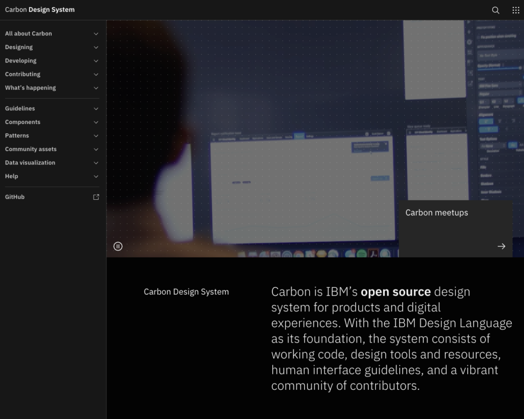
A Design System therefore consists of a library of graphic elements and functional components reusable across different media and made available to designers, developers, editorial team members, marketing, coupled with resources, guidelines, and recommendations to enable them to create, faster and together, and deliver a consistent user experience that reflects a brand's image and values.
We can also call a Design System "atomic design, "design language, "pattern library, "modular design, "component design, "user interface library... But the objective remains the same, whatever the name given: to create a series of design components that you and your team can reuse, with rules for use.
So what's a Design System Email?
In the field that concerns us directly, what does a Design System Email mean? Design System Emails are built for the same reasons: efficiency and industrialization of design steps, as well as maintainability and quality control guarantees. A Design System Email is a set of components and standards that teams use to guide their work and create error-free emails faster and more consistently.
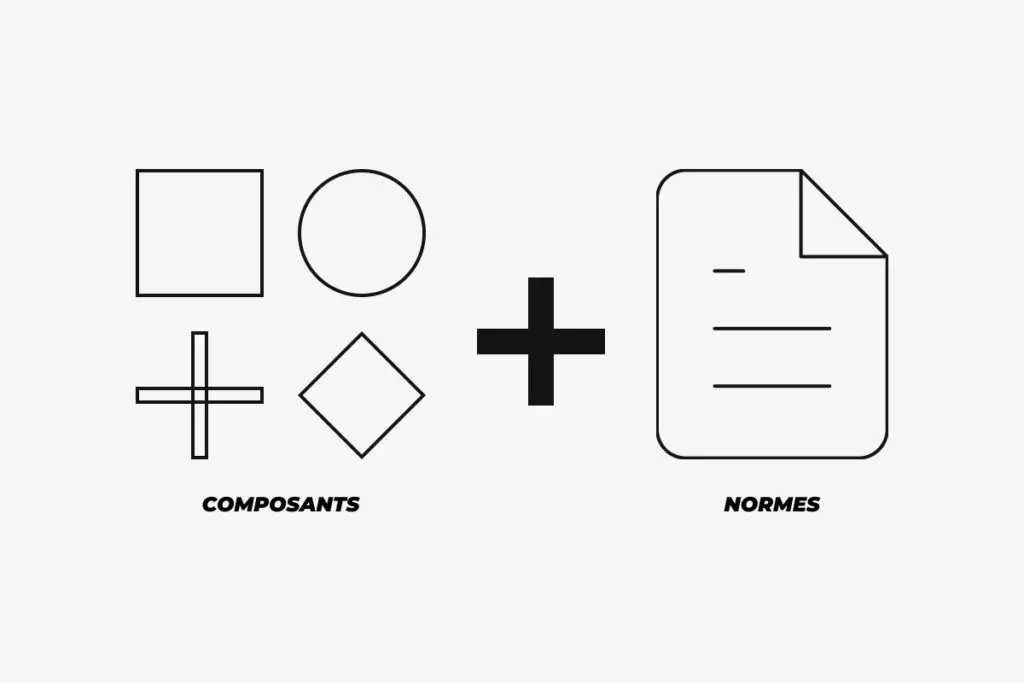
Consider an Email Design System as a single source of truth for all email campaigns to be created. It is a library of all the different content blocks (modules)fonts, colors, or any other element you use to create your email campaigns.
The Email Design System does not replace the general Design System. It is a part of it. It is rarely established because it is quite rare to have in-house experts in email design and code.
How do you know if you need a Design System Email?
To do this, analyze, quantify - both the number of campaigns sent and the number of people involved - look back at what has been done and consider current practices.
- Does email creation take a lot of time?
- Do you regularly encounter errors during the quality assurance process or after sending the campaign?
- Are there many people involved in the design and development of emails?
- Are you bothered by the current email production process?
- Do you have little time to produce emails?
- Are there any disparities in the style of your email campaigns?
Checked off most of the questions above? Then it makes sense to create your own Design System Email.
Who uses Design System Email?
The Design System Email addresses multiple profiles:
- At Designers They complete it, then refer to it to find all the components already designated, or to update them.
- At Developers They complete it with tested and approved code, then refer to it since the Design System Email takes snippets, pieces of code and modules already developed. They can update the code when necessary.
- At Manager of the Design System Email: a single person, who agrees to design it, prepare it, update it, promote it and guarantee its use by the production teams. But also in charge of training the teams to use it.
- A anyone responsible for designing an email ! From now on, the profiles mentioned above will not be the only ones who can work on the subject. And that's the beauty of an Email Design System: with all the modules, designated and developed components available, worked on and tested, everyone (campaign managers, marketers, CMs...) is able to design emails following the guidelines and recommendations.
When should you set up a Design System Email?
If existing emails
Having existing emails may seem like a hindrance to designing an Email Design System: creating an Email Design System after the fact, when everything is already in place... It might take more work, right? The fact of having a base of existing emails allows you to benefit from a significant feedback if we are able to analyze the statistics of the modules used: do they generate clicks? Do they please? The list of experiences will be invaluable in building the email design system. Evaluate the performance of your current emails and look for things you want to keep, and things you would like to try. Look at what works and what doesn't.
There is no point in reinventing the wheel for every new marketing campaign. If something has worked in the past, consider using it again, perhaps with some minor adjustments. Not only will this bring a sense of familiarity to subscribers, but its past success also means that it is likely to resonate with your prospects.
So first you need to audit your existing emails and know what to include in your email design system. The goal of this work is to determine which components are common to all emails and which are unique, so that you know what you are really building and what standards to write.
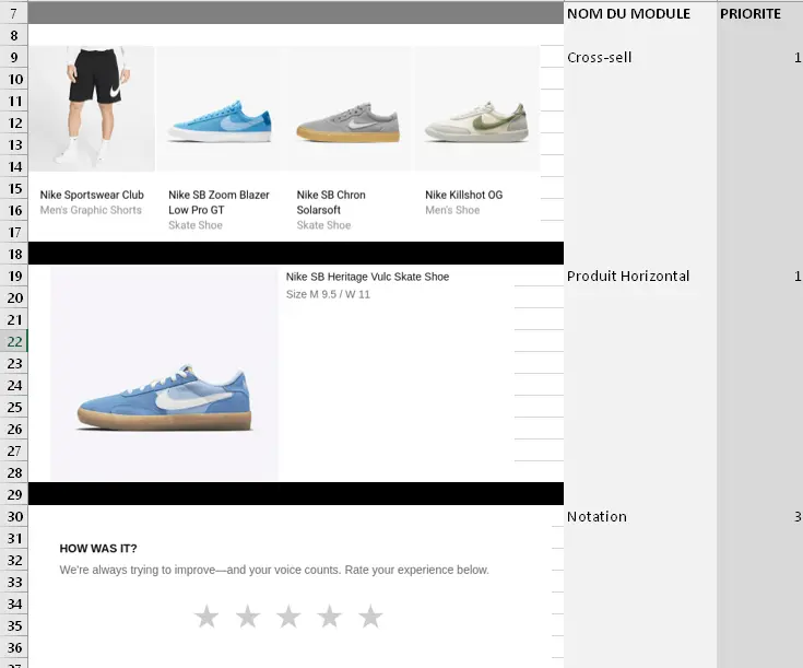
You can do this exercise with an Excel spreadsheet and document each email sent, the different types of content, images, buttons, headers, footers, banners... Feel free to attach screenshots or links to email mirror pages.
Then, discuss with your team and work in collaborative work and prototyping tools like Figma. You'll then be able to discern the smallest elements, text styles and hues, build molecules and assemble them to create organisms... This work will also enable you and your team to list and document the choices you've made.

Take advantage of this opportunity to perform A/B tests, to understand your audience's preferences, what are their main opening environments (Gmail, Outlook...)the type of support (desktop, mobile... the percentage of consultation on each).

If no email has yet been created
Without doubt the case of (which seems) the simplest and most adapted in terms of process: we start the work from scratch, with a completely blank sheet of paper. This can also be the occasion to monitor what the competition is doing to understand the trends and find new inspirations.
The work will then continue with a wireframe systemIt has a wire frame structure to delimit the modules, the organisms. We don't get distracted by colors, images, typography. We focus only on the design of the modules and elements.
Each step will be discussed with the teams in order to get their opinions, feedbacks, optimization axes... Several series of modifications will be possible in order to collect comments and make the necessary adjustments.
Why create a Design System Email?
We have already quickly defined the objectives of the Design System Email, but let's take the time to go deeper into them.
- Time saving : A Design System Email represents a considerable time saving; no need to reinvent the wheel (or design) for each campaign. Instructions are given to go faster in the design of the email template. It is then possible to increase the volume and improve the speed of content production.
- Innovation This time saving can be used to investigate innovation or particular cases, which may be more difficult to insert into the Design System Email.
- Brand consistency and product emails With the Design System Email, emails produced are consistent, even if the email typology is not the same. In this way, a brand will be identifiable and recognizable between its marketing and transactional emails, reinforcing its credibility with recipients. Your subscribers should always know that an e-mail is coming from you. Sender name and the logo do the heavy lifting, but the rest of the design should contribute too, as design consistency is directly linked to user trust. Brand consistency means that the way you present your company - and what it stands for - remains the same across all your marketing channels, unifying the image and message your customers and potential customers see. Brand unity is important because it leads to brand recognition. When customers recognize your brand (and have positive associations with it)As a result, they are more likely to make purchases and commit to your company over the long term. Plus, when you create brand consistency, you reinforce the qualities your customers can cite when recommending your brand to their friends and social network followers. Keeping your brand consistent helps you keep your customers.
- Efficiency Production teams, whether on the design or development side, are now much more efficient with this document at their disposal. Design and development are two of the three most time-consuming tasks in email production.
- Transversality The Design System Email allows you to avoid having to rely on your design team to respond to specific requests. Now there's no excuse for the marketing team to be busy creating emails too! Plus, when everyone is using the same workflow, it's easier to get things done.
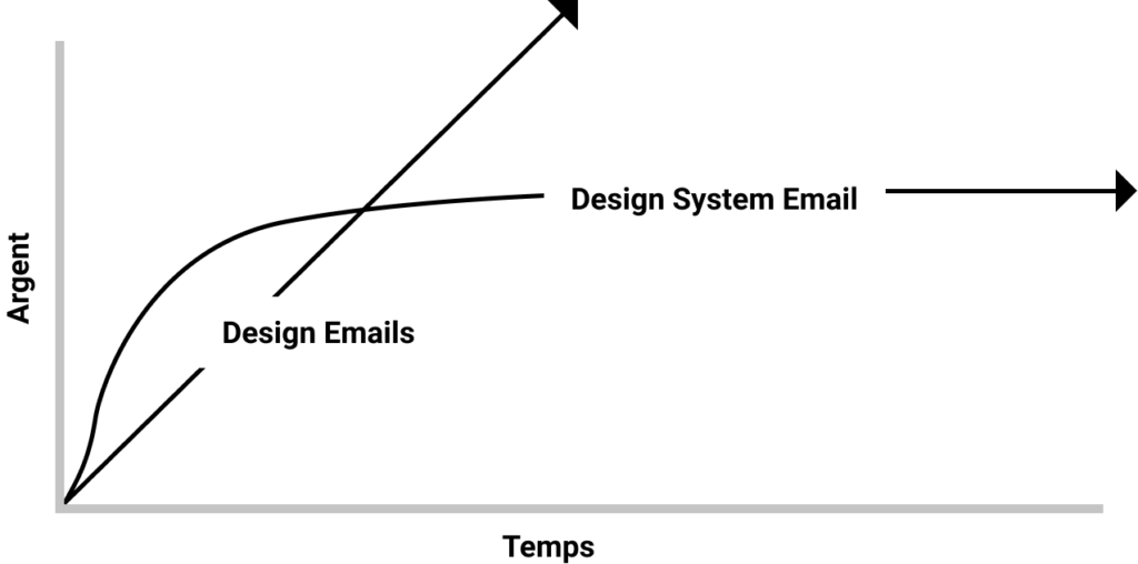
- Profitability The Design System Email will take some effort to set up, but the considerable gain it represents (team, branding, volume and production time) in the long run weighs heavily when weighed against it. Think about it!
- Quality : Fewer errors possible! We are all human, and if we have to work fast, the risk of error increases. The slightest typo in your code can lead to serious rendering problems. The fact that components are pre-built limits this risk of error.
- Framing By setting design constraints, we offer less choice when configuring emails, which can also be a plus! It also allows to go faster, for small teams: we avoid gas machines, the too much choice kills the choice.
- Document Allows everyone to easily understand the decisions made (including for non-technicians). Clearly communicate expectations and objectives to team members, reducing the risk that specifications will be misunderstood or misinterpreted. A single source of truth to refer to. Shared repository of knowledge collected as a backup when teams change.
- Correct design and code debt with a reusable frame for increased efficiency and speed.
- Flexibility The organisms are "living", stretchable and will be able to adapt according to the content precisely because they are evolving elements. By flexibility, we also mean that these organisms will be able to change place, and the structure of the email will undoubtedly be more modular!
Are there any drawbacks?
- Standardization We could regret that the designs produced with the help of a Design System Email are a little too identical... But is this really the case? There are still elements that are possible areas of graphic customization (visual)The visuals will help the email stand out from the crowd. The texts, the contents of the buttons, the visuals, the subject, the preheader... The visuals will mainly help the emails to stand out: it can be a large visual, where the possibilities will be greater (as defined in the General Design System). Flexibility is always present despite everything and it is also necessary to know how to preserve it: a Design System Email does not mean to restrict creativity and to be constrained to what exists, it is also necessary sometimes to know how to leave the beaten track! A Design System Email should not look like something that stifles creativity either. Don't make it too rigid, a certain level of craftsmanship is important. It should still allow for creativity within a set of guidelines. And also keep in mind that consistent emails just build brand credibility, as seen above.
- Cost : Longer to set up? Yes, but probably more profitable in the long run because you will work with components that you will reuse over time, and the time spent creating will stabilize.
You will have to introduce this Design System Email to your teams. A training session can be planned to explain how it works, its categories, its use. A continuous training can also be considered, with an ongoing support, so that it is not just another tool that will fall into oblivion with time...

It will also sometimes be necessary to make updates to your Design System Email, and to document these updates (indicate the changes made, to inform your employees). Design System Emails are not supposed to be static. They evolve over time, according to changes in the brand's identity, but also according to new bugs from mail client renderingwebmails and open environments, or even with interpretation bugs of the sending platforms. Or, on the contrary, with the resolution of some bugs.
And remember that nothing is set in stone! This Email Design System will evolve with time, with the feedback! And the fact of having precisely established a Design System Email will make these evolutions much easier to implement.
How do I create a Design System Email?
Components and their classification
To build your Design System Email, you need to organize the components. This part is particularly important because it helps your teams to easily find the right modules to useThis makes it easy to adopt. The components of a Design System Email will therefore usually be brand colors, elements such as logos, icons, images, code snippets, organizations or complete email templates.
Atomic Design
In the world of System Design there are several approaches and methodologies. The most common and easily transposable to any project (email or larger) is the one established by Brad Frost: Atomic Design.
It is a modular approach that starts from the smallest interface element and goes up to the largest in 5 levels of classification: atoms, molecules, organisms, templates, pages (email in our case)
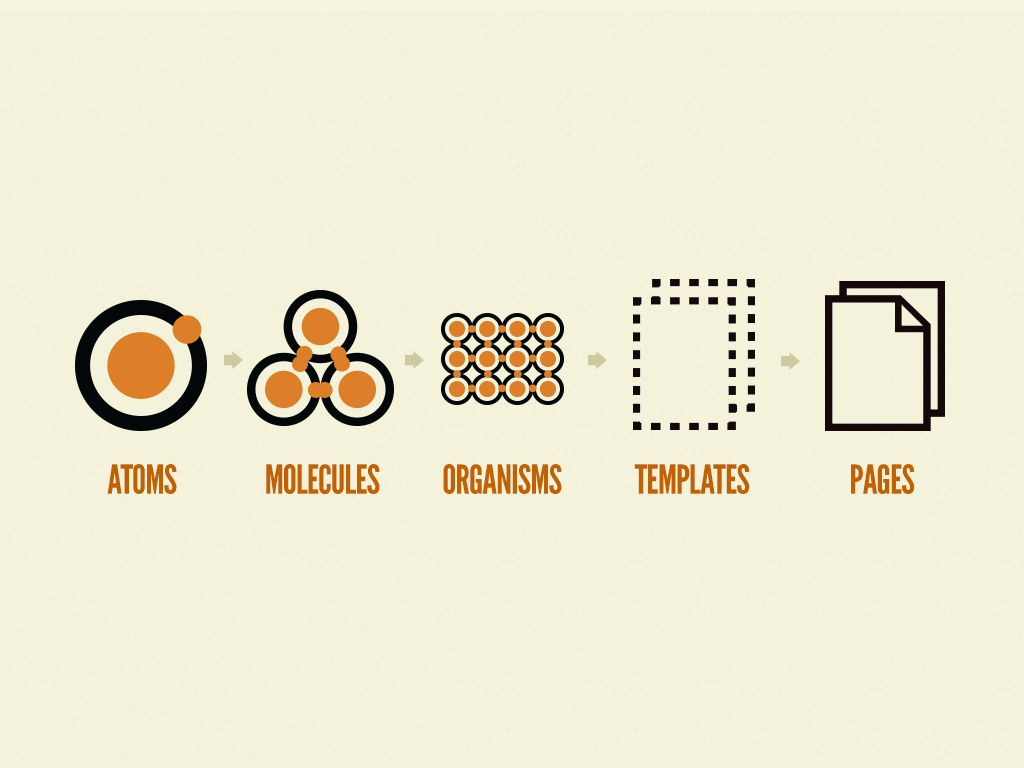
Atomic Design, in a way, could be put in analogy with Lego :
- A single Lego element, like a single brick, is a atom. This is the smallest element.
- Combined with several other bricks, it can form a window frame for example. It would then be a molecule.
- This molecule (door frame)combined with a transparent glass, will become a door in its own right (with, why not, a handful, an atom more) which thus becomes a organization.
- This organization can be used in a house, a castle or a tiny house which will be your different **.templates.
- Finally, what will prevent you from using your different templates (house + tiny house) for the same email campaign? So you get your pages (emails) which will be the final results, the outcome of your construction.
In two words ? Atomic Design consists in reversing the traditional logic of design. Instead of starting with the finished "product (a poster, a web page, an email)it is about :
- to first codify basic design elements (a button, a title, a graphic treatment of the visuals),
- to assemble and arrange them afterwards, to "produce" the final design.
Therefore, the creation is indeed "atomized".
The atoms
Atoms are the smallest elements of your Design System Email: they can come from the general Design System already established beforehand, or from the rules of your brand book, graphic charter, styleguide... You probably have a document that defines the rules of visual expression of your brand. Get these basic ingredients of your brand identity. And if not, there are at least print or digital campaigns, specifications for your website... so many clues to lay the foundations of your future Design System Email.
The colors

The work begins first with the colors. This is probably one of the most important elements of atoms. There can be a specific color for each type of email for example. The colors you use can evoke specific feelings. Keeping them consistent in your digital and physical marketing materials will make it easier for customers to recognize your brand. List and specify the colors used and when they are used (in background or not, in solid or gradient, in the text...)
The Logo
The margins around a logo, its breathing, are elements often detailed in the general Design System. But nothing prevents you from applying specific rules to its use in an email! You can also talk about your logo and its different combinations (if existing).
Typography
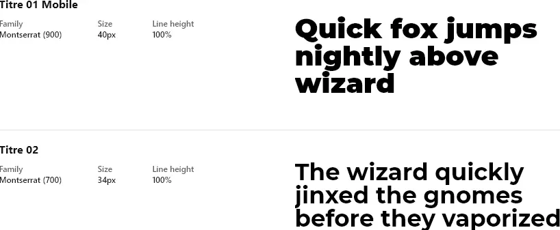
Your font choice should generally consist of primary and secondary fonts that complement each other. Your brand will be more recognizable if you use the same fonts when communicating with customers. So you can talk about your fonts, typographic rules (when to use bold, underline, what proportions between a title, a subtitle, an intertitle and the current text...). But also text hierarchies, importance levels... And, of course, the alternate typefaces when you use webfonts!
The visuals
The images you use say a lot about who you are and the value your product or service offers to customers. The style of your images should align with the other elements of your brand. If you sell jewelry, close-up photographs will probably be a better choice. In short, what types of visuals are used and how they are handled (with or without borders, with cut-outs, overlays).
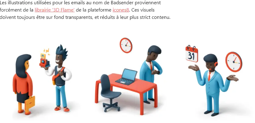
In the Design System Email, you can also detail the dimensions of each visual, depending on the organizations where they will be present. However, don't spend too much time specifying ideal weights per visual, as this depends on multiple variables and unknowns (Retina or not, image content, extension, size of the visual...).
The icons, the rounding, the layout...
The "Atoms" part can also include other elements such as indications for the roundings to be respected if they exist, the spacing, the gutter and grid system if present, recommendations on the use of icons... Depending on each Design System Email created, elements will be added or removed, and each Design System Email is different in this sense!
The molecules
The buttons

This is an essential element in your Design System Email! And this is probably the most important molecule: you put together a text, a background color or border, and maybe a pictogram, with maybe rounded corners as well, and you get a Call to Action, a call to action in button format. But it doesn't stop there! You can detail several types of buttons, depending on their importance. Their behavior on mouse-over. The rules regarding their colors, rounding, fat and text size...
In short, it is the perfect example of a molecule that can work just as well on its own (a button centered in the email)but also integrated into an organization (a module with image on the left and text + cta on the right for example).
The organizations
Blocks, modules, horizontal sections
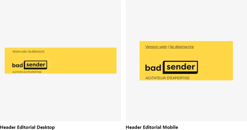
It will probably also be necessary to detail a hierarchy of organizations: which ones must imperatively be present, primary, secondary, tertiary... While also measuring the impact they can have on the layout, the final design, the density, the understanding of the message(s), but also the final weight of the HTML file!
The Templates
Templates are both examples of emails created with the organizations (example of editorial, marketing, transactional email)but can also take the form of Master Template with all the organizations grouped under each other, and which will serve as a basis for each email design. This can also allow you to skip the prototyping stage in a platform.
So you will have a single HTML document that contains all the possible modules, which means that the creation of the next campaigns will necessarily come from the same code. This is more or less what you do today when a new campaign looks like the previous one and you copy the HTML file of the previous campaign, right?
The "Pages" or rather, the emails
The Pages are finally the result of your construction, with the final contents, the links put in place, the optimized images, etc... In short, it is your finished email, completed!
Components and their uses
The standards
Standards dictate the use of components. They are guidelines that provide answers to the questions "Can we?", "Should we?", "What if?". They are there to explain how to use or add elements, or to explain the logic behind design decisions for example. This information reduces the need for daily problem solving and decision making. The marketer is more relaxed and feels supported.
Recommendations
They allow us to ensure the right combinations of components to create consistent user experiences. These are the different rules that must be respected to ensure the proper usability of the email and to reflect the brand image.
The guidelines
Guidelines define the rules to follow during the design process. They can cover everything from brand colors to the typefaces used. They indicate how to use them in your marketing. Having brand guidelines in place makes it easy to maintain consistency in your brand's appearance. Once you've written them, they're available at any time; you don't have to start from scratch with every new campaign. So brand guidelines create a win-win situation: less work for you and brand recognition from your customers.
Writing
Whether they are guidelines, recommendations or standards, they can take the form of documentation, comments, indications, warnings... They must be respected by designers and developers in the creation and use of the various components. Try to follow these best practices when writing them:
- Make these standards easy to read with bulleted lists instead of paragraphs of text.
- They must be simple, clear, and not subject to misunderstanding or misinterpretation.
- Use "do's and don'ts (to do, not to do) or "callouts".
- Avoid masses of text, which are too long to read and understand.
- Use visuals or screenshots: an illustration is sometimes worth many explanations.

The classics of a Design System Email
The Responsive
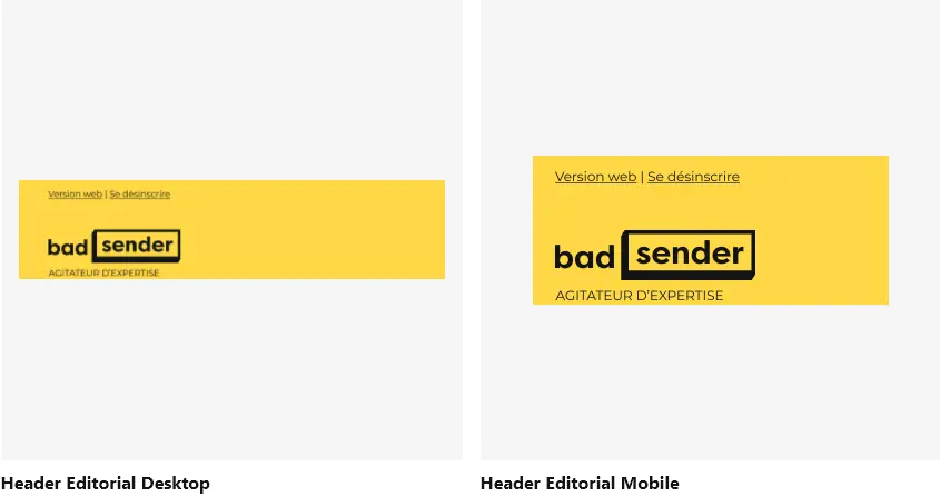
It is essential to indicate or recall how organizations will behave between desktop and mobile. This can result in a side-by-side view of the two behaviors of the same element.
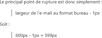
It will also be relevant to fill in the value of the breakpoints of the media queriesto indicate if the development is in "Spongy Code" in the case of the absence of interpretation of media requests...
You can also go into much more detail about these recommendations by indicating the variations of typography sizes on mobile according to the different levels of text, the possibly changing behavior of calls to action (a button that is limited to its content with internal margins in Desktop will perhaps take the whole width of the email on mobile? Are the internal margins then different?)the width of the organizations on mobile (in percentage or in fixed width?)...
The behavior of the components on the mobile should ideally be completely clarified and documented, so that no mistakes, misunderstandings, or hesitations are possible.
Fallback solutions
Support issues or cases requiring an alternative solution.
This is also what the Design System Email is for: anticipate when a feature will not workbecause we know that not all mail clients interpret HTML tags and attributes in the same way. If a "Video" organization is planned, what will be its behavior on the mail clients that do not support the video ? What will be the backup solution? Should it be a JPEG with player, or an animated gif? If a "Carousel" organization is considered, what will it display when the functionality is not accepted: a mosaic of the items in the carousel? Or only the first two products? It's up to you to define it!
Support and acceptable degradation
Apart from fallback solutions, it is also necessary to be able to anticipate the cases where a graphic style will not work, because we know that not all mail clients interpret CSS properties in the same way.
Example with rounded corners If we plan to use rounded corners on our Design System Email, we will detail and anticipate how these rounded corners will be displayed on Outlook, which does not accept the CSS property border-radius, and what to expect in such a case. The Design System Email will also allow you to weigh the pros and cons of this or that solution, and to explain them: it is better to provide these rounded corners in CSS rather than in image, for accessibility, readability, maintainability, Dark Mode...
? It is impossible to guarantee a pixel-perfect rendering anyway. And that would be a waste of time, energy and money, and the imperative is no longer to this objective. It is therefore necessary to have a good knowledge of the viewing habits of your recipients: depending on their opening environment, the support of CSS properties may vary, the rendering of the email will be different. It is up to you to define in the Design System Email what is acceptable in progressive degradation.
The Dark Mode

Why not take the opportunity to detail the behavior of a component in Dark Mode? What is the expected result ? What to do to get there ? What good practices respect? The Design System Email will allow us to share our experiences and acquired skills. The particular case of the Dark Mode, the issues surrounding it and the best practices referring to it are a very suitable case to take the time to talk about it in this document.
To go further
It may also include standards on subject line writing, best practices for preheader text, sender name formatting, voice approach, content tone, terms for calls to action, link tracking parameters, campaign sending frequency... All this is much broader and no longer concerns the design itself, but rather the emailing strategy. However, you can still insert it into the Design System Email if you wish.
How do you update and maintain a Design System Email?
Test, test, test. And test.
From the moment this Design System Email is brought to become the source of truth of the next campaigns to be created, it goes without saying that this resource must be free of any errors : the code components that will be presented there must have been tested many times to ensure that they are displayed on all mail clients, that the responsive works correctly, that all class have been implemented, that the rendering on Dark Mode is optimized, that the 120DPI or Retina have been anticipated, etc...
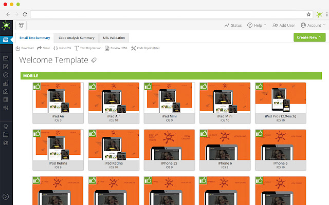
Therefore, make sure to test the code elements that you will make available from this Design System Email. To do this, you can obviously use email preview solutions such as Litmus or EmailonAcidwhich will allow you to access several rendered screenshots on multiple opening environments, mail clients, webmails, browsers, resolutions...
Updates
Again, there is nothing to prevent the HTML code in the Design System Email from being updated afterwards. On the contrary, there will be evolutions, changes of course. It is precisely the regular use of the Design System Email that will allow you to identify and list the updates, corrections and modifications to be made. But, if possible, they should not be gross error corrections. You will therefore have to update this Design System Email, and fill in the changes for the new version. It is then up to you to inform the production teams.

What tools does Design System Email use?
To draw
If you need to make first wireframes of your future elements, you can use a solution like Balsamiq Wireframesfree of charge, or plugins available on Figma.
To model
You will have to model your components. You have to. Whether it's the molecules (buttons)organizations (header, cover, footer...)you will have to go through a mock-up stage. So here is a quick proposal of some platforms present on the market, and that we consider relevant and adapted to conceive a Design System Email.
Figma
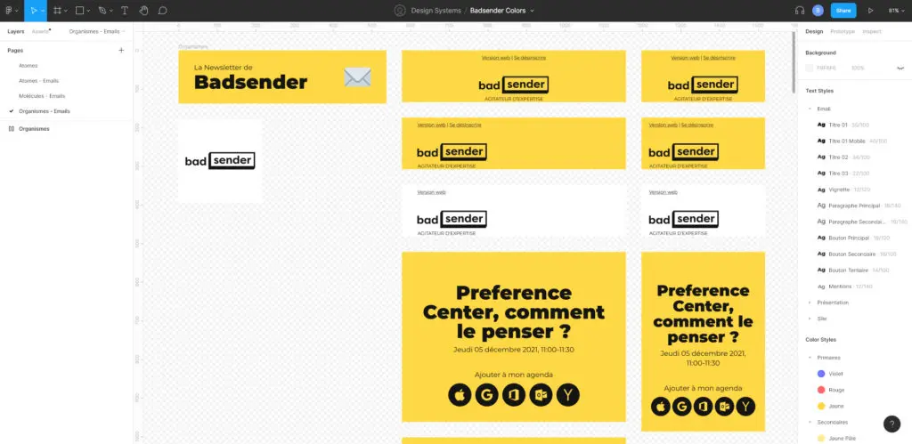
Is it still necessary to introduce Figma? This solution saw its first public version appear in 2016. Since then, it has continued to grow and take market share in Prototyping solutions. Today, it is a tidal wave. We discussed it at length in an article on email production with Figma. Figma, for Design System Email, is probably one of the most practical platforms, since it offers to save text styles, colors, create components... In short, a sort of "first draft" of Design System. On the other hand, the code indications it can provide are not especially emailing oriented.
A special mention goes to the "Auto Layout" feature, which lets you create scalable, stretchable components. Especially since Auto-Layout evolutions deployed in 2023 by Figma.
Sketch
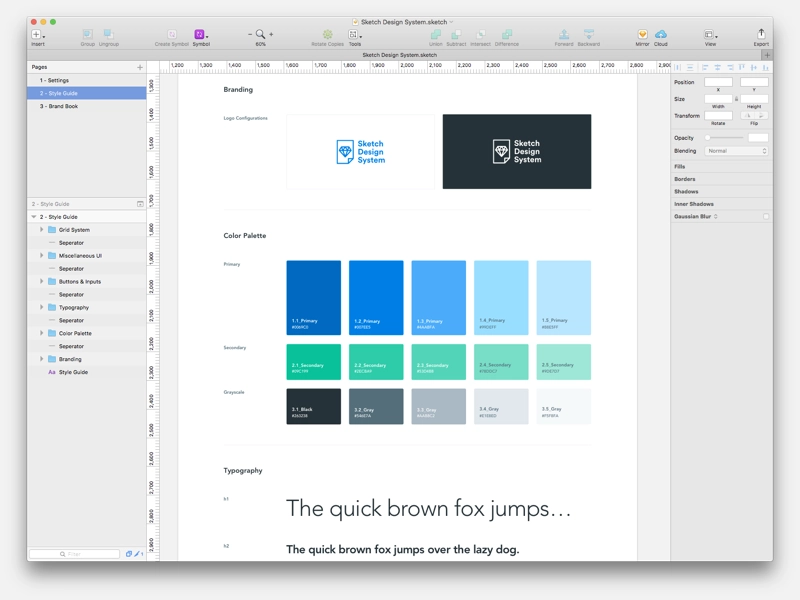
Sketch works exclusively on MacOSSketch can be a very effective tool for documenting your Design System Email, designing your atoms, molecules, organisms, templates and pages and then importing them easily from other platforms where more documentation is possible. Sketch is older than Adobe XD and Figma, which may explain why the interface of the three platforms is relatively similar. The main handicap of Sketch is perhaps the absence of a collaborative work tool directly integrated into the platform.
Adobe XD
This tool proposed by Adobe is very close to Figma, as much in its functionalities as in its appearance and ergonomics. The difference lies in a few details (price, community, plugins...). If you wish to find a detailed comparison between the three solutions seen above, please consult this article.
Framer
A collaborative tool to prototype, create, model.
To code

In your Email Design System, you will undoubtedly need to offer pieces of code so that they can be reused directly in the HTML files of the emails produced. In fact, it is highly recommended! So you need to be able to develop these "bits" of code in HTML and CSS. Many tools exist on the market to code.
Dreamweaver
The development solution by Adobe, still present on the market, and still very practical for email development.
Storybook
Storybook is an open source library created for component development, which focuses on component isolation. You can browse a component catalog (book) while viewing the different states of a component by use-case (story). Storybook is really adapted to Design Systems! It's up to you if you want to implement it on a Design System... Email?
Parcel
A code editor made FOR email development, and BY an email developer (Avi Goldman). With little features that will delight REAL email developers (snippets, MSO support, Can I Email integrated, CSS inlining...)
Design Tokens
Some platforms that we will discuss in the next chapter, such as zeroheight, allow you to generate and retrieve design tokens, in other words, "variables" that you can use to make sure you find, for example, the color codes, text levels, and rounded corners defined from the prototyping platform.
This feature is rather rare to use in email development, but it is possible. On the other hand, it requires a little more technical skill.
To centralize and share
That's it, you have your shades, your color palette, your typographies, your text levels, your atoms, molecules, organisms, templates... And the code that goes with it! It's time to move on to writing the Design System Email. We have only tested three platforms for the moment, but there are probably many others, which you can discover for yourselves.
Please note: The functionalities proposed in the solutions detailed below seem interesting, but the biggest difficulty is that they do not focus on emailingAnd that's what makes the task of finding the ideal solution so difficult!
Zeroheight
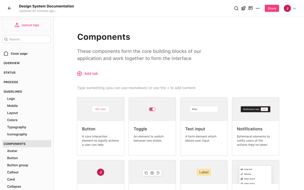
Zeroheight is undoubtedly the most convenient platform to gather all the information of the Design System Email. Indeed, this solution offers many advantages:
- Possibility to link one or more Figma documents, where the beginnings of the Design System have already been established (text styles, shades, atoms, molecules, atoms, templates...).
- Text styles and colors are automatically imported with a very practical formatting, detailing respectively the typography used, size, fat... and hexadecimal codes.
- Ability to link to the most useful categories, very quickly, to simplify the use of the Design System Email.
- Ability to insert pieces of HTML code with a preview above, or code snippets.
- Ability to import files Githubvideos, to make a comparison with other code development solutions, or with Sketch or Adobe XD.
- The platform is very intuitive and easy to use.
- And the big plus: a free package for a single editor and a single "styleguide
Zeplin
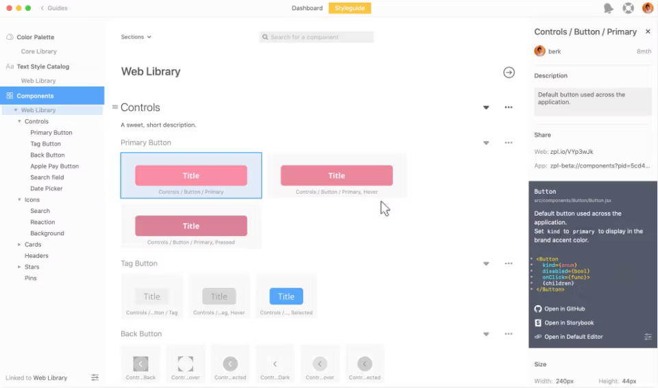
The functionalities offered by Zeplin are surprising (in good). Once again, the Figma plugin allows, as with Zeroheight, to simplify the task and import text styles, colors, components, etc. very quickly. (which can be sorted according to whether they are atoms, molecules, organisms...). However, the main weakness of Zeplin lies in the impossibility of creating pages of texts, to detail a little more in writing particular cases (Dark Mode, 120DPI, Accessibility...). Of course, there are descriptions that can be added to elements. And maybe this could be enough for you.
InVision
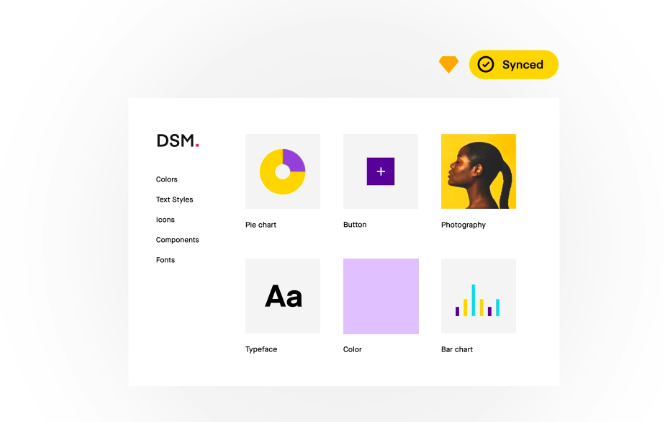
The famous platform offers its own Design System servicewith DSM (for Design System Manager). Only problem: apparently, the only possible plugin for importing components is Sketch. So we haven't had the opportunity to really test it yet, but creating an account is still possible for everyone, and for free.
Notion
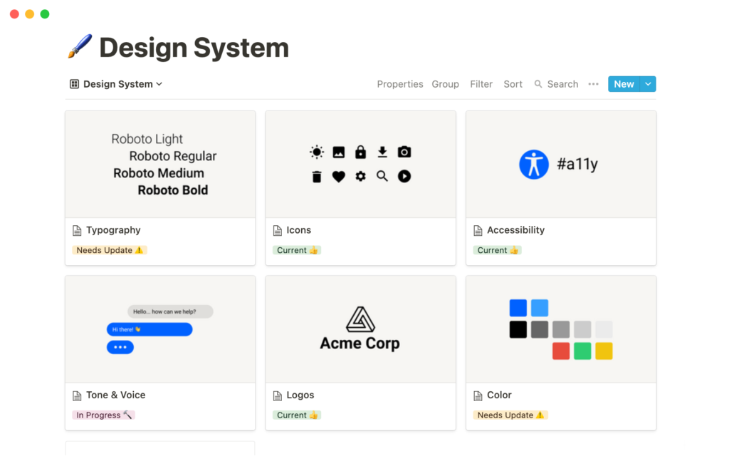
The platform Notion.so offers a free Design System template. We have experienced this for one of our clients, and the tool is quite handy for gathering all the recommendations and guidelines and organizing the content of the Design System Email. In short, especially for writing textual content and organizing it. On the other hand, for the moment, the platform is not yet advanced enough to automatically import styles or saved components from external solutions like Figma, Sketch or Zeplin (even if it allows you to import Figma, Sketch, Codepen, Framer, InVision files...).
To assemble
LePatron Email Builder
LePatron is an Email Builder developed by BadsenderIt is open source and based on Mosaico. It stands out from its competitors by the possibility of creating Master Templates entirely customized and designed according to the principle of Design System Email. Badsender offers a Design System Email service for each of its clients, to be able to design consistent emails quickly and efficiently from the LePatron tool.
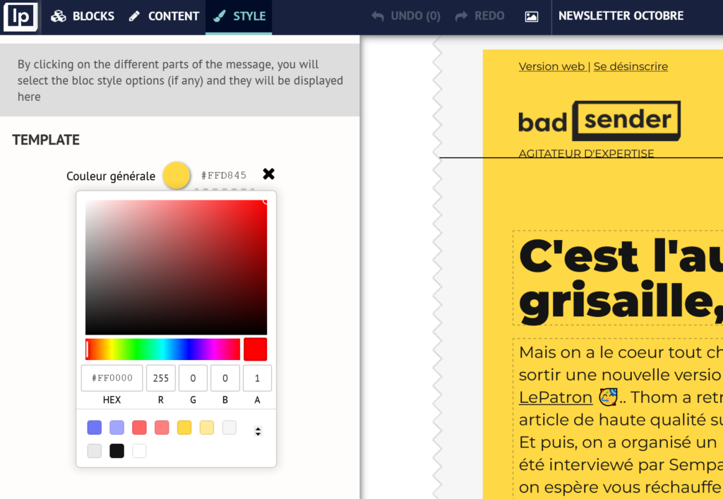
This way, anyone on the marketing team can create a campaign from scratch and be confident that stay consistent with the emails produced. Do not hesitate to ask us for a demonstration of the Bossto discover all the possibilities and features!
And the others
There are many Email Builder, developed for some by :
- agencies: Beefree, Chamaileon, Cab For Email, Mailmodo, Stripo, Dartagnan, Topol, EDM Designer, Mosaico, Mailerlite... Each of these email builders has its own advantages, specificities, and prices vary.
In this short list, only LePatron and Dartagnan are French solutions! Cock-a-doodle-doo!
- ESPs / routing platforms: Welkom Editor by Dolist, Layout by Sarbacane... Their functionalities are also different for each one. It's up to you to test them or to ask for a demonstration!
You should therefore be able to find the right tool for your needs in this vast, non-exhaustive selection.
Mention for the Litmus Email Builder: Litmus offers an Email Builder which allows you to save colors, code snippets, complete modules... So all the styles that are filled in these snippets or modules will always be present. Moreover, if you come to modify a hexadecimal code tomorrow, this will automatically be reflected in all snippets and modules.
PS: If all this is a bit long to read, there is also the possibility of viewing our live on design system email you know!
Appendices and resources
Videos
- Design System Email: https://www.youtube.com/watch?v=WD_XZXhD-q0&t=39s
- Design Systems for Emails UI: https://www.youtube.com/watch?v=Zb896uwZzAc
- Industrialize your email design with Figma: https://www.youtube.com/watch?v=Lm36lMKD2UY&t=710s
Sources
- https://blog.dartagnan.io/ux-et-design/atomic-design-email/
- https://content.dartagnan.io/livre-blanc-guide-charte-email
Design System
- https://lagrandeourse.design/blog/ui-design-et-da/design-system/
- https://atomicdesign.bradfrost.com/
- https://www.forumone.com/ideas/what-is-design-system/
- https://www.sdlv.fr/blog/ui-design/design-system
- https://www.uxpin.com/studio/blog/best-design-system-examples/
Design System Email
- https://www.litmus.com/blog/email-design-system/
- https://www.litmus.com/resources/how-design-systems-empower-email-teams-everywhere/
- https://uxdesign.cc/design-systems-for-email-bringing-order-to-the-chaos-c9d9c85ee46d
- https://blocksedit.com/email-design-system/
- https://chamaileon.io/resources/email-design-system/
- https://www.emailonacid.com/blog/article/email-development/email-design-system/
- https://taxiforemail.com/code/what-is-an-email-design-system/
- https://www.sparkpost.com/whitepapers-guides/5-steps-to-creating-your-own-email-design-system/
- https://medium.com/@sentbycrystal/email-design-systems-introduction-d64e84c4361f
- http://www.benbullivant.com/email-design-system/
- https://ansira.com/insights/blog/email-design-systems-laying-the-groundwork-for-collaboration/
- https://blog.prototypr.io/building-a-system-for-email-design-deployment-164faffe9e43
- https://mailchimp.com/fr/resources/brand-consistency/
- https://superfriendlydesign.systems/articles/design-systems-for-email/
Examples of Design System Email
- https://design.mutualofomaha.com/email/
- https://stackoverflow.design/email/guidelines/getting-started/
- https://www.email-designer.net/portfolio/email-design-system-pour-mma/
- https://dribbble.com/tags/email_design_system
- https://treehouse.github.io/email-style-guide/
- https://zeroheight.com/2bcee821b/p/196241-badsender