Here you are a newsletter template just like the advertiser: against the grain. I could have said modern or innovative, except that in this case we're not going into a debauchery of animated effects or dynamic content, no, no. We're talking about design choices. But in design choices. Although this newsletter may seem "ordinary" on the surface, it's full of design choices that we come across less and less often in email. For the good reason that they are difficult to implement, especially as they are sometimes poorly supported by opening environments.
Opening context
I opened this email on my mobile in the evening, therefore in its "dark mode" version. Because of the nature of my work at Badsender, I'm inevitably biased when I take a quick look at an email. And here it was obvious that I had to take a closer look, so I'm going to take you on a complete tour.
Deliverability
For an advertiser offering home automation solutions, including security and "optimal surveillance", an alignment of practices would be desirable.
If it seems obvious that Bimi is not in place but thatthere is list-unsubscribeLet's start with a quick check of the headers to verify the configuration details.
- Their domains (
info.netatmo.comandnetatmo.com) are aligned in strict modeand that's cool. - The policy quarantine on the info.netatmo.com and netatmo.com domains could benefit go to reject.
- No Bimi while we're on policy quarantine, it's a shame.
- The SPF of info.netatmo.com is
"v=spf1 ip4:130.248.193.0/24 -all"it's a very wide IP rangeIdeally, we should restrict ourselves to what is really useful.
All right, I admit it, I asked Jonathan to help me make sense of it, and by his own admission: " Frankly, everything looks great! "Well done. All that's left is Bimi. Having said that, I might as well have read Marion's excellent article for check technical deliverability parameters.
Writing
First things first. Clearly it's not the sender-object-preheader trio that prompted me to open this campaign.
As you know if you follow this column, the personification of the sender is not for me. Especially since the famous " Laura "At no point do we find it in the content, not a hint, not a signature, not a joke, nothing.
And then, cold as it is, I think that for a connected home automation service, they could have chosen " Nono the little robot "when to fake it.
Still in the inbox, the preheader is completely disconnected and adds nothing. It doesn't bounce off the object, doesn't question or complete it. It looks more like a generic baseline than information specific to this campaign. Anyway, let's move on.
Okay, maybe it's a bad idea, but I clicked and opened it.
There's a a strong promise from the outset : " A home that takes care of you and your environment" .
Apart from an ambiguity quickly cleared up on the meaning of the word ". environment" Here, the subject is clearly your home environment, not environmental impact. Personally, I think this choice of word is a bit misguided and a bit limiting. " A home that takes care of you and your loved ones every day" There's no doubt about it, and what's more, the scope of the subject is broader.
Apart from that, the rest of the content is informative, covering the Netatmo product range and the benefits they offer in a "smart" home. No commercial emphasis, just short sentences, highlights, tips and product benefits, all with a single suggested action. We know exactly where we're going. And yet...
Accessibility
Unfortunately, this is clearly not the newsletter's strong point.
By working harder on this point, the whole editorial team would have benefited.
- No title hierarchy
- No semantic markup
- Contrast orange text on white background
I won't dwell on text alternatives for images. There aren't any. Except for the logos, where we've saved the furniture. Nothing for social networks, and nothing for illustrations either. For the latter, it's not a big deal, as the visuals are "decorative" and the associated text is self-explanatory.
Coming back to the basics, at the level of the text and therefore of the wording, here we're faced with the classic pitfall. There is no no semantic markupUnfortunately, this still happens a lot, and it's hard to get the message across about the usefulness of adapted HTML code.
Except that here this is also noticeable when reading, as there's no formatting based on a "false" title hierarchy.. Everything is at the same level, in 14px. This makes it difficult to scan quickly and focus on key information.
As for the orange text, therein lies the difficulty of graphic charters that include this color palette. This is often the case in the service sector (mutuals, insurance, telephony...), where teams want to "brighten up" their designs with orange, but please not on plain 14px text. On bold headlines and with a sufficiently large size at a pinch. Check your color AND size contrasts - there are plenty of tools for that!
In the mobile version, all text is centered. Why is that? Frankly, you really shouldn't do that. Especially with so much editorial content, reading becomes difficult.
Don't forget to include the obligatory mentions and links, and here too it stings, non-explicit links here "for the privacy policy or unsubscribing, it's not pretty..
Design
Although the above points are part of the design and can be improved, it's the template as a whole that really caught my eye.
Remember what I said in the introduction, a first opening on mobile and in dark mode. Wow! Normally, this is exactly the kind of situation in which problems arise quickly. But here it's just the opposite, I wonder how they did it!
Clearly Dark mode is well thought-out and optimized. Both in style declarations to preserve contrast between background and text when changing modes. But also in the management of visuals. The logo is preserved with a white cartouche, which is very judicious when the typography of the logo is fine. Here, the technique of "white" outlines would have resulted in a less-than-ideal rendering. For the other illustrations, the transparent pngs are very clean and trouble-free.


A quick aside on value for money. Here, Adobe Campaign offers image caching, which is a good thing. What would have been better, however, is to optimize the weight of resources before hosting them. For example, the top of the main illustration is 57 Kb, which isn't much, but in a few seconds, thanks to a tool like TinyPng we save 70% and the file is only 17 Kb! If you don't do it for your subscribers, do it for the planet.
Back to the design and layout.
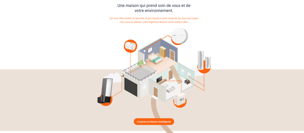
What caught my eye, and what I find well done, are illustrations linking zygzag content blocks. It's purely decorative, of course, but it's not easy to install, and requires a great deal of technical integration. Especially since some with overflow, some have rounded cornersclassy and well done!


And it works well on mobile too!
This gives the composition an original, elegant rhythm that would have been even more pronounced with a fine hierarchy of titles.
The other key point, which requires advanced HTML and image slicing, is introductory block (hero or cover). The visual overlaps a full-width band. Original and dynamic.

Any last words?
In conclusion, I wonder the question of production. Yes, once again it's a professional deformation, but when I see a creation like this, I wonder.
Doing this with a builder? Clearly, it's not the most practical solution. You need to anticipate all the image cuts, so in addition to the builder, you need access to editing software.
So I ask again: who produces this kind of newsletter? What is the profile of the person in charge of such a campaign and what is the production process?
No need to worry about integration by hand and we could go even further in terms of design and accessibility. In fact, I can see our Thomas challenging this type of newsletter with a very complex redesign and, to top it all off, adding micro-interactions and animations, wouldn't you say?

