Because I love solar panels. It's a shame they're so unattractive, otherwise I'd install them everywhere! And when will we see solar roof tiles? But back to the point. I chose this Beem email for several reasons:
- Renewable energy : An approach I fully support.
- A direct link to current issues Electricity bills are rising steadily (accompanied by stinging regularizations).
- A promising start-up : Beembased in Nantes, I believe deserves recognition on a par with that ofEcojoko.
- Opportunities for improvement : This promotional email has some interesting points, but also some areas for improvement.
Here is my detailed analysis.
Editorial and strategy
Positives:
- Clear message : Offer highlights solar station Beem On at a reduced price, available for a limited time. The urgency is relatively well communicated.
- Effective calls to action The buttons "I'm enjoying it!" and "I'm enjoying it fast!" are visible and direct.
- The object "Your €434 Beem On, does it stop tonight?" and the preheader "Enjoy it fast!" seem relevant to me.
Areas for improvement :
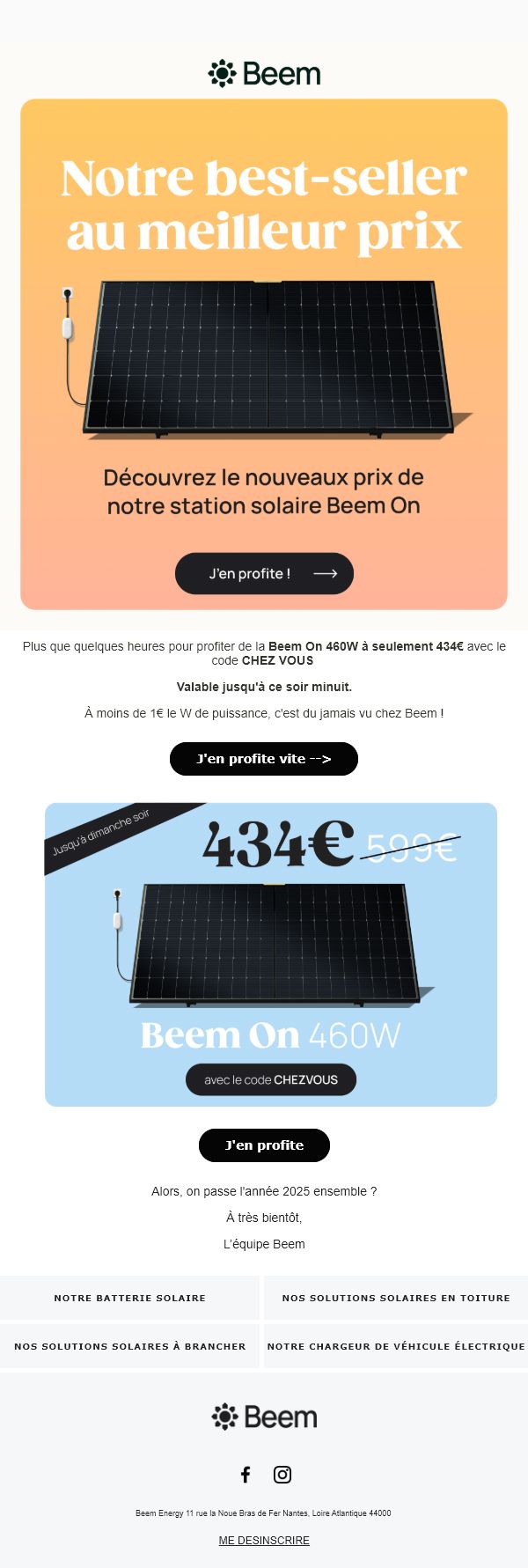
- Spelling mistakes If there's one thing that bothers me about commercial communications, it's spelling mistakes. And I see a huge one in the subtitle "Discover the new price of our Beem on solar station " Why add an "x" to the end of "new"?
- Information redundancy The text "Only a few hours left [...] unheard of at Beem!" repeats data already visible in the following visual. This duplication could be replaced by differentiating elements: potential savings, payback period, equivalent energy output, etc.
- Unrewarding relaunch Let me clarify one thing: an email was sent three days before by the brand, with virtually the same content, apart from additional paragraphs between the hero visual and the visual on a blue background. In addition to the rather excessive commercial pressure (but hey, it's a relaunch)I don't see any additional information in the first email. It would be a good idea to include new data to encourage conversion. Furthermore, in an email about renewable energy, it's a good idea to include practical information and ecological arguments to increase reader engagement.
- Alignment with brand values : Knowing the brand's values, who believes, I quote, "every gesture counts to build a more sustainable, autonomous and responsible world".I think it would be a good idea to add a text at the end of the email with a link to the email expiration dateinitiated by Badsender, and even more so when an offer like this has an expiration date...
Accessibility
Positives:
- Some of the text and buttons are designed in Raw HTML, for improved accessibility for screen readers and image-free display.
Areas for improvement :
- Mirror page missing A link to an online version would improve the user experience, while enabling better technical analysis.
- Button texts not very descriptives : Labels should reflect the action performed, for example: "I order the Beem On station, "I take advantage of the discount.
- Difficult reading : Systematically centering texts makes them more difficult to read. A classic left-hand alignment would make reading easier.
- Alternative text for images These descriptions are not always complete or relevant. They should detail the visual content in a useful way.
- Separating textual and visual content Numerous titles (including the major title, sacrilege!)texts (price, strikethrough price, offer duration) and buttons are included IN images: I could say it 1,000 times and it wouldn't make any difference! 😉 All textual content should be designed in HTML and formatted using CSS.
Design
Positives:
- The use ofRaw HTML for certain texts and buttons is appreciated.
- The unsubscribe link is clearly visible.
- The typography used for titles is graphic and aesthetically pleasing, providing a clear distinction between the different levels of text.
Areas for improvement :
- Visual uniformity Text lacks variation in size and style, making the email monotonous.
- Lack of coherence The email logo doesn't match the site logo (orange). While this may be an aesthetic choice, it can be detrimental to brand consistency. And also: the product visual is different from the one on the brand's website: why? Okay, I'm looking for the little beast, but it's in the details that the devil hides!
- Redundant use of visuals and logo The same images are used in several sections without providing any new information. Why not vary the perspective or add technical details? What's more, is there any point in adding the logo to the email footer again? I often ask myself this question, because it's a practice I'm seeing more and more often, but it bothers me, because it's height lost unnecessarily, and potentially space for other, more judicious information.
- Social networks in pictograms Replacing these icons with text would simplify the email and reduce its weight.
- No data available An email dealing with energy could make a little more of the product's ecological and technical data.
Code
Not having access to the original HTML code since no mirror page is available, I won't venture to analyze the code returned by my webmail. Or at least not in detail 😀
The positives
- Bravo: the attribute
roleattribute with the value presentation to allpresentationis well represented on<table>necessary for the HTML structure of the email. - Some semantic tags (
<p>) are used for current texts, top!
Areas for improvement :
- Irrelevant attributes Some elements, such as title on the images, doubling up with the alt and should be removed.
- Excessive complexity The code contains redundant tags (
<span>and attributes (valign) or CSS properties (vertical-align). A lighter layout would optimize loading time.
Conclusion
This Beem email on renewable solar panel energy has some strong points, including clear communication and relevant calls to action. However, technical, editorial and visual adjustments would improve its impact, readability and alignment with the brand's values. An extra effort on accessibility and code optimization would reinforce the overall effectiveness of the communication. So! Get ready to see a redesign for the pleasure of this email very soon. Keep up to date with Badsender news by subscribing to our newsletter!