Crystal clear!
The email's subject, preheader and main title complement each other and make for smooth reading.
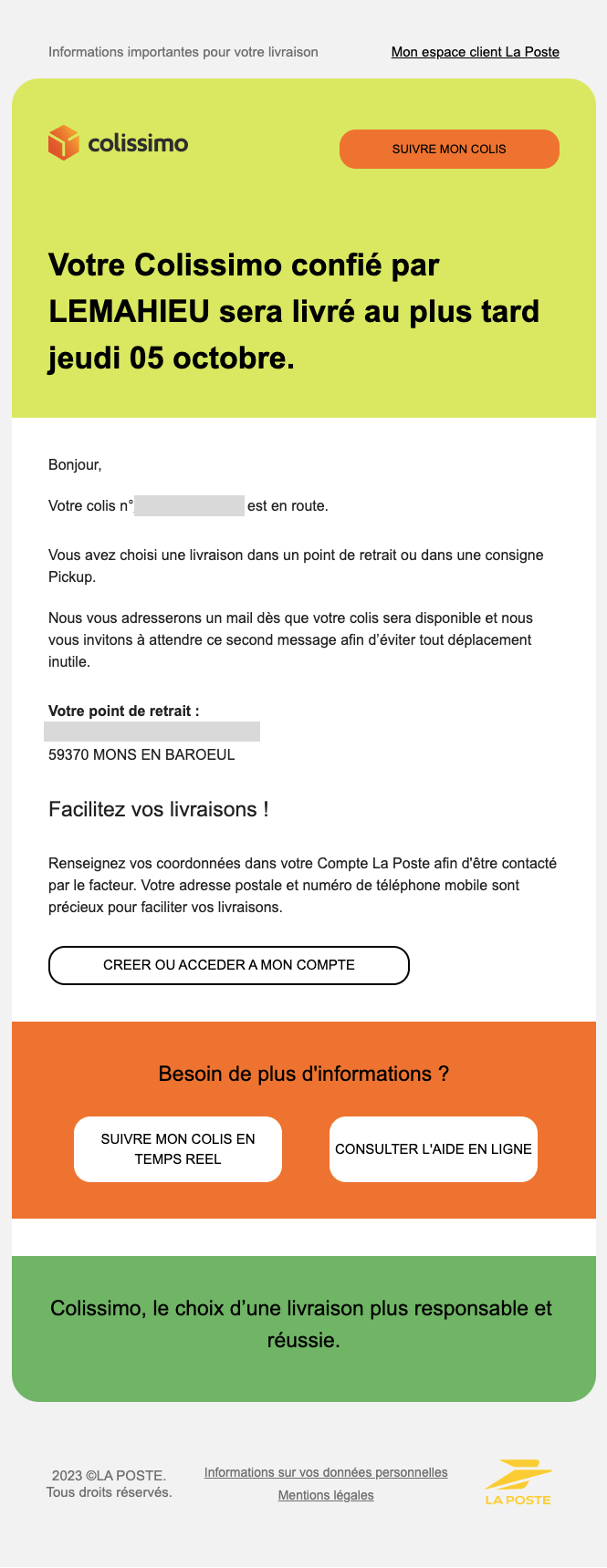
The main headline has a large enough font to be easily visible at a glance when I open the email, and it includes all the information that reassures me and makes me happy! I'm waiting for a parcel, it's going to arrive, you've got to share in my excitement!
From the header, I have a CTA to track my package. Good point.
The text reassures me and explains the next steps: I'll be notified as soon as the parcel arrives. It reminds me of the delivery address. He could have added the opening hours next to the address. It's in the next email (the one that tells me that my parcel has arrived), but I'd have liked to have it in this email too, so that I could plan my organization).
The email is readable without the need to display images. And that's cool!
Tricks
- The preheader: I'd like to see only "Important information for your delivery" and not "My La Poste customer area FOLLOW UP MY PACKAGE", which confuses the reading.
- The preheader (again) that repeats when I open the email. Useless.
- The sender label is not stable. In this email it's "La Poste-Colissimo" and in the next one (still the one that tells me my parcel has arrived) it's "Colissimo" only. I wish it were stable. When I look a bit, it's certainly due to the fact that these 2 emails come from 2 different sender addresses. But it's important to align because at the end of the chain it's the same reader. And it's always scary these delivery emails, I always tend to check 3 times that it's not phishing. A stable wording would have reassured me more.
- The "Facilitate your deliveries" block should have been on a different background color to separate it from the text.
- The display isn't exactly top-notch on mobile, lacking non-breaking spaces and margins on CTAs, but nothing illegible.