Editorial staff
A word of warning: the text is in English for the French speaker in me. Targeting error or not, the brand's intention, who knows... Well, you don't need a 12-year degree in foreign languages to understand.
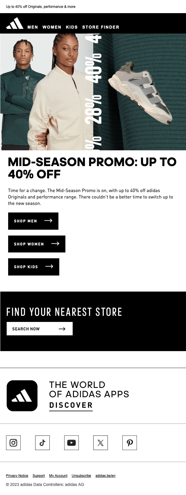
The message is clear:
- mid-season discount up to -40%
- gender (men, women, children)
- find a store nearby
There's an inspirational/promotional visual, but no product visuals, which isn't really commonplace for this type of email.
In a way, it's rather effective: the website will be much more effective in driving consumption. But what's clever here, and this is surely what this campaign is all about, is qualifying me: my gender, my locality.
Design side
It's very raw, very short, it's mobile friendly.
The gif gives a little punch and whether it's blocked or not, the info is there.
