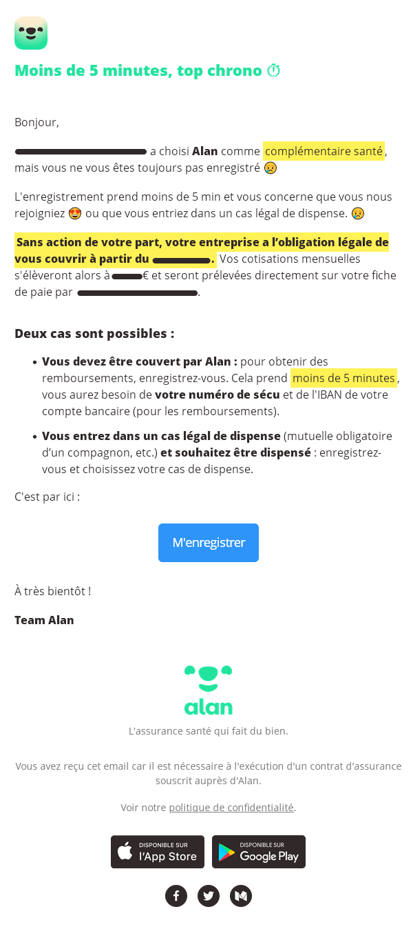
Here's a special email: it's a reminder for a complementary health insurance plan chosen by a company for its employees. This reminder delivers a strong message, as it informs the recipient that he or she must register, whether or not he or she is concerned. For me, this type of email has a complex, almost legal mission. It has to be clear, limpid in terms of content, easy to understand, and push the recipient to take an (obligatory) action.
Many complementary health insurance companies would go for the simplest solution and opt for an email without any graphic layout or HTML version. This is not the method chosen by Alan complementary health insurance. Here, they set out to design a short email, almost entirely in text (HTML) and virtually devoid of images (leaving only the logo, signature, social networks and buttons to the app). But the rendering and aesthetics are there, and that's how they stand out!
First of all, the text in this email is "alive": the use of bold to highlight certain pieces of text is judicious: the typography selected for the body text clearly gives the possibility of accentuating the differences in boldness. And there's more, Highlighting allows you to grasp at a glance the most important information in the email..
The hierarchy of information is well thought out, with a single headline, nice spaces between paragraphs, a bulleted list used as such with a pre-headline... And a punchy, concise, centered call to action.
I have a few reservations about the choice of Mailchimp as the tool for sending this type of campaign, as it heavily overloads the HTML code in the CSS properties defined in the head of email and the implementation of padding for highlighting on span (elements of type inline). But these are technical points, and my main point in this email example is to show that it's perfectly possible to design an aesthetically pleasing "trigger" email with very few graphic elements or images, and just clear text, beautiful typography, and judicious use of CSS text formatting.
