The email is most certainly created and sent automatically. It is sent out every day at 5 p.m. and reproduces word for word the last four news headlines published on their website.
Sender / Object / Preheader

- The subject includes the main title of the first article in the email.
- The preheader is not well thought out. The title of the second article could have been included to give readers more material.
- There is no logo next to the wording. BIMI not set upIt could be, since DMARC is well configured. We should take this opportunity to configure Apple Branded EmailIt costs nothing.
Content of the email
- Playback without loaded images is very clear. The hierarchy of information is also clear, making diagonal reading much easier.
- The main CTA could be improved with more engaging wording and a real button layout. For example: "I read the other side of the coin".
- There are no secondary CTAs; secondary links are placed behind titles. In our experience, it's better to see the buttons visually to encourage more clicks. I would have put CTAs in proper form by working on the wording. Example: CTA: "I'd like to take a look at the 4 graphics".
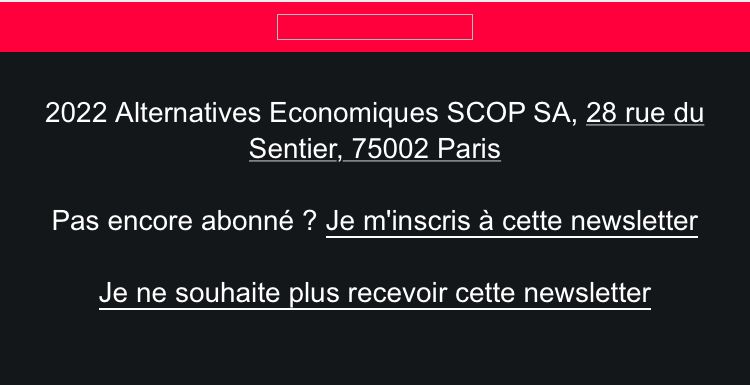
- I'm always amazed when I see the word " Not yet a subscriber? Subscribe to this newsletter "in a newsletter. If it's received, it means people have subscribed, right? Or I imagine that the campaign creators put this mention for those to whom the newsletter has been forwarded? In that case, why not add in the header a Transfer" button with a mailto link and a message encouraging recipients to sign up? In my opinion, it's more logical and effective.

- Just above the footer or right in the middle of the email below the 2nd article, for example, I'd add a block reminding readers that Alternatives Économiques is an independent 100 % cooperative, owned by its employees and living only thanks to its readers. I'd explain that it's possible to access the articles in their entirety by creating a free account. I'll include two call-to-action buttons: "Create a free account" and "Subscribe", and a 3rd "Make a donation".
- All links are accessible, and this is rare enough to be emphasized - we still see "click here" too often in emails. Emails should be easily read by everyone, even those who need a voice reader to read their emails.
- The image hosting url is not consistent with their domain name: they would have to ask their router for a sub-domain delegation.
