An industrial brand, targeting a B2B audience in a freelancer dedicated to emailing ? Yes, for several reasons. Firstly, because the our emailing agency is important for B2B campaigns. Secondly, Schneider Electric is one of France's most committed industrial brands on climate issues.
Finally, just because you're targeting pros doesn't mean you have to make ugly emails 😉 (I didn't say that was the case here).
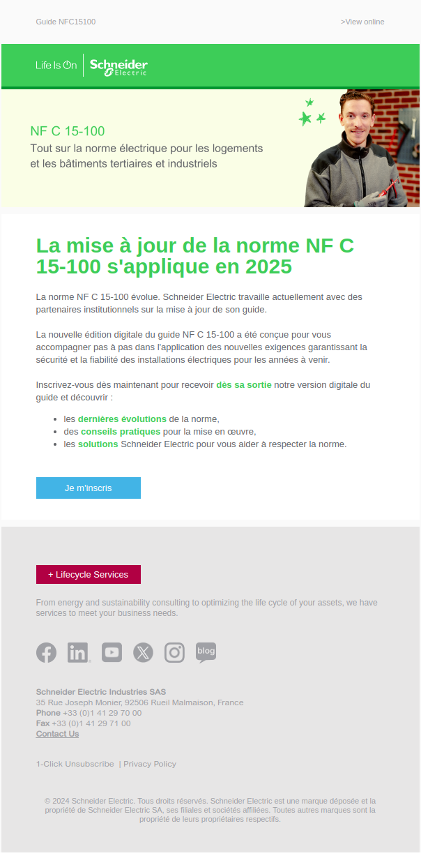
Email at a glance: accessibility and disappointment
The first thing that jumped out at me was the lack of contrast. Right from the email header, the contrast is extremely low and the logo barely visible. The same applies to text and calls to action. The footer in gray text on a gray background obviously doesn't help matters..
This contrast problem should at least be counterbalanced by larger sizes. This is the case, for example, in the email header. The colors are exactly the same as on the Schneider Electric website, but the larger size on the site makes the brand logo much more legible and identifiable at first glance.
Still on the site, the "normal" texts are much larger and, above all, darker, even if they're not in true black.
Too bad for theemail accessibility while Schneider Electric is a brand with a strong commitment to diversity and inclusion.
The second thing that stands out is that the disappointing aspect of this email. The object promises "All the new features" of the NF C 15-100 standard. But the main button is a somber "Je m'inscrire" ("I subscribe"). You have to rummage around in the middle of a paragraph to read "Sign up now to receive ****as soon as our digital version of the guide is available...".
I obviously don't have the statistics for this email at hand, but assume from the outset that the guide is not yet available and something along the lines of "Be alerted as soon as our guide to the NF C 15-100 standard is available" would probably have been more appropriate.
Other "tricks" for improvement
The idea of our email freelance is not to make a exhaustive audit of all emails that we analyze, so here are the other points that could be improved:
- Pre-header : No optimized emailing pre-header in this email, a URL is displayed by Gmail.
- Double main title One in the cover image, the other just below it. Neither brings the main info of the email (Aka: Be informed when our guide is ready).
- Call to action The main CTA contained in the email is too small, not contrasting enough, does not seem to respect editorial charter and you don't know what you're signing up for.
- Reinsurance : There's a great email signature. Unfortunately, it's not emphasized enough. On its site, Schneider states in the header and footer that it is a company with an impact, so it would be nice to highlight this in emails too. Access to customer service is also difficult to find.
For the record, I haven't taken the time to analyze the email code or the responsive 😉 I'll leave that to my colleagues who specialize in the subject.
And under the hood of deliverability?
Because it's hard for me to resist making a analysis of email deliverabilityHere are a few details about this Schneider email. For your information, emails are sent from Marketo.
- Reply : For once, no "no-reply", but reply@se.com ! Here's hoping this email address does indeed lead to customer service.
- DMARC Another great point, DMARC is in policy reject. This means that Schneider Electric uses the most secure authentication standards to send its emails.
- Domain use policy The tracking and image hosting links are branded with schneider-electric.com. That's fine, but the ideal would have been to use a sub-domain of the shipping domain, which is se.com. But frankly, it's not bad at all!
- Unsubscribe I'm putting it here because it can have a direct impact on deliverability, but this tiny unsubscribe link in gray on a gray background is far too hard to find. Urgent improvement.
I'm glad I had the opportunity to end on a positive note! Let's get to work!