For this month of February, I have chosen an e-mail from Release but especially Libé Portraits!
But what is Libé Portraits, you might ask?
Every week, Libé presents portraits of famous and not-so-famous people in the news!
What's more, Libé goes out of its way to meet them and tell them where they're from, who they are and where they're going (they say so in the very first lines of their e-mail).
Let's take a look at what caught my eye and what - in my opinion - could be improved...
The pluses that caught my attention:
We'll start as usual with the authentications (perhaps it's a fault of mine to start with this :p) and then we'll highlight the design and content of the e-mail!
Authentication SPF and DKIM are valid and both aligned with the sender domain. DMARC, on the other hand, is present on the sender sub-domain (newsletter.liberation.fr) with a restrictive policy (to quarantine)... In short, we comply with the latest Google / Yahoo requirements! There is also BIMI on the sender domain but without a VMC brand certificate (no logo available in Gmail)... Too bad :'
* SPF (MailFrom domain): newsletter.liberation.fr
* DKIM (From domain): newsletter.liberation.fr (d=newsletter.liberation.fr)
* DMARC (From domain): newsletter.liberation.fr (p=quarantine)
* BIMI (From domain): newsletter.liberation.fr (without VMC)
The design The e-mail is easy to read in either light or dark mode (my phone is only in dark mode), and the portraits follow on from one another, one below the other 😉
The - that caught my attention :
In terms of areas for improvement, I'll start with DMARC and BIMI authentication, then move on to optimizing the pre-header, redesigning the portrait inserts and finally optimizing the footer...
Authentication Even if the sub-domain is correctly authenticated, the main domain is completely neglected (and yet it is so important) with DMARC, the security policy is at none and no address has been defined in RUA/RUF (cf. no monitoring of the activity of the organizational domain and all sub-domains... except newsletter). On the BIMI side, the newsletter.liberation.fr subdomain does have a record, but the BIMI Inspector detects several image-related errors:'
* DMARC: liberation.fr (p=none; no RUA/RUF)
* BIMI: newsletter.liberation.fr (The SVG Image needs an Update, check the errors for more details)
The preheader Even if it's not visible when you open the e-mail, it's still annoying to see "The online version" "Logo" "Libération à la der..." in your Inbox. With a few <br/>we could improve things, even rework it to make it a little longerg !

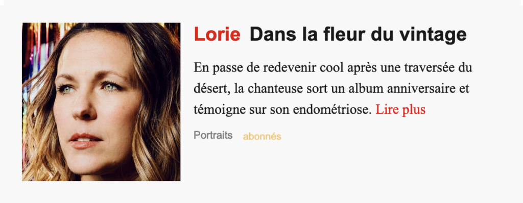
The content The portrait blocks are quite nice (a photo + text), but I would have put a nice CTA instead of text on the "Read more" link. By the way, I would have replaced the text with a sexier call to action…

The footer : The footer of an e-mail is usually a bit of a catch-all area, where you'll find an essential link, the famous unsubscribe link ! Here, I have to say that it's really written small compared to the other texts, I would have liked (or preferred) it to be a bit bigger / bigger! Maybe I'm just quibbling?

And how do you see this e-mail from Release ?
Please visit our page dedicated to our e-mail selections and analyses 🙂
Enjoy your reading!
