As a music fan and drummer for many years, it's only natural to receive emails from online music sites. And La Baguetterie is the biggest company on the subject in France.
So let's scan this email that I find very well done and very effective!
We'll simply unroll it from top to bottom.
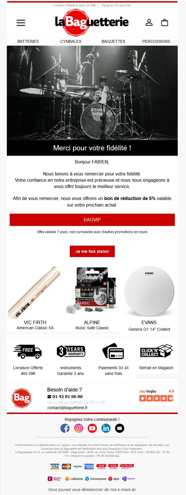
- the pre-header: free delivery for a small fee and 4x free payment. That's a lot of information for a buyer. So it's very attractive right from the start.
- logo, customer account, shopping cart and menu: a nod to the site and good product categorization.
- the cover image: a beautiful, sober image with beautiful material. In short, it's a real eye-catcher!
- the text: first of all, I'm thanked for my loyalty (which is true, I'm not being brushed in the right direction...), and then there's some personalization with my first name. Personalizing an e-mail is essential. It changes the recipient's perspective. And your numbers too. I've also been offered a discount, and that's always appreciated whether you use it or not.
- the CTA (even a single CTA): a single, visible button with an inciting verb.
- the 3 products: here I'm offered 3 common and 'consumable' products. These are the items we use the most. So they're often needed, and they're far from being the most expensive items. It's a great investment.
- Reassurance: 4 clear pictograms with the right information to reassure the customer.
- store info: help, opening hours, email & customer reviews, i.e. the right information to help customers.
- social networks: for community and showcasing drummers/equipment.
- legal notices: short, with 4 short lines.
- banking and delivery partners, who provide further insurance for the customer.
- unsubscribe link: mandatory and clearly visible.
Conclusion:
I love this email because it's a textbook case! It's simple and effective. It's bound to hit the nail on the head.
I'm well addressed with a personal message and I have a nice offer. There's a nice image and a single CTA. Plus all the reinsurance too.
In short, it's everything we recommend here. A short, personalized email, with a single message to get across to the customer. The product placement is very clever in choosing what to put forward.
In short, it's remarkable comm email. There's nothing to add or take away.
Bravo La Baguetterie, !! (Well I have 10% next time??)
