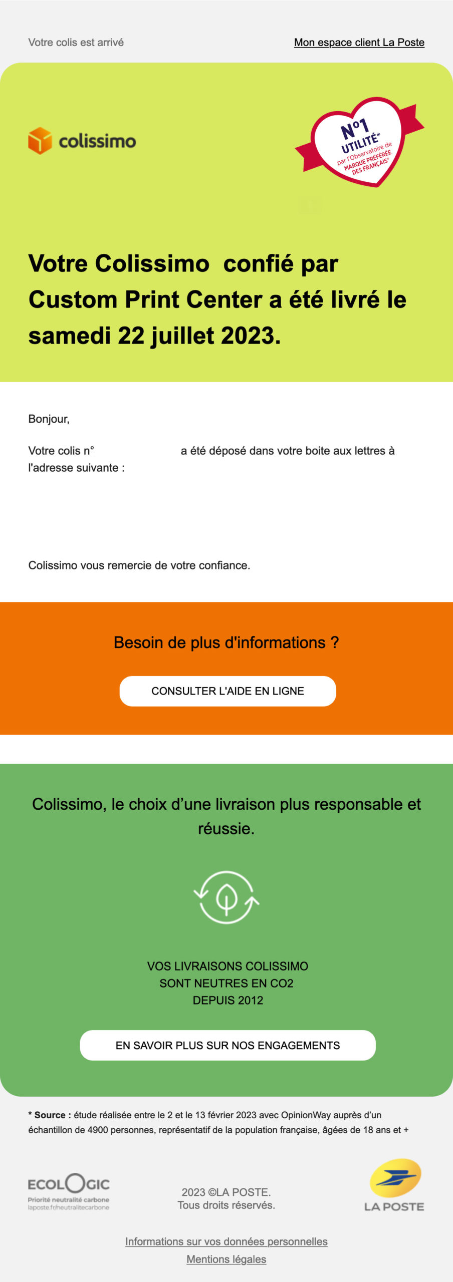
I chose this e-mail for several reasons, even if not everything is perfect:
- Design :
- The design aspect of the desktop version: easy to read, pleasant design and useful information (I went looking for the package afterwards). Although the space between the orange and green blocks could have been removed.
- I'm not so keen on the dark mode mobile version, as the colissimo logo is a bit off and the green used isn't very pleasant.
- Scenario :
- A first e-mail had been sent to me from the same sender to let me know that my package would arrive before 24/07.
- Strategy:
- La Poste's commitment to carbon neutrality!
- The domain of the sending address has the blue checkmark, so BIMI is set up with a VMC certificate!
- Even though BIMI is there, I'm not a big fan of the domain name - you'd think it was a phishing e-mail! I'd have gone for notif-colissimo.laposte.fr or notification@colissimo.laposte.fr instead.
- Only one major drawback: the absence of a preheader
