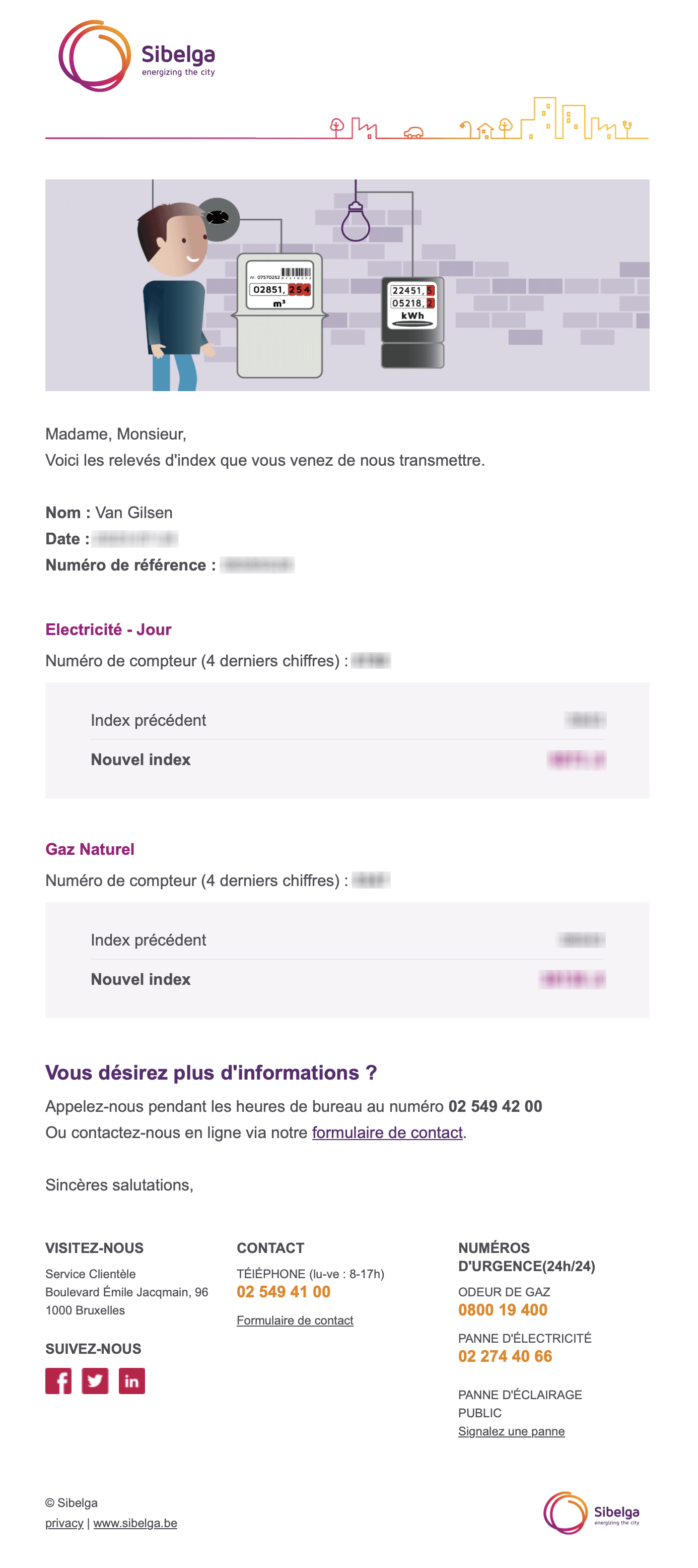
I like this email for its clarity. This is an informative email, it's not covered in unnecessary introductory text, and doesn't try to sell things over the top. The relevant information is immediately available and are formatted in an airy email. In short, it's clearclear at first glance, and cleverly formatted.
This email has also chosen to ignore the user's darkmode. While this choice is debatable, the sender can be sure of the readability of the information. As a darkmode user, I think I prefer an email that forces lightmode rather than an unreadable rendering.
The negative point remains the sender's name, which could hardly be less clear. This is probably why the brand name is included in the subject line.
