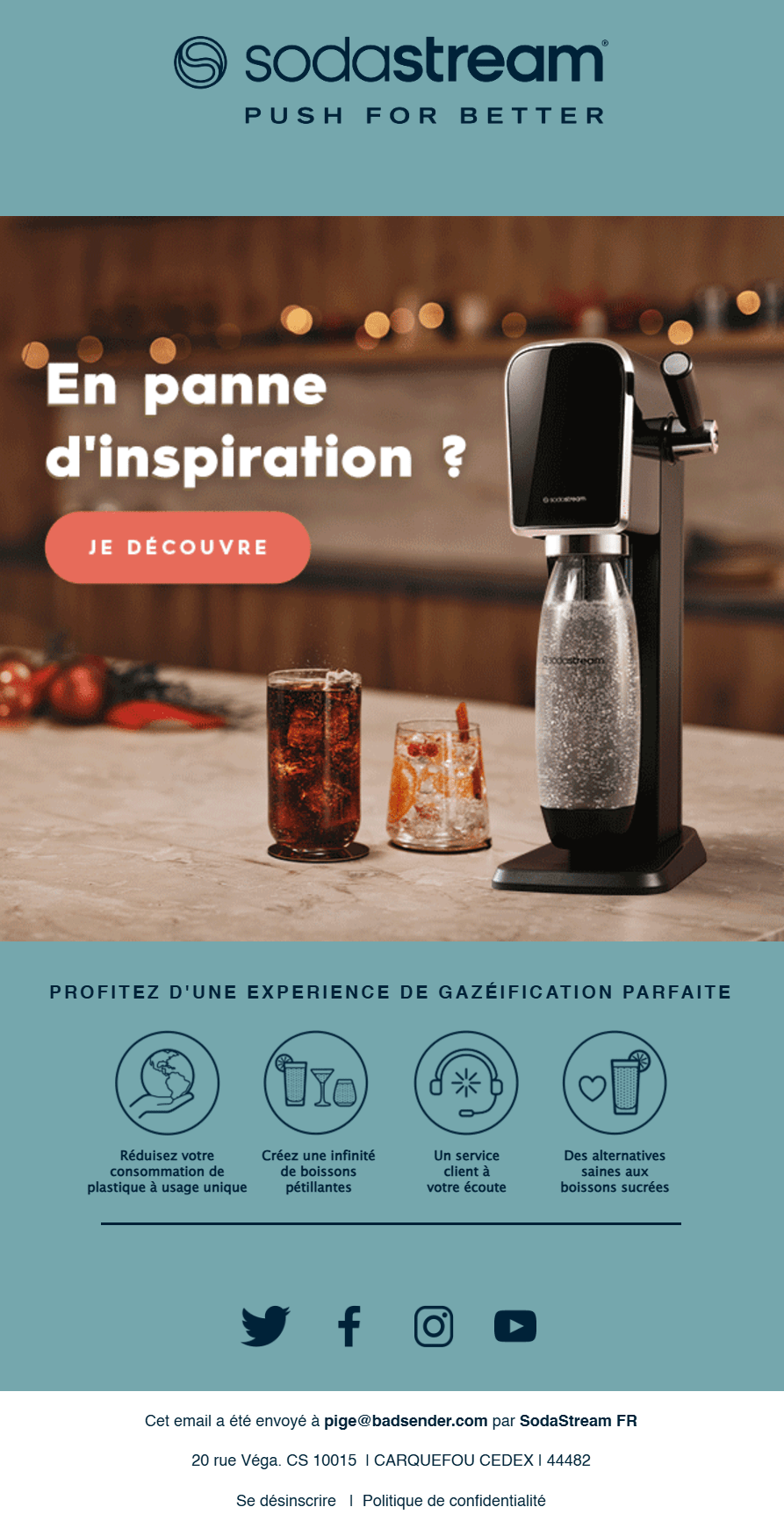
Let's talk content! There's a clear lack of consistency between text and visuals. I received this email with the images disabled. The alternative text for the main image is : Christmas Offers | Up to -45% on machines. Reminder of the object: (emoji Santa Claus) Is your list ready?
When loading the images, I was surprised not to find the subject advertised in the subject line and the alternative text in the main image, both of which are Christmas-oriented. What's more, I can't find the "up to -45%" offer in the visual either. Out of inspiration? The title isn't such a bad choice after all 😛
The brand's emails are all pretty much built the same way: centered logo, main image with integrated text, sometimes multi-column to highlight the different models, reassurance, footer.
Quick warning: there's no preheader. Too bad, since it's essential content to give your contacts more information and encourage them to open the email. We could have highlighted the famous 45% discount, or included a bit of enchantment.
In my opinion, there's a need for a main title and an introductory text (even a short one), all outside the image. Especially since I can imagine many connections between Christmas and the lexical field surrounding soft drinks: Faites pétiller Noël, Une table scintillante avec Sodastream, Faites étinceler vos papilles, Offrez des bulles de bonheur à Noël, Pour des cadeaux qui pétillent sous le sapin...
Finally, as far as reassurance is concerned, I wouldn't necessarily have mentioned customer service, which is a bit of an oddity given the other content: environment, health and pleasure. Why not introduce a more detailed block on these advantages?
These few adjustments would improve the effectiveness and clarity of the message, while reinforcing the SodaStream brand image. And I can't end this analysis without the perfect phrase: "It's my bubbles!"
