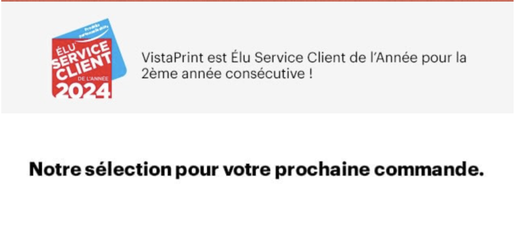
For this month of March, I have selected and analyzed an e-mail from Vista Print ! But what is VistaPrint?
VistaPrint offers design, marketing and printing services for small businesses.
When I started e-mail marketing in 2008, I heard a lot about VistaPrint, not all of it good, unfortunately, because of some dubious practices... And a lot of ISP blocking! Finally, I can see that over the years, VistaPrint has improved (as time shows, you can change with time!) and so I decided to analyze one of their e-mails.
The pluses that caught my attention:
As usual, let's start with the points that clearly caught my attention in the VistaPrint e-mail... The authentications, the subject line and the design...
Authentication SPF and DKIM are valid and aligned with the sending domain. DMARC, meanwhile, is present on the sending domain (mail.vistaprint.fr) with a restrictive policy (to quarantine)... The little bonus, a BIMI record is also present on the sending domain with a VMC brand certificate (purchased from Digicert)...
* SPF (MailFrom domain): bounce.mail.vistaprint.fr (SoftFail)
* DKIM (From domain): mail.vistaprint.fr (d=mail.vistaprint.fr)
* DMARC (From domain): mail.vistaprint.fr (p=quarantine)
* BIMI (From domain): mail.vistaprint.fr (with VMC brand certificate)
The logo and blue checkmark can be seen in my Inbox Gmail (class)!

The object The subject line of an e-mail is the first thing a person sees in their mailbox, so it needs to be carefully crafted if you want your e-mail to be opened. Here, VistaPrint proposes a subject line full of "mystery" and that expires very quickly... Nothing better to arouse interest, human curiosity and the incentive to open the e-mail quickly!

The design The e-mail is displayed correctly on desktop and also on mobile. The layout and choice of blocks are well thought out (it's usually these blocks that my wife goes to when she places an order with VP).
The - that caught my attention :
As far as VistaPrint's e-mail is concerned, there are a few points that could clearly be improved... Like the design, the preheader or even the management of the reply-to address!
The design Even though I've mentioned it in the positive points, there are some areas that could be optimized. I'm talking about the 3 image blocks below, which could have been turned into text...


The preheader : Almost perfect! The preheader started well, but as it's a bit short or not detached from the following elements (here the images), it doesn't become very coherent... Too bad :' They must not have read Olivier Fredon's excellent article on e-mail preheaders !
Time is running out! Take advantage of your Vistaprint discount J'en profite J'en profite J'en profite

The Dark Mode The entire e-mail can be read in dark mode. Unfortunately, some texts are in black on a very dark background... Before approving your design, make sure it's clearly legible everywhere!


Reply-to address management Personally, I think it's a disaster... because it's not managed! But at least VistaPrint sets the tone:

When you know how important managing your reply-to addressand how it can help boost your reputation, it's a shame to leave it out...
And how do you see this e-mail from Vista Print ?
Please visit our page dedicated to our e-mail selections and analyses 🙂
Enjoy your reading!
